


This is a complete guide to conversion-focused design for your online website.
In this in-depth guide, you’ll learn:
- What is conversion-focused design
- Why is conversion-focused design important
- The 10 principles of conversion-focused web design
- and lots more
So if you’re ready to optimize your online website into a conversion machine, this guide is for you.
Let’s jump right in.
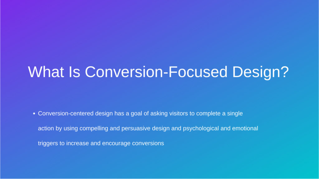
What Is Conversion-Focused Design?
Conversion-focused design uses established design principles and strategies to convince users to take action on your brand’s website.
You can exponentially boost sales and conversions by minimizing distractions, optimizing your website’s user experience, and using psychological triggers.
Let’s break down conversion-focused design even more.
For ecommerce stores, a conversion is when an online shopper makes a purchase. As such, conversion-focused design prioritizes turning online visitors into customers.
However, sales aren’t the only conversion elements on an online store. Ecommerce stores will also usually have CTA buttons like “Sign Up” and “Shop Now“. These CTAs are used to capture emails and entice visitors to browse different collections around your store.
Furthermore, conversions may be different from sales on your own website. Whatever drives your website’s revenue is what will ultimately be your main conversion.
For this reason, your CTAs become your website’s core principle when you pivot to conversion-focused design. Every element of your website design will focus on getting the visitor to engage with the different calls to action.
Why Is Conversion-Focused Design Important?
As a website owner, you want to create a beautiful and highly functional website.
However, there’s one simple truth: what looks good for someone might not be ideal for someone else.
As such, it’s challenging to create a one-size-fits-all website that every visitor finds appealing. This is where conversion-focused design kicks in.
Conversion-focused design harnesses proven research and testing from design experts. The design principles of conversion-focused design are based on irrefutable data and scientific explanations on why users respond well to a specific layout.
You have likely noticed how most ecommerce stores, agencies, and sales websites look the same.
There’s a navigation bar near the top, followed by the hero banner, copy, and a call to action. The reason why the majority of online websites follow the same layout is that it makes things simple for the visitors.
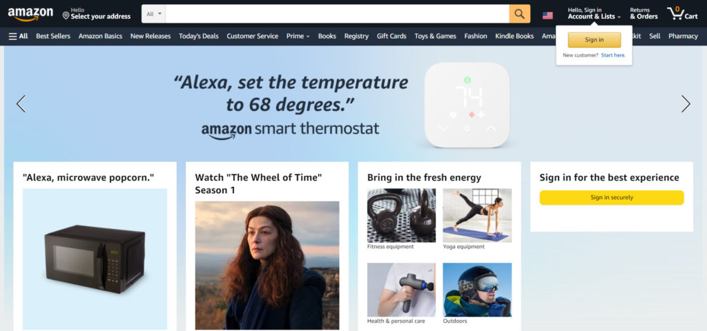
They immediately know how to find what they’re looking for and can browse special collections or promotions if they’d like to.
As such, it’s highly inefficient to reinvent the wheel and create a unique or eccentric design. By following a proven layout that works, you have a much higher chance of gaining conversions on your ecommerce store.
When you pivot to a conversion-focused design, you’ll never look back. With the proper design, your ecommerce store or online brand will make sales by itself and receive a higher conversion rate.
10 Principles Of Conversion-Focused Design
Now that you understand what conversion-focused design is and why it’s important, let’s dive into our list of 10 design principles.
These principles will help you create a website that persuades your visitors to take action.
1. Create Focus
Every time a visitor views your landing page, you’re competing against everything that might distract the user.
Although you can’t control their Instagram notifications or somebody chatting with them in real life, you can control how distracting your own landing page is. Distractions on your landing page include internal and external links as well as how many options you give the visitor.
For this reason, the first principle of conversion-focused design is to create focus. Every design element of your website should be created with a unified goal.
As such, the more calls to action and options you give to your visitors, the more distracted and confused they will be. This is known as overchoice or analysis paralysis in psychology. It’s the same feeling you get when you’re overwhelmed with the number of choices there are on Netflix.
Although it would be amazing for the visitor to complete every call to action, people can only realistically focus on one action at a time. When you offer too many options to your website visitors, they are more likely to exit your website.
2. Consistency Is King
As brand building experts at Conversion Fanatics, we understand the importance of having a consistent brand theme and design. For this reason, we recommend keeping the entire ecosystem of your brand homogenous. This way, visitors won’t get confused or overwhelmed as they browse different areas of your website.
Your brand is essentially all about the relationships you build with your target audience. Each touchpoint you have with them helps build the relationship and their viewpoint on your brand.
As such, we recommend using the same fonts, colors, and styles across each page on your website. Although testing or experimenting with new styles seems appealing, you risk creating a disconnect with your website visitors.
In terms of design, you should create brand guidelines to keep track of your colors, fonts, and other design elements. For fonts, we recommend using two fonts: one for your body text and another for headers. Furthermore, you shouldn’t use more than three main colors throughout your website.
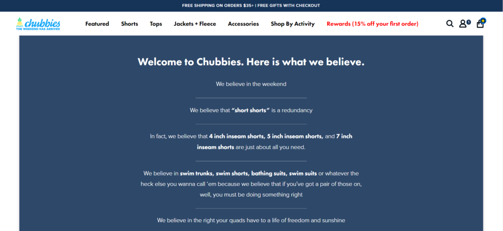
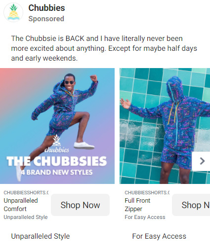
Design match is another essential way of creating a conversion-focused design. This involves designing your ads with the same style as your website. You should use similar color schemes and design elements on your ads and website.
This is because our brains process visual information 60,000 times faster than textual information. For this reason, design is the first thing visitors will notice on their journey from your ads to your website. Using similar design elements on your advertisements makes your website feel relevant and comfortable.
3. Build Structure
Conversion-focused design doesn’t only look high quality, but it also subtly guides website visitors to continue scrolling and take action as well. For this reason, it’s important to build structure and create a natural flow on your website.
We recommend balancing the content in a way that’s both informative and visually appealing. It should be easy for your visitors to understand what to do next. As such, building an optimized layout will eliminate the anxiety that comes from a blank canvas and save you from future headaches too.
The first step in building structure on your website is to design your information hierarchy. Rather than blindly choosing a landing page template, it would help to decide what elements to include on your page and what order to list them in.
So, think about the different components you need to include to support the goal of the page. Then, list them in their most logical order. Next, choose which components are the most important and how large to make critical sections.
After you decide how to order your landing page, it’s helpful to examine the flow from a visitor’s perspective.
A few questions to ask yourself include:
- How much content will each section require?
- Where should images be located?
- How can you separate the sections so the page is more visually aesthetic?
It’s important to avoid throwing content all over the place. So, create a flow where each following section adds additional value to the visitor. Remember, the ultimate goal is to answer all of the visitor’s questions and convince them to complete the conversion.
4. Showcase Benefits
Have you ever heard of the saying “Show, don’t tell“?
When it comes to your website, you can utilize your visuals to show why audiences should care about your offer. Videos, illustrations, and images can help visitors connect with your brand on a deeper level and capture the important intangible emotional benefits you can’t fully express with copywriting alone.
However, it’s not just about picking visual elements that look nice and match the design of the page. Instead, you want to use visuals to show the benefits your offer provides and what the offer will do for your visitors. When online visitors are considering an offer, they need to fully understand how it will improve their lives.
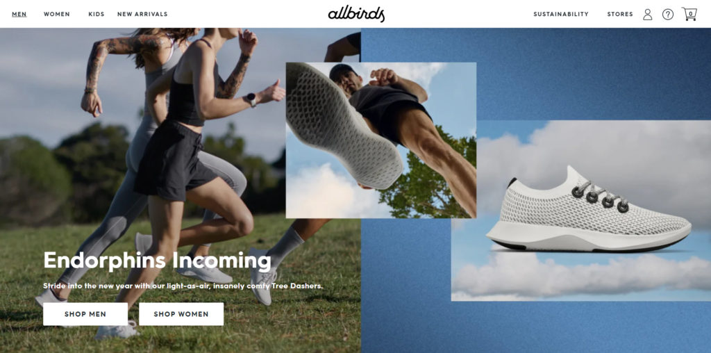
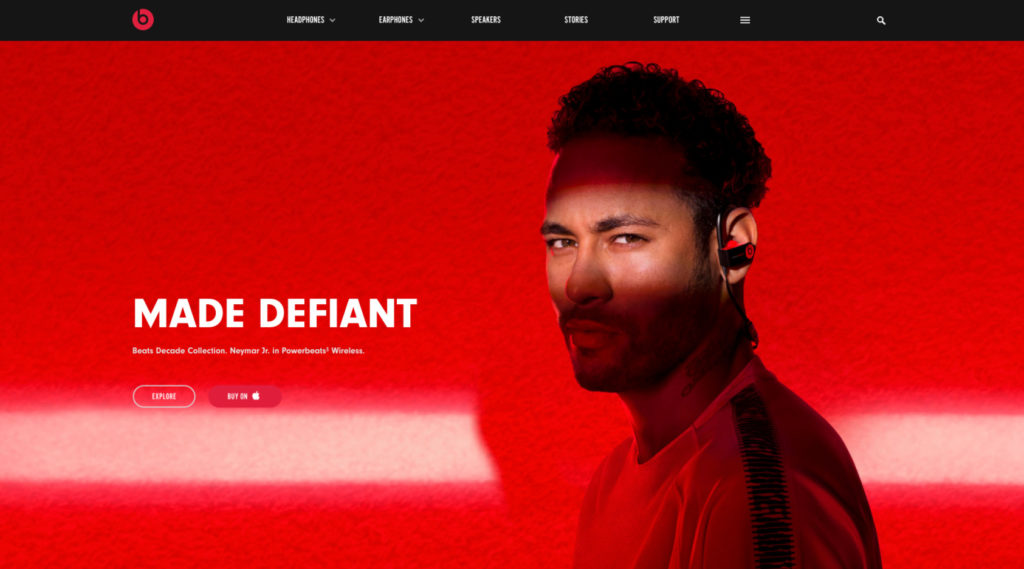
The Hero Image
Your hero image sits at the top of your website and is the first thing visitors will see. Although it needs to grab their attention, it also needs to display the benefits of your offer clearly.
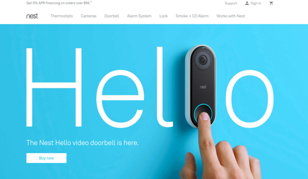
Since this is the most important visual element on your website, we recommend spending extra time on making it perfect. Most importantly, your hero image needs to be clear. This means that visitors will easily understand what your website is about without needing to read any text.
As such, focus on clarity and transparency. The majority of websites, ads, and so forth fail to deliver a clear message. Although it’s such a fundamental mistake, websites tend to overcomplicate their hero images.
Types of Hero Images
Photographs & Images
Photographs and images are the most commonly used hero images. Photos of real people and objects will make your website look more trustworthy and tangible.
When choosing your images, we recommend using images that feature positive emotions like pride, happiness, or love. Furthermore, research has shown that images that feature a photograph of a real-life person will convert better than just a photo of the product.
This is because photos of real people increase empathy and are more memorable for your visitors.
On the other hand, you can also use images to express negative emotions that touch on your visitors’ pain points. For example, an ecommerce store selling ankle braces can display a person who has pain walking without an ankle brace.
Illustrations
Software companies typically use illustrations to explain how their product works. These are incredibly informative and help convert visitors by fully showing them how the product/software works.
Videos
Videos are not as common in the hero image because they are difficult to produce. However, videos can be very engaging and conversion-driven if appropriately created.
5. Draw Attention to Key Areas
Attention is not given for free and needs to be earned. This is because people face thousands of different distractions throughout the day.
For this reason, it’s important to use colors, fonts, shapes, and patterns to your advantage. Although they might be subtle, these design elements help draw attention to key points of interest on your website. As such, you can use them to engage with your visitors and drive them towards the all-mighty CTA.
How Does Color Affect Design?
Although color can have an impact on your website’s conversion rate, there are no set guidelines on what colors you need to use. However, there are a few things to keep in mind as you ultimately decide on your website’s color scheme.
Firstly, it’s vital to choose contrasting colors. Coolors is an excellent website to use generate different color schemes or explore trending palettes. While the majority of websites use the color white as their primary background, we recommend experimenting with other colors to enhance the visual engagement and scannability of your website.
Overall, it would be best to use a maximum of three or four colors. These colors don’t include the colors that are shown in photos or other visual elements.
Furthermore, it’s important to reserve one color strictly for your call to action button. Ideally, this should be the boldest and most eye-catching color in your color palette.
What Type of Fonts and Typography Should I Use?
In a perfect world, your visitors would read every single line of text on your website. However, this is never the case. Instead, your website visitors will skim through the content and look at your images.
For this reason, it’s essential to use a strong visual hierarchy so your visitors can conveniently pick out important information. As such, we recommend deciding what content is critical on your page and using headers, bold font, italic font, and colors to frame it.
Design Optimal CTA Buttons
When your CTA buttons are well-designed, you will notice a higher click-through rate and conversion rate.
Here’s how we recommend designing your buttons:
Button Size
In terms of size, your CTA button and CTA fonts should be around double the size of your body copy. On an ideal website, the CTA button should be the second element visitors see after reading the headline of the sections.
Button Effects
You can use different stylistic elements such as bevels, drop shadows, and gradients to make your buttons look more enticing. However, websites with a more contemporary flat design can also enable a “hover state” so the button changes color when visitors scroll over it.
Button Placement
In general, we recommend placing one CTA button above the fold. This means the user shouldn’t need to scroll down to see the button. Furthermore, you should place another button at the bottom of the page for visitors who do scroll all the way down. If your page includes a lot of scrolling, you should consider putting even more CTA buttons.
6. Build Trust With Your Design
When a visitor clicks on your website for the first time, they are taking a leap of faith in hopes that your website is legitimate. This is because the internet is filled with sketchy websites and offers that are too good to be true.
For first-time visitors, it’s essential to have a website that’s designed for trust. You can accomplish this by putting together social proof that’s credible and honest.
Customer Testimonials
If your website uses customer testimonials, it’s vital to ensure they are trustworthy and high quality. If the testimonials don’t include specific trust signals, your visitors may assume the testimonial is fake or written by yourself.
So, include a high-resolution headshot photo of the customer. Furthermore, the person should be smiling in the picture, and their shoulders should be visible. It’s also important to include the full name of the customer and to feature multiple testimonials.
Product Reviews
If you have an ecommerce store, you can utilize product reviews to create a conversion-focused design. Although it’s important to have honest reviews about your product, sometimes customer reviews can be unfair and biased. For this reason, we recommend monitoring your product reviews regularly for spam and dishonest reviews.
Furthermore, you can use an application that automatically sends an email to customers a week after their product arrives. This email will ask them to write an honest review of the product and to include a picture of the product as well. You can incentivize them to write the review by offering a discount code if they do so.
Instagram Feed & Influencers
If a notable influencer or celebrity featured your brand, it’s important to include their testimonial somewhere easily visible on your website. Furthermore, you can include your brand’s Instagram feed on your website. This way, your visitors can see the engagement your brand has and boost the legitimacy of your website.
7. Reduce Friction
As website owners, we sometimes focus too much on the design and disregard the website’s functionality. However, any minor inconveniences or glitches will end up lowering your website’s conversion rate.
A conversion-focused design accounts for user experience (UX) and reduces friction wherever possible. Friction occurs when your visitor’s flow is disrupted, and something distracts them from completing the conversion.
Let’s discuss how you can reduce friction on your website.
Simplify Your Forms
Although forms are a necessary feature to include on your website, nobody enjoys filling them out. For this reason, we recommend only asking for essential information on your forms. As such, you should make your forms as short as possible.
Increase Website Speed
Furthermore, it’s important to have a website that loads quickly. Slow-loading websites are the number one reasons why visitors bounce from your site. So, we recommend using GTmetrix to check how fast your website is. GTmetrix will explain the top issues causing slow speeds and your website and let you know how to fix them.
8. Make Use of White Space
White spaces are the areas of emptiness in-between areas of importance. As such, white spaces give your websites room to breathe and allow your CTAs to stand out.
Your website will be extremely cluttered and hard to navigate without white spaces. Google’s homepage is the perfect example of how to use white space effectively. All the white space on Google’s homepage draws your attention towards making a search query.
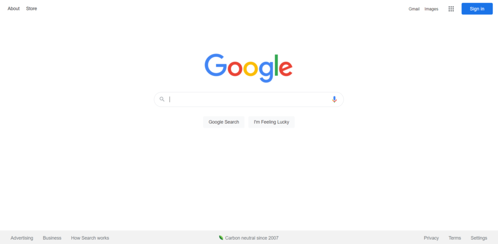
In addition, white space removes distractions and makes it easy for the visitor to know where to look. With over 40,000 searches per second, Google is clearly doing something right.
9. Focus on User Experience (UX)
At Conversion Fanatics, we have an in-depth article on “80 Essential Tips To Improve Ecommerce User Experience“. As such, improving your website’s user experience is an effective way of boosting your conversions.
User experience refers to the quality of a visitor’s interaction with your website and how it made them feel. Offering an excellent user experience means that each visitor will be able to perform the actions they want easily. Furthermore, visitors will effortlessly be able to find exactly what they are searching for.
As such, the best tip I can give you for user experience is to make your navigation consistent and helpful. Furthermore, we recommend ensuring that your website performs well on mobile devices. This is because many of your website visitors will come to your website on a mobile device.
10. Use a Minimalistic Design
Another effective way of creating a conversion-focused design is to use a minimalistic design. A great example of a minimalistic website is Apple. Apple is one of the largest technology companies in the world, but they chose to use a simple and clean design for their website.
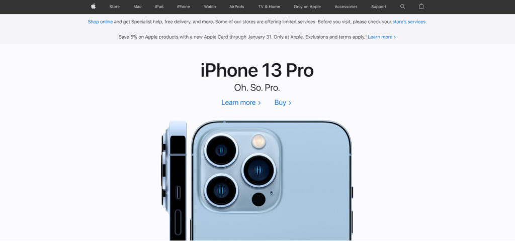
Their website focuses on:
- Short and effective copywriting
- High-quality product images
- Potent navigation
- White space usage
Now It’s Your Turn
There you have it: the 10 principles of conversion-focused design. Taking your time to implement these principles properly will drastically improve your website’s conversion rate.
However, it’s important to focus on one principle at a time. Trying to apply every principle at once will result in errors and a low-quality website.
Now I’d like to hear what you have to say:
Which principle are you going to try first?
Are there any principles we forgot?
Either way, let me know your thoughts on conversion-focused design in the comments section below.