Today we’re going to take a close look at the 15+ best ecommerce landing pages on the web.
Elegant landing pages can be just the ticket you need to increase your store’s revenue and profitability.
In fact, you can take inspiration from any one of these 15+ examples and implement them on your own ecommerce store today.
In this in-depth guide you’ll learn:
- What effective ecommerce landing pages look like
- How to create a standout landing page
- How to turn your store into a conversion machine
- Lots more
So if you’re ready to completely revamp your online store, this guide is for you.
Let’s dive right in.
Ecommerce Landing Page Fundamentals
Before we look at the examples, it’s important that you understand what ecommerce landing pages are.
Oftentimes, people get confused and mixed up between landing pages and product pages.
Landing Page vs. Product Page
Ecommerce landing pages and product pages are similar but ultimately offer different functionality.
Product pages are information-rich and offer everything a shopper needs to know about the product. The goal is to educate the buyer so that he or she can make an informed purchasing decision.
Landing pages are much shallower in content and focus on a single goal: To hook the customer into making a purchase.
These pages focus on emotions and the core benefit the product(s) give.
Usually, landing pages are used as the page people are linked to from an advertisement.
For example, if you were creating a Facebook ads campaign for your new promotion, you would link the landing page for said promotion.
Most ecommerce stores either link to their homepage or product page, which aren’t as effective at getting conversions as landing pages are.
What Makes a Stunning Ecommerce Landing Page
You must always remember, the purpose of a landing page is to convert visitors into customers.
Well-made landing pages can be summed up as short and sweet. The message is always simple and easy-to-follow and the design is clean.
Furthermore, you should avoid having multiple promotions, links, and messages on the landing page. This is because multiple offers can potentially decrease conversions by up to 266% by overwhelming consumers.
When faced with multiple choices, consumers are more likely to panic and leave the website instead of actually choosing one.
You also want to ensure that the landing page is optimized for both desktop and mobile. This means that the page will load fast and look great on any device or platform.
Here are the four essential elements your landing page should include:
1) Attention-Grabbing Headlines
The headline is the first thing people will read when they reach your landing page. For this reason, it’s important to make it engaging and vivid. You should focus on telling shoppers what the product is, why it’s valuable, and why visitors should trust you. A great headline should take some time to formulate, so don’t rush your message.
2) Social Proof
Although not required for amazing landing pages, social proof can instantly provide shoppers with the trust they need to make a purchase. Social proof comes from news articles or celebrity testimonials.
3) Design & High-Quality Images
Ultimately, the design of the landing page is what’s going to captivate users most. I recommend using a minimalistic design without any links or clutter so visitors don’t get distracted. Furthermore, the images should be HD and relevant to your products.
4) Effective Call-To-Action
A great landing page has a well-placed call-to-action button that visitors can click on. It should be seen without having to scroll down and stand out from the other design elements.
Why Are High-Quality Landing Pages Important
As an ecommerce store owner, your ultimate goal is to grow your revenue, profit, and brand awareness.
Landing pages allow you to accomplish all three of these tasks by focusing on your core product benefits and call-to-action.
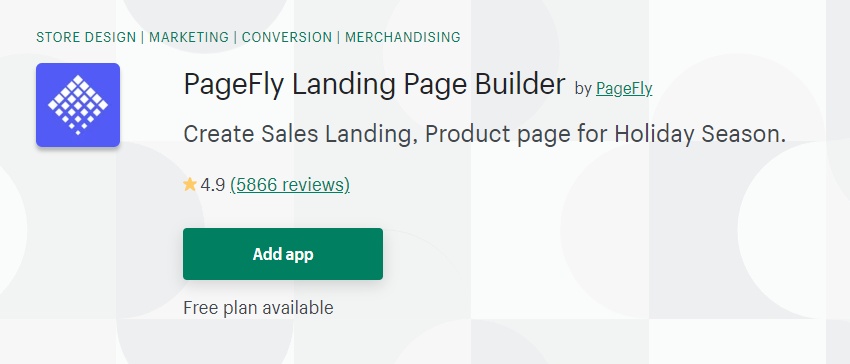
If your ecommerce store is hosted on Shopify, I recommend using PageFly to create your landing pages. This application is easy to use and offers a lot of customizability.
Furthermore, I recommend creating specific landing pages for each marketing campaign you run. By keeping it different, you can see what kind of offer and design bring the best conversion rate.
Another great practice is to make separate landing pages and directly target different segments of your customer base.
For example, you could create a landing page that is only used for people who visited your online website before but didn’t purchase anything. You can include a discount to entice them into making a purchase.
The 15+ Best Ecommerce Landing Pages
Now that you fully understand ecommerce landing pages and the power they bring to your brand, let’s get into the examples.
1) Winc
Winc is a subscription-based online wine store. Customers can receive a personalized box of their favorite wines each month.
Here’s what their landing page looks like:
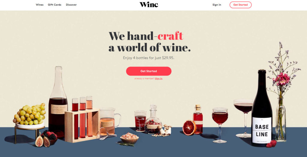
What isn’t shown in the image is that the word “craft” changes every second to “deliver” and then “pick” and then back to “craft” again.
This simple animation is extremely captivating and promotes a sense of personalization.
Moreover, the headline is just 7 words long because 7 words is all they needed to get their message accross.
After clicking ‘Get Started’ customers are directed to a short 5-question quiz.
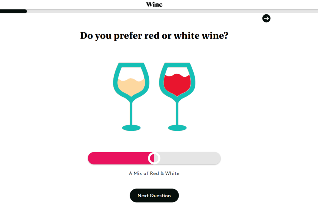
These questions ask what your favorite type of wine is, your favorite flavors, and your favorite food. At the end of the quiz, Winc will pick 4 bottles of wine that best match your preferences.
This level of engagement and personalization offers an amazing experience for any potential customer.
Key Takeaway:
The overall goal of Winc’s landing page is to get customers to take the personlization quiz. The quiz not only increases the duration of a visitor’s stay, it also provides a tailored experience. Visitors will be especially enticed to make a purchase since the wine is specifically catered to what they like.
Furthermore, the hero image on the landing page is clever. They show an array of wine glasses and bottles. Furthermore, you can also see three vials that resemble a wine tasting.
2) Dollar Shave Club
Dollar Shave Club is an ecommerce store that delivers razors and other grooming products to their customers.
They offer standalone products as well as a subscription membership service where customers are automatically billed and sent products every 2, 3, or 4 months.
Here’s what the landing page looks like.
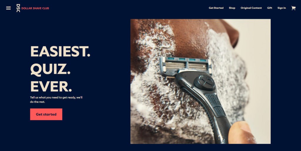
Their landing page is as simple as it gets. With a short 3-word headline, they explain how shoppers can take an easy quiz to find out exactly what they need.
Furthermore, the picture is a high-quality shot of their razor being used in action.
As you continue scrolling down the page, they offer an inexpensive bundle for users who aren’t interested in taking a quiz or joining the club.
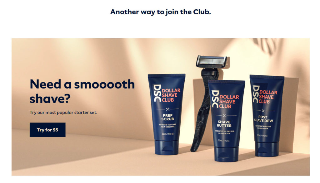
Key Takeaway:
This landing page is effective because it instantly gets the shopper engaged. Remember, the goal of a landing page is to get as many people to complete the call-to-action (CTA) as possible.
They accomplish this by offering a tailored and unique experience through their quiz. Furthermore, by compelling visitors to take a quiz the visitor spends a longer period of time on the website.
Psychologically, by spending more time on a website and being offered a tailored-set of products based on your needs, you are more compelled to become a customer.
3) Fabletics
Fabletics is an active-lifestyle brand that sells apparel to both men and women.
As an ecommerce store, they have an extremely unique concept.
Instead of normal promotions or sales, Fabletics offers a VIP membership where customers can get access to steep price cuts.
Here’s what their current landing page looks like:
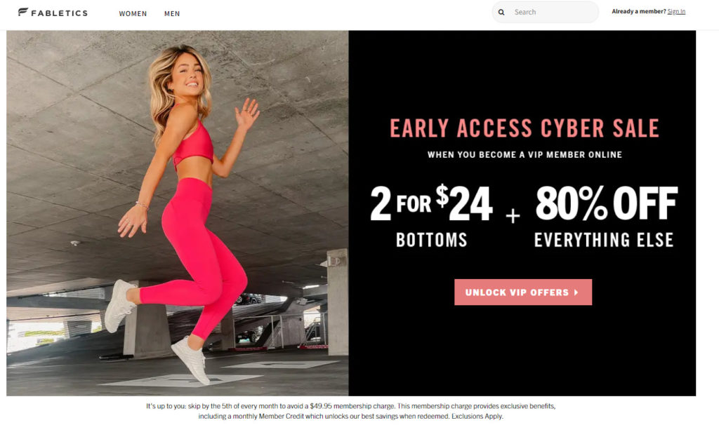
As you can see, they’re offering 80% off of everything. The only catch is that you have to join the VIP club.
However, Fabletics does a great job of showing exactly what a VIP membership offers. Shoppers who are already interested in their products would do anything to get 80% off their order.
In terms of design and the message, they are both extremely simple and eye-catching.
Key Takeaway:
This landing page is bold, straightforward, and offers a heap of benefits to a potential customer.
It also does a great job of getting visitors to complete the call-to-action since the benefits are only available if you being a VIP member.
4) HelloFresh
HelloFresh is a meal-subscription company that delivers fresh ingredients with recipes directly to a customer’s door. They focus on healthy tasty food and recipes that don’t take long to cook.
Take a look at their landing page:
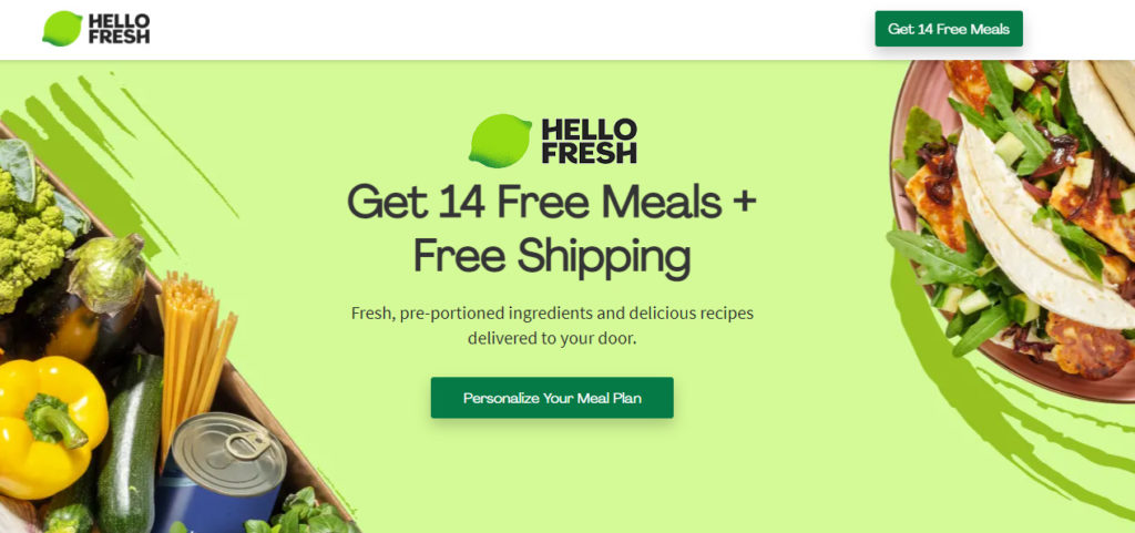
As you can see, you feel an immediate sense of healthy food and freshness. Furthermore, you are instantly offered 14 free meals with free shipping as well.
So, what kind of health-concious eater wouldn’t want to at least click the ‘Personalize Your Meal Plan’ button and see exactly what they have to offer.
Based on this reasoning alone, HelloFresh does an amazing job of getting users to click the CTA and potentially purchase a subscription.
Key Takeaway:
By offering a generous promotion to first-time customers, you can exponentially increase your ecommerce store’s conversion rate.
5) Quip
Quip is an oral hygiene company that offers electric toothbrushes, toothpaste, floss, mouthwash. and gum. Their goal is to promote a lifetime of healthy oral hygiene habits.
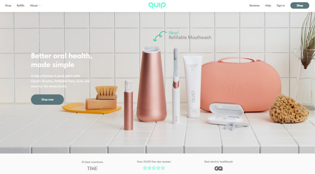
As you can see on their landing page, they display their entire product line with a simple message that convinces users to shop now.
Since they’re not a notable electric toothbrush company like Oral-B or Philips, they also have social proof from Time, GQ, and customer reviews.
Key Takeaway:
The best feature this landing page offers is the image in the background. By displaying all of their products on a sink, visitors can vividly imagine Quip products in their own bathroom.
Because of this, users will have a higher potential of clicking ‘Shop now‘ and learning about the products they offer.
6) Axis
Axis is a smart device technology company that offers a device that automates window shades or curtains. You are able to control your shades by voice or phone after installing their device, Gear, on your window.
Here’s what their landing page looks like:
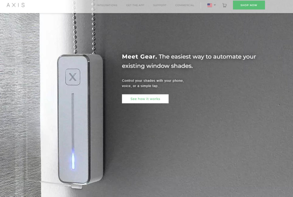
As you can see, their call-to-action is a button that says ‘See how it works‘. Upon clicking the button, a video pops up that shows how the product is used in real life.
I think it’s extremely clever they made their call-to-action a video pop-up. Gear is a device that’s best shown through video since the features are so unique.
By showing customers how the product actually works, they have a higher chance of getting conversions.
Key Takeaway:
Axis identified that their key painpoint was that customers didn’t understand how the product works. For this reason, they created their landing page with the goal of explaining how the product works as best as possible.
7) Vanity Planet
Vanity Planet is a beauty and cosmetics company. This industry they compete in is extremely competitive so they must be as creative as possible when it comes to their brand.
Let’s take a look at their landing page:
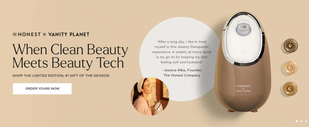
As you can see, the eye-catcher is a quote from Jessica Alba, an a-list actress. You immediately learn that she’s the founder of the collaboration company, Honest, which provides a lot of social proof and trust. Anybody who’s a fan of her movies would instantly be convinced to try her product.
Key Takeaway:
Vanity Planet implemented a very clever tactic by partnering with Honest to develop the product. Through this partnership, they were able to put Jessica Alba’s name on their own brand.
This allowed them to create a uniquely engaging landing page with an amazing call-to-action.
8) Waterdrop
Waterdrop is a company that sells cubes that people can put inside their water. These cubes provide flavoring and are made from real fruit and plant extracts.
Let’s take a closer look at their landing page:
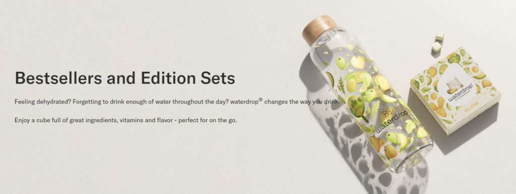
This landing page was directly linked to from their Facebook ads and showcases all of their bestsellers.
Below the main header image is a catalog of their products.
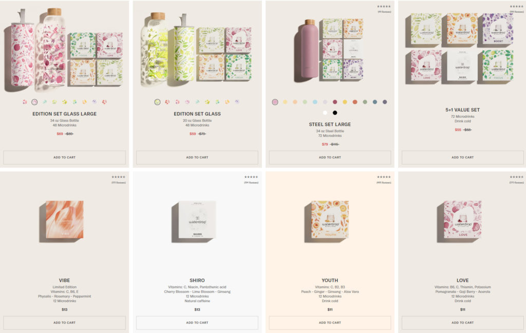
Key Takeaway:
Although this landing page ignores the golden rule of only implementing one offer, it can be difficult to follow that rule for most ecommerce stores.
This is because ecommerce stores usually carry a variety of different products and options within each product.
For this reason, Waterdrop did a fantastic job of implementing a category page into their landing page.
On the landing page, you can add any item to your cart without having to look at the specific product page. This increases the chance of conversions as well as customers buying multiple products.
The design also has a beautiful organic and vintage feel. This is probably because their customer base is interested in these qualities.
9) InfiniteMoon
InfiniteMoon is a sleep company that offers pillows, sheets, and comforters.
They have a landing page specifically for their EverPillow which highlights key features and benefits.
Let’s take a closer look.

The first thing you see is an enthusiastic woman holding the EverPillow with some compelling text.
As you scroll down you’ll see what the pillow is made out of along with the first call-to-action.
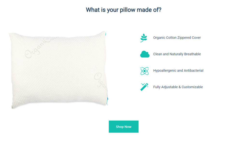
The third section you’ll see is another call-to-action that shows that you have the option of choosing the shape and fill of the pillow.
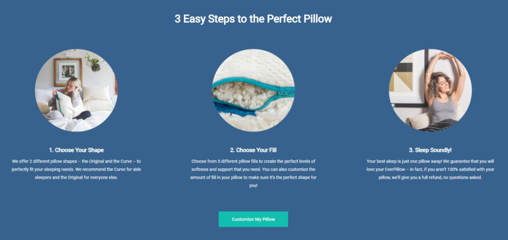
Both call-to-actions bring you to the same page.
The next thing you’ll find as you’re scrolling down is a video.
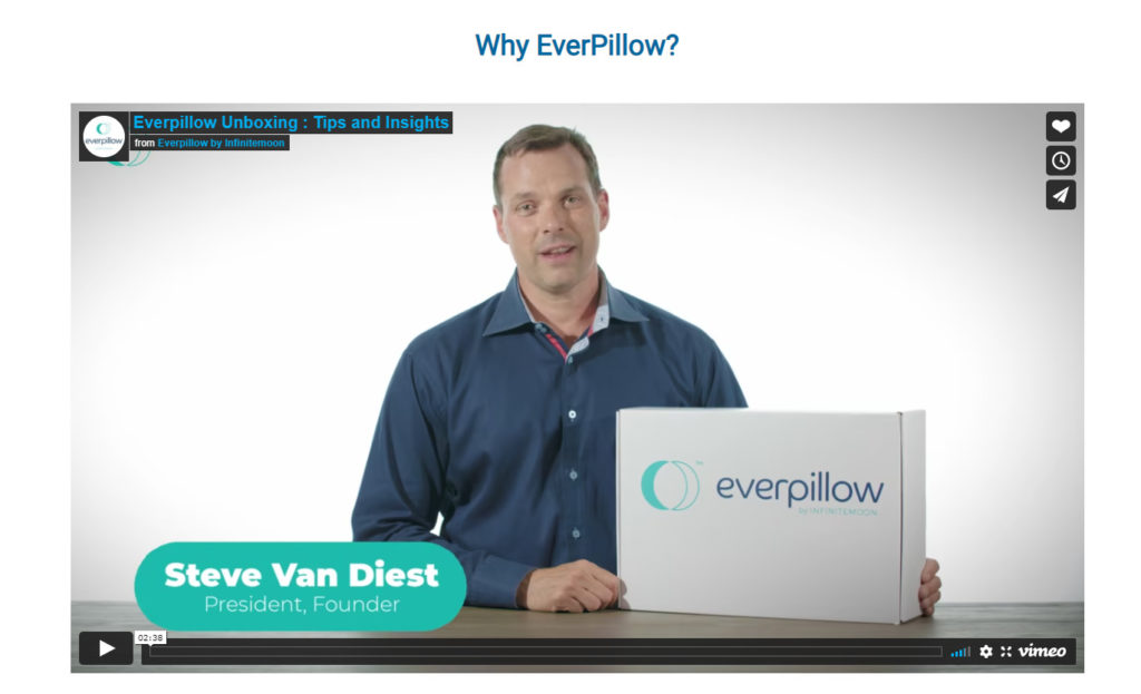
This video includes the founder of the company discussing why you need the pillow and the benefits it offers.
It doesn’t end there.
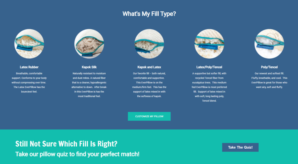
Below the video are two more call-to-actions. One of them showcases all the different fill types they offer. The second CTA allows shoppers to take a quiz to find the best pillow for them.
It still doesn’t end there.
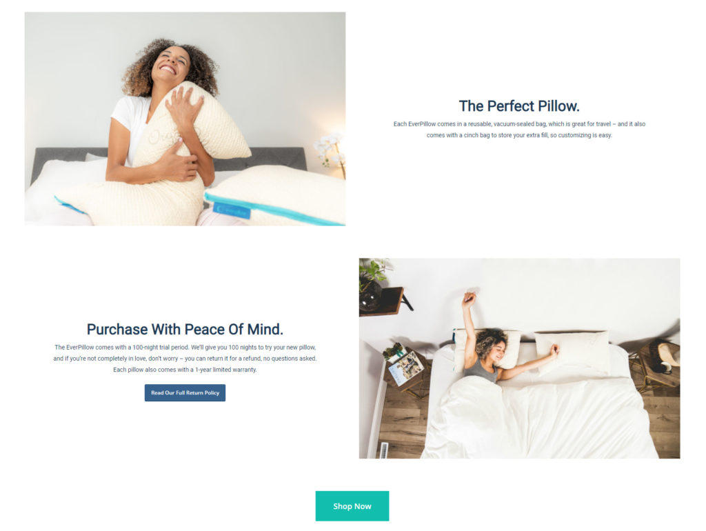
The next thing you’ll scroll to is another CTA that allows shoppers to see InfiniteMoon’s return policy. This provides a sense of security for shoppers.
Finally, the last thing on the landing page is a testimonial box and another CTA directing shoppers to purchase now.

Key Takeaway
As you can see, this ecommerce landing page had a total of 7 call-to-actions and messages that attempt to persuade viewers into buying a pillow.
Even though there is so much content on the page, they don’t dive too deep into the product details and descriptions. Instead, they focus on short and effective lines of text and high-quality images.
It’s common for ecommerce stores to have massive landing page. Each specific section offers another reason why the customer needs the pillow. As a customer continues reading down, they grow more likely to make a purchase.
10) Away-Kit
Away-Kit is a company that sells Airpods cleaning kits. Their landing page is clean, simple, and captivating.
Let’s take a closer look.
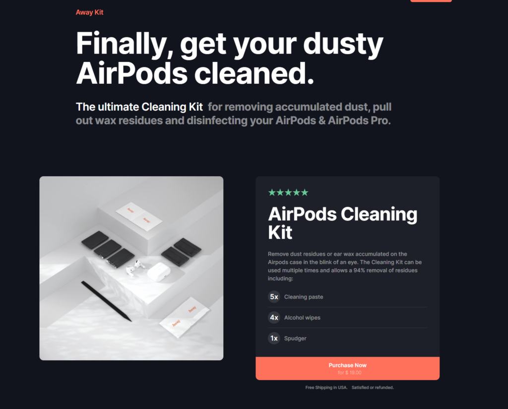
You can instantly feel the futuristic-Apple style design when you view the landing page.
The headline “Finally, get your dusty AirPods cleaned” is casual and friendly but also showcases the product’s benefit.
Furthermore, you immediately see the call-to-action which is an option to purchase now.
This gives shoppers the opportunity to immediately purchase the kit without having to visit any further product pages.
However, if shoppers are still unsure, they can continue scrolling down to see more benefits the product offers.
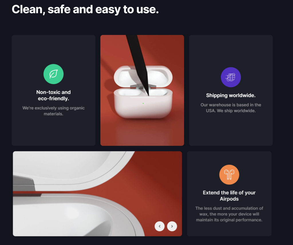
You can also find the product inspiration:
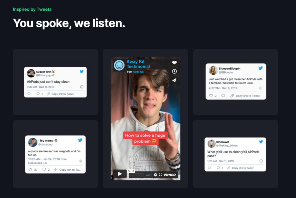
As well as an FAQ section:
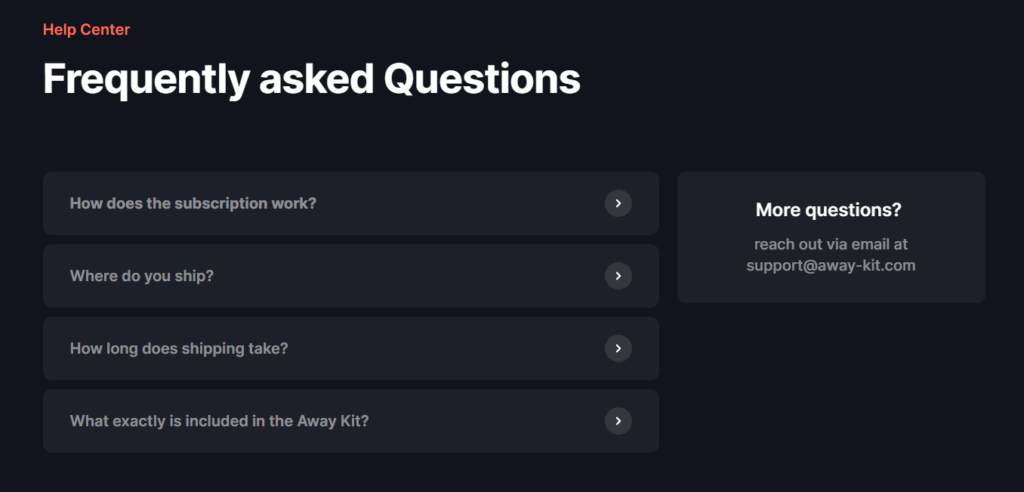
Key Takeaway
The goal of this landing page is to convert customers without having too much text on the page. By focusing on design and effective headlines, Away-Kit is able to keep shoppers more engaged.
11) Fitbit
Fitbit is a technology company that specializes in smartwatches. They have a specific landing page for all of their new products that makes for a great example.
Let’s take a look.
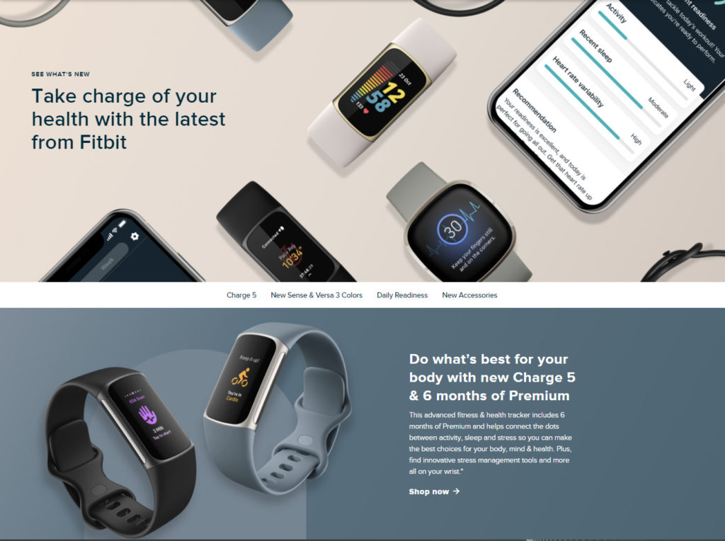
The overall goal of this landing page is to show their audience all the new and updated products they have to offer. Upon viewing the landing page, you are immediately met with a large hero banner that showcases a few of their products.
The headline also hints towards the fact that you can get even better health benefits with their latest technology.
As you scroll down, you’ll find sections that summarize all the new products they have. Each section is short and straight to the point.
Furthermore, each section is colored differently and has its own unique call-to-action for the specific product.
Even though the page is long, nothing feels cluttered because the page is designed beautifully without too much text.
Key Takeaway
Fitbit provides a great example of how to create a landing page with multiple offers. Even though too many options can overwhelm visitors, each section is concise and uncluttered.
12) Oura Ring
Oura Ring‘s are worn around the finger and offer 24/7 heart rate monitoring, personalized health insights, and much more.
Let’s take a closer look at this beautifully designed ecommerce landing page.
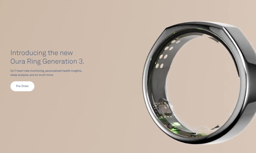
As you can see, their product is currently unavailable but the CTA allows customers to preorder the ring.
However, the page doesn’t just end there.
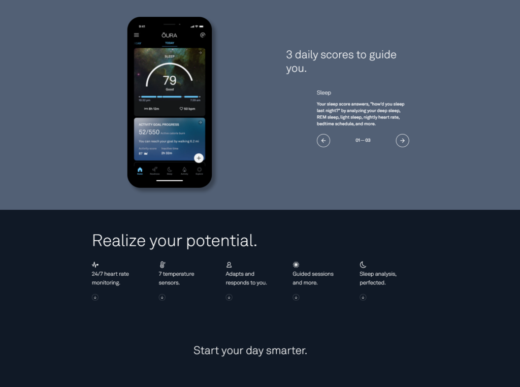
As you continue scrolling down, you’ll be met with 11 more sections that provide further insight into the product.
Each section is colored differently, uses beautifully detailed images, and provides short and effective text.
Key Takeaway:
This landing page paints a picture in the viewers’ minds of a new and improved lifestyle with the benefits the ring provides.
As an amazing landing page does, you’re able to learn all the features of the product without having to read walls of text.
I encourage you to take a look at the landing page yourself to see how well it’s actually designed.
13) Lumin
Lumin is a beauty and cosmetics company that exclusively targets men. They were one of the first cosmetic companies that successfully penetrated the men’s beauty industry.
This was accomplished by having an impressive marketing strategy and an equally impressive website.
Let’s take a look at their landing page.
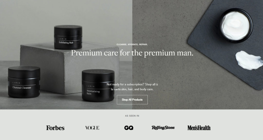
Since men and beauty products don’t often pair together, Lumin focuses on portraying a premium skincare brand for the modern man.
The headline is short and sweet but offers a lot of impact. Furthermore, they have amazing social proof by showing they were displayed on Forbes, Vogue, GQ, Rolling Stone, and Men’s Health.
These are all well-respected companies that bring a sense of security and confidence to potential customers.
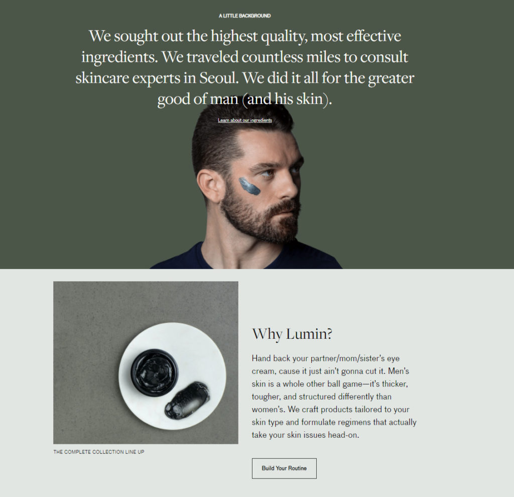
If the first call-to-action didn’t work, viewers can continue scrolling down to find more supplementary information about their products.
Key Takeaway:
Lumin showcases how effective a well-written headline can be. The image of the man with product on his face also showcases how even “manly” looking men should care about their skin.
Since some men may feel insecure about looking at skin products, Lumin’s packaging, products, and message all show that skincare is important regardless of your gender.
14) Love Wellness
Love Wellness is a company that focuses on women’s health. They offer supplements, cleansers, and various different kits.
I wanted to show their landing page because they offer something extremely unique.
What is it?

As you can see, they are offering two free gifts for every purchase. Offering something for free is an effective way of actually getting visitors to purchase an item. Furthermore, there’s no cart requirement so you can receive the free gifts by purchasing even the most inexpensive item.
Key Takeaway:
I believe their goal is to capture as many customers as possible in hopes of converting them into lifetime customers. Since they are selling cleansers and supplements, users will always have to restock once they run out.
For this reason, I think this type of landing page is ingenious and probably one of the reasons why this company is so successful.
15) Doodly
Doodly is a whiteboard animation software. Although they’re not selling a physical product, their landing page is a great example of how to effectively capture a viewer’s attention.
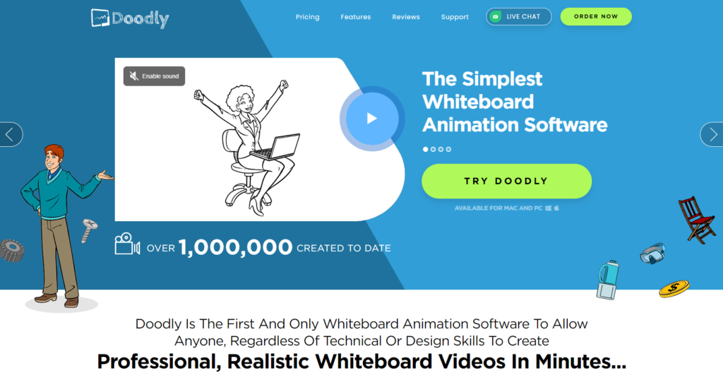
As you can see, the hero banner on the landing page showcases a video of the software being used in action.
This can instantly answer any questions visitors had on what the software does.
Furthermore, the call-to-action is bold but not aggressive. “Try Doodle” offers more of a risk-free suggestion than a forceful push.
The landing page doesn’t end here though, it continues scrolling down for 16 more sections. Yes, that’s 16 more sections of information and content explaining the software.
Key Takeaway:
Although the amount of content on the landing page is excessive, I believe they’ve done this in an attempt to answer any question a visitor would have. Since the software is so unique, every customer has a different need and different questions.
16) Netflix *Bonus*
Although Netflix isn’t an ecommerce website, their landing page is something to be inspired by. Using only 22 words, the main message is compelling and offers a sense of comfort. “Watch anywhere” and “Cancel anytime” really engrains the fact that people have nothing to lose by signing up.
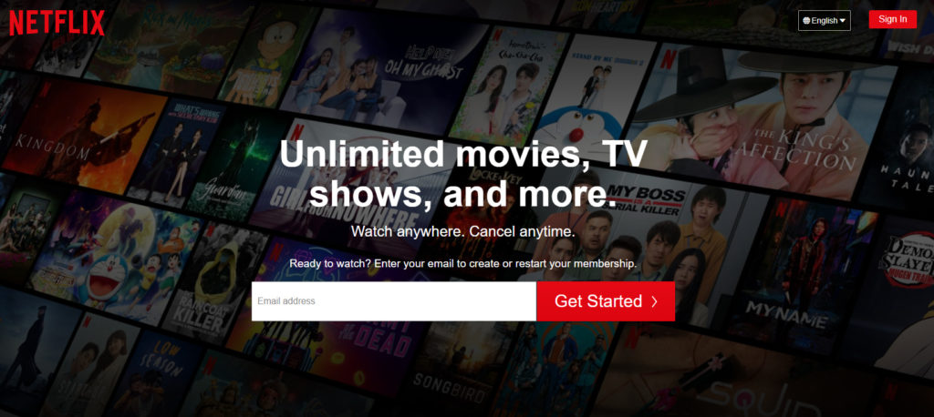
Yes, there’s more information if you were to scroll down but most people don’t. They see the first message and instantly type in their email.
Furthermore, the background and color scheme make it feel like you’re sitting at a movie theater and given the option to pick any movie you want.
Key Takeaway:
Overall, the designers completely knocked it out of the park with this landing page. It’s easy on the eyes, engaging, and offers a compelling call-to-action.
Conclusion
Well, there you have it. My 15+ best ecommerce landing page examples that you can imitate to instantly drive more revenue.
Now I’ll leave it to you: Which landing page did you like most?
Did we miss any other amazing examples?
Either way, let us know by leaving a quick comment right below!

