


If you’re looking to enhance your ecommerce store, A/B tests offer an effective way of optimizing your store.
In fact, A/B testing allows you to increase your ecommerce store’s conversion rate, reduce cart your cart abandonment rate, and much more.
In this in-depth guide, I’ll discuss:
- What A/B tests are
- Why you need to run A/B tests
- 34 A/B tests you can use to improve your ecommerce store today
- Examples from the leading ecommerce websites
- and much more
A/B testing is one of the most potent ways of improving the most critical metrics in your business.
So if you’re ready to dedicate some time to revamp your ecommerce store, today’s guide is perfect for you.
Let’s get started.
What is A/B Testing?
Simply put, A/B testing, also known as split testing, is when you determine which content, design, or functionality resonates most with your site visitors.
It’s much more than only changing around a few colors on your CTA buttons or offering new promotions in your headline.
Some examples of practical A/B testing include:
- Adjusting navigation items to see which one produces more sales
- Testing multiple content layouts on the same product page to see which layout brings more sales
- Testing different product taxonomies on your ecommerce site to see which one is better at capturing sales
Before you get too excited and think about immediately tripling your store’s monthly revenue, there are important things you should know.
Although exponentially boosting your store is the goal, effective A/B testing requires patience and discipline.
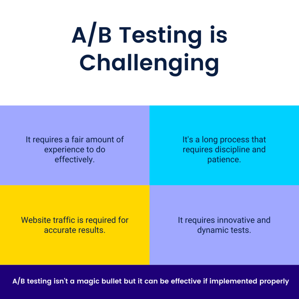
As such, you’ll need to repeat tests until you get the best and most optimized version.
Each successive test should build upon the results of the previous tests. Improvement is always possible, and you shouldn’t get comfortable when you see a slight increase in performance from one test.
A/B testing is similar to working out and lifting weights in the gym. You won’t see immediate improvement, but consistent daily workouts will build into incredible results over a long period of time.
Benefits of A/B Testing
Running an ecommerce store means that you have dozens of tasks to worry about. From managing advertisements to getting ready for new product launches, your time is being pulled in multiple directions.
I understand the struggles that come with being an ecommerce store owner as I’ve run my own stores for several years. However, A/B testing has allowed my stores to reach newer levels without even needing to change my advertisements.
This is because effective A/B testing lets you substantially improve your customers’ shopping experience.
A customer-first ecommerce website leads to:
- More conversions
- Less abandoned carts
- Increased revenue
- Better customer loyalty
- Fewer complaints
- and lots more
A/B testing is so effective because it’s based on statistics and data. Furthermore, A/B testing dramatically reduces the risks that come with an entire website re-design. By slowly testing different parts of your ecommerce store, you can gradually build your store into a conversion machine.
34 A/B Test Your Ecommerce Store Needs To Try Today
1. Product Page Layout A/B Test
With this method, you should test to see if putting more educational content about the product higher on the page will impact the add-to-cart rate.
Through this, you can discover which content layout produces more sales for your ecommerce store.
2. Form A/B Test
With a form A/B test, you should see if your customers are more willing to complete a form with fewer fields and more straightforward text within the fields.
3. Navigation A/B Test
In this A/B test, your objective is to determine if customers navigate better with a navigation menu at the top level or with a drop-down menu. The goal is to help customers make it to the checkout page as efficiently as possible.
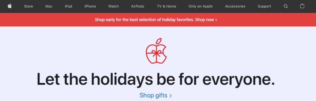
As you can see, Apple uses a top-level navigation bar instead of a drop-down menu. This is because they have a small set of prominent products, so a top-level navigation bar makes it easy for customers to find what they’re looking for.
4. Free Shipping A/B Test
Free shipping is essential for many online shoppers. For this reason, conduct a split test by comparing your store’s conversion rate with free shipping and without. To keep your margins the same, you can add the cost of shipping to the product’s base price with free shipping. Furthermore, you should ensure the customer can clearly see your store offers free shipping.
The number one reason why customers abandon their checkouts is because of extra costs such as shipping, tax, and additional fees.

As you can see from the image above, Shein offers free shipping on all orders. They even go a step further by including a countdown timer. This induces urgency in their visitors and forces them to purchase an item quickly.
5. Hero Image vs Carousels A/B Test
The banner on your homepage is the first thing shoppers will see when they arrive at your ecommerce store. However, carousels are usually less effective than a single high-resolution hero image. For this reason, test both a carousel and hero image to see how it impacts your store’s conversion rate.
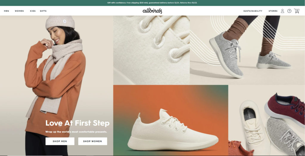
Allbirds provides an excellent example of a hero image that’s simple and effective. Although they use several images throughout the banner, they aren’t using a carousel. Furthermore, the text is exceptionally minimal, so visitors don’t have to spend much time reading.
6. Call to Action Button A/B Test
When it comes to your ecommerce store’s CTA buttons, you can test different:
- Sizes
- Phrasing
- Color
- Placement
In terms of sizing, your CTA buttons should be prominent and easy to find. It’s vital that each CTA button is placed in the optimal location. So, test out different sizes for your CTA buttons, such as your ‘Add to Cart’ and ‘Checkout’ buttons.
For phrasing, each CTA button should clearly state the button’s purpose. Your customers should completely understand what clicking each button does and where it takes them. Research shows that having ‘Submit’ is more effective than using ‘Apply Now’ for your email form forms. This is because ‘Submit’ sounds more reliable and welcoming inside the consumer’s head.
The overall design of your website, including the CTA buttons, is important. So, your CTA needs to boldly stand out on each page they are located on. The CTA buttons should never blend into the background. Instead, test different appealing and inviting colors.
Your CTA buttons should also be placed “above the fold” which means users don’t have to scroll down to find it. Furthermore, it would help if you didn’t have too many CTA buttons listed close to each other. You can use ‘Add to Cart’ and ‘Checkout’ on your product pages.
7. Headline Wording A/B Test
The copy on your landing pages or home page is the first thing new shoppers will see when they enter your ecommerce store. For this reason, the headline has a significant impact on your website’s first impression.
Well-written copy can tremendously boost your store’s conversion rate, so testing different headlines is essential. Use A/B testing to see what kind of wording resonates the most with your customers.
8. Checkout Page Layout A/B Test
Your checkout page should provide a seamless process that allows your customers to check out quickly and efficiently. In fact, single-page checkout pages typically perform better than multi-page checkout pages.
So, test one-page vs. multi-page checkout screens and monitor which one causes more checkout abandoners. However, both versions should offer easy-to-read form labels and avoid distracting inner-links.
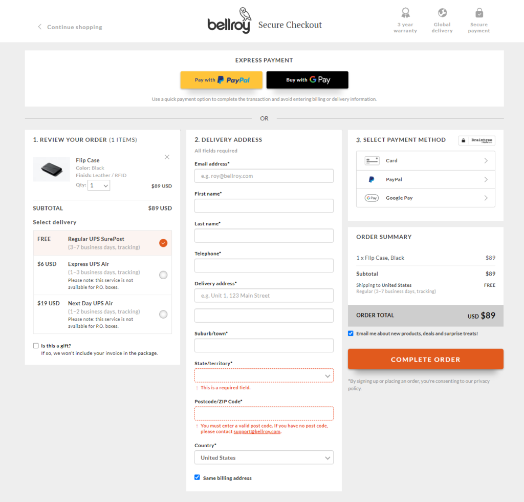
Bellroy uses a single-page checkout where each section is clearly divided. Furthermore, the bold form labels make it easy to understand what information needs to be provided.
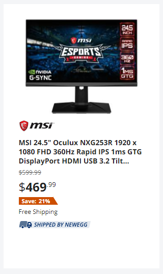
9. Product Name A/B Test
Another A/B test you can run on your ecommerce store is changing the names of your products. For example, Newegg uses ultra-specific product names since they sell electronics.
However, the names you change your products to should correlate with your specific products and overall brand image.
For instance, “Comfort Fit Redemption Hoodie” is a much more appealing name than “Gray Hoodie”. However, it all depends on your brand and the image you’re going for.
10. Product Video A/B Test
Depending on the products in your ecommerce store, it may be a good idea to test out product videos. Product videos allow your visitors to see an in-depth look at the product and the benefits it offers.
Many ecommerce stores that focus on apparel and footwear often use products videos to enhance their product pages.
So, record high-definition product videos and test them against product pages without videos.

Patagonia’s product pages often include a video underneath the main product photo, pricing, and add-to-cart button. This video showcases an individual using the backpack as they are fly fishing in a river. So, be creative with your videos and show real-life use cases.
11. Email Popup A/B Test
The majority of ecommerce email popups offer something along the lines of “Sign-up and get 10% off of your first purchase”. Although customers appreciate any sort of discount, it’s important to test different offers.
12. Default Guest Checkout A/B Test
Instead of forcing your visitors to create an account on your website, you can run a test using guest checkouts instead. In fact, I recommend always having a guest checkout option, but you can run a split test first to see if it’s effective or not.
The goal of offering a guest checkout is to reduce your store’s cart abandonment rate by providing a faster checkout process.
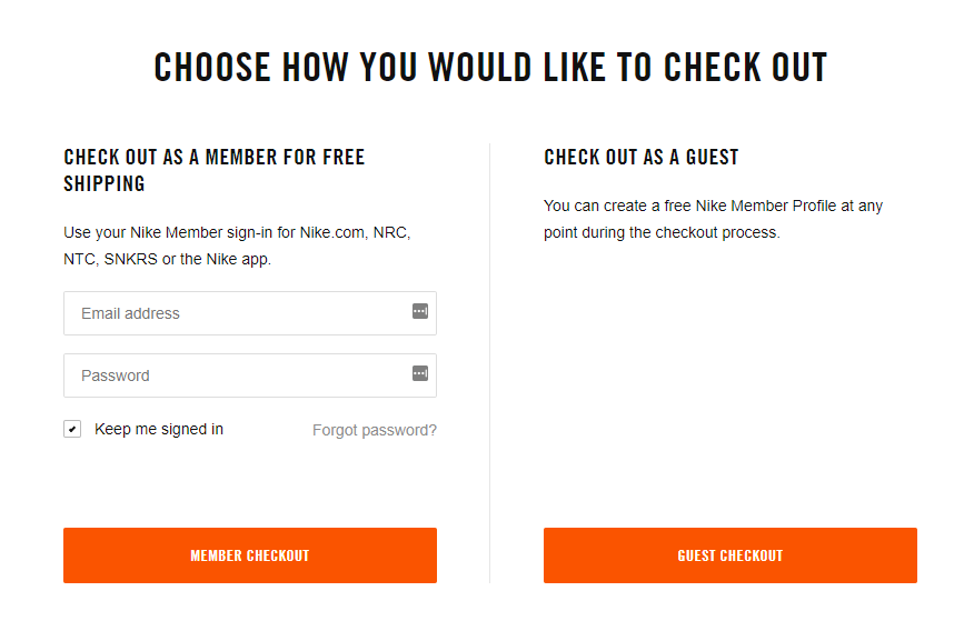
Nike offers a guest checkout that makes it extremely simple for inpatient visitors to complete their purchases.
13. Product Quick View A/B Test
A product quick view allows your visitors to see additional product information without leaving the page. This will help them compare products easily and make faster buying decisions. Your quick view can also allow them to add the product to the cart immediately without visiting the product page.
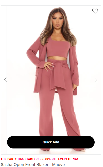
As I hover over a product on Fashion Nova, a ‘Quick Add’ button appears that allows me to add the item to my cart instantly.
14. Promotional Offer A/B Test
When it comes to promotions and discounts, online shoppers absolutely love them. For this reason, it’s important to find a promotion that is optimized for your audience and produces the best results.
There are a variety of different discounts you can offer:
- Standard % off discounts
- % off discounts once a certain price is reached
- $ off discounts once a certain price is reached
- Free shipping offers
- Buy one get one offers
- Product bundling offers
- and much more
It’s up to you to be creative with your promotions and continue testing until you see an offer that has a significant impact on your conversion rate.
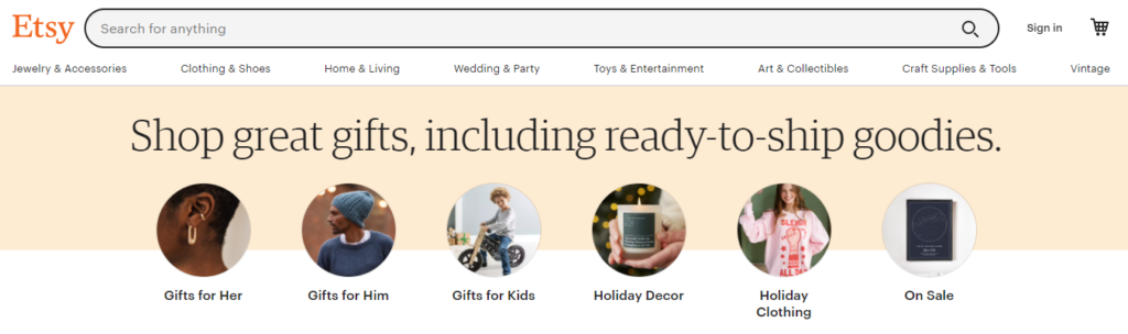
15. Search Bar Appearance A/B Test
It’s important to make your search bar visible and easy to use. For this reason, you can test the size, placement, and text in your search bar. For instance, Etsy uses an extremely wide search bar that’s placed directly on their headline bar. This makes it easy for their customers to find anything they’re looking for.
16. Key Footer Information A/B Test
Although ecommerce store owners commonly overlook website footers, they are important in the overall user experience of your store. In fact, a well-designed footer with helpful information can reduce your website’s bounce rate and improve conversions.
So, test a website footer that includes key information and helps customers find what they’re looking for. You can also include your ecommerce store’s contact information and office address, as well as trust badges.
17. Chatbot A/B Test
Chatbots allow customers to get real-time help when they have a question or a problem arises. Furthermore, chatbots are proved to be an effective technique for improving your website’s customer experience. They are also inexpensive to implement and easy to test.
So, test out your website with a chatbot and without to see how effective it is at providing help for your customers.
18. Display Top Selling Products A/B Test
As an ecommerce store owner, you already know which products are the best-sellers. So, implement an A/B test where one version of your homepage lists your store’s best-selling products directly under the hero image. This way, customers can easily find your most popular products since they will likely be interested in them.
19. Filtering and Sorting A/B Test
Effective filters allow your customers to find exactly what they’re searching for. So, you can test:
- Sticky side filters that stay on the page as they’re scrolling
- Different groupings of filter options
- Different options that sort product by price, alphabetical order, top rated, etc.
The more options you give your customers in terms of filtering, the happier your customers will be.
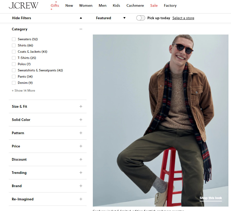
J.Crew offers a sticky side filter that makes it easy to sort through different products. Furthermore, it’s easy to collapse if you don’t want it on your screen.
20. Feature Top Product Categories A/B Test
Instead of showcasing individual products on your homepage, you can feature your store’s top product categories. This A/B test is highly beneficial for ecommerce stores with a multitude of different products and product categories. Your website serves to help customers find what they’re looking for, and highlighting your top categories is an excellent way to do so.
21. Highlighting Discounted Items A/B Test
You can implement an A/B test to emphasize discounted items by striking through the original price and positioning it next to the discounted one. I recommend including the exact percentage the discount offers to draw attention to the customer’s savings.
22. Hover Effects For Product Thumbnails A/B Test
An underutilized feature in ecommerce stores is hover effects on your category pages. A hover effect is when visitors move their cursor over a product, and additional information appears without needing to click. This additional information should include available colors, sizing options, and so forth.
23. Product Size Charts A/B Test
Sizing charts are extremely important for apparel and footwear stores. Without them, customers may order the wrong size and return the item. So, if your sizing chart is located on a separate page, you can test to include it on the product page it fits. For example, a women’s jacket should have the women’s jacket sizing chart directly on the product page.
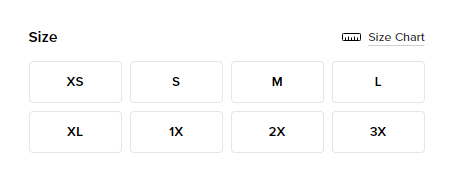
Fashion Nova offers a clickable size chart right above the size options. This makes it easy for customers to match their size to the correct option.
24. Exit-Intent Popup A/B Test
Exit-intent popups are usually triggered to appear when:
- The customer moves their cursor outside of the browser window
- A customer spends more than a set amount of time on the cart and checkout pages
Furthermore, the exit-intent popup usually offers a last-second deal to convince the customer to make the purchase finally. You can run an A/B test of your store that has an exit-intent popup turned on. Compare it against your store’s performance when the exit-intent popup is off.
25. Product Page Description A/B Test
When it comes to your product descriptions, there’s a variety of different A/B tests you can run.
- Layout
- Length of text
- Including detailed graphics
- Changing the wording
- Providing an FAQ section
A product description aims to answer any potential question a customer may have about a product. For this reason, it’s important to offer detailed but concise information.
26. Product Image A/B Test
In terms of product images, you can test different ones. For example, you can take new and improved product images of your products that aren’t selling well and see if the new images lead to higher conversion rates.
I recommend using high-definition pictures that show a vivid display of product detail.
27. Product Price A/B Test
As you may already know, one of the most important split tests you can run on your ecommerce store involves your product prices. So, it would be best if you implemented a pricing strategy based on how much customers think your product is worth.
28. Personalization A/B Test
Ecommerce personalization is when you offer product recommendations based on what a customer searched for or purchased before. By using previous shopping behavior, your ecommerce store can offer a more personalized catalog of items the customer may be interested in.
So, test your website with and without personalization and see how it affects your overall revenue.
29. Back In Stock Notification A/B Test
When your products are selling well and inevitably go out of stock, you can notify your visitors when the product is back in stock. Not only will you be able to collect their email, but the user also won’t walk away empty-handed.
So, you can test the impact of offering back-in-stock notifications against a page that doesn’t offer them.
30. Value-Add Emails A/B Test
Although it may seem like you have to pitch your products to your visitors constantly, this is not the case. In fact, you can send emails to your newsletter list with helpful advice about your niche.
For example, let’s say you had an ecommerce store selling workout apparel. Instead of your typical sales emails that promote different products, you can send an email that offers workout or nutrition advice. Through this, you’ll be able to increase the value of your brand in customers’ eyes.
So, test how your value-add emails perform against your standard promotional emails.
31. Upselling vs Cross-Selling A/B Test
When it comes to upselling vs. cross-selling, you can test selling higher-end products against complementary products. For example, Apple are upselling specialists because they always offer upgrades on their electronics. On the other hand, Amazon are cross-selling experts because they offer intriguing related products on every product page.
So, find the most optimal cross-sell and upsell offers for your ecommerce store and test their effectiveness against each other.
Here’s an example of how Amazon offers cross-sells.
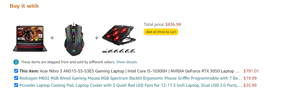
As you can see, instead of just purchasing the laptop, they offer a bundle that includes a gaming mouse and a laptop cooler. The additional items are both useful products new laptop owners may need.
32. Tags On Product Preview Images A/B Test
Highlighting if a product is a “Best Seller”, “New”, or “On Sale” is a great way to influence your visitors to make a purchase. In fact, online shoppers are more motivated to purchase a product with a callout that interests them.
So test out your website to include product tags against your website when it doesn’t offer product tags.
Here’s an example of how Wayfair offers product tags.
As you can see, the new and on sale products are emphasized clearly.
33. Customer Reviews A/B Test
Customer reviews are a fantastic way of convincing customers who are on the verge of purchasing a product. This can come in the form of previous customer reviews or Instagram posts. So, be sure to test your website to include product reviews on the category pages, product pages, and even the cart page.
34. Homepage Layout A/B Test
Your homepage acts as one of the most important parts of your ecommerce store. This is where visitors will be able to find what they’re looking for, as well as any promotions your store has.
However, it’s important to have a homepage that’s lean and uncluttered. Instead of promoting dozens of different offers, think about how you can narrow it down to only one to three.
So, test out a new and improved homepage layout against your current one and monitor which one produces more sales.
Conclusion
I hope you enjoyed this extensive guide on the 34 A/B tests you should run for your ecommerce site.
Now I’d like to hear from you: Which strategy from today’s guide are you going to implement first?
Are there any split testing methods I forgot to mention?
Either way, let me know by dropping a quick comment below.