This is the ultimate guide to easy conversion optimization wins in 2022.
In this new guide I’ll show you:
- What conversion rate optimization is
- How to optimize your online business
- 13 quick conversion optimization wins
- Lots more
So if you want to spend some time to work hard and improve your company, you’ll love today’s actionable guide.
Let’s dive in.
Conversion Rate Optimization Basics
Conversion rate optimization (CRO) is the systematic process of getting more website visitors to take a specific desired action.
Here are some conversion goals grouped by industry type:
- Ecommerce – product sales, add-to-carts, shopping cart completion rate, email list sign-ups
- Media – pageviews, ad views, recommended content engagement, newsletter subscriptions
- Travel – booking conversions, social shares, ancillary purchases
- B2B – leads generated, deals closed
Conversion optimization involves improving the way your online business generates revenue. No matter what type of business you have, there are strategies you can implement to improve your conversion rate.
This is achieved through content enhancement, split testing, workflow improvements, and much more. We’ll discuss exactly how to ramp up your website’s conversion rate today.
What Can CRO Do for Your Business?
While we already know that conversion rate optimization generates more revenue, it also offers other unique benefits.
Let’s discuss them.
Competitive Advantage
Conversion optimization gives you a fighting chance against massive competitors. Whether you’re running an eCommerce store or marketing agency, every online industry is competitive.
Furthermore, new players enter your space every day, intending to take your customers.
There’s one common mistake I see online businesses make frequently. It’s when they solely focus on traffic generation without optimizing the system that converts the traffic into leads or sales.
If you already have traffic coming to your website, this guide is perfect for you. You’re at the stage where it’s vital to optimize your conversion funnel.
CRO gives your website the ability to compete with any other website in your niche.
Understand User Behavior
The way users interact with your website is everything.
It’s the closest you’ll get to reading your potential customer’s minds.
It tells you what they respond to best, what they’re looking for, and what causes them to bounce.
This means you can give your visitors exactly what they want when they enter your website. Conversions would happen much quicker because visitors would have what they need right away.
But how can you accomplish this?
Get a solid understanding of Google Analytics and learn how to use it. Google Analytics allows you to monitor user behavior over time.
You can learn:
- Where your visitors are coming from
- What channels are driving in the most traffic
- Where on your site are visitors spending the most time
- Where visitors leave your website the most
Then, you can deploy our CRO tips to keep your visitors engaged.
Lower Customer Acquisition Costs
Customer acquisition cost is the cost associated with convincing website visitors to buy a product or service.
This is the metric that can make or break your business because high customer acquisition costs will eat your profit margins.
On the other hand, larger profit margins give you more flexibility in the market and can be accomplished with excellent conversion optimization.
Maximize Profit Margin
Simply put, more conversions lead to more significant profits.
The best way to capitalize on CRO is to map out your entire customer journey. This map illustrates the path your customers go through when they interact with your website.
Once you’ve drawn this map out, deciding what to optimize at each stage should be crystal clear.
13 Quick Conversion Optimization Wins To Implement Today
It’s time to go over 13 quick and easy ways to improve your website’s conversion optimization.
1. Simplify Your Website
Simple website designs generally have better conversion rates.
Depending on your business, you might have hundreds or even thousands of different products for sale on your website. Trying to cram everything into a single page is ineffective and will crush your conversions.
Clutter overwhelms your website visitors and makes it hard for them to find what they’re looking for. Instead, it would help to focus on your best selling products or items with the highest profit margins.
Let’s take a look at how one of the most popular brands in the world set up their website:
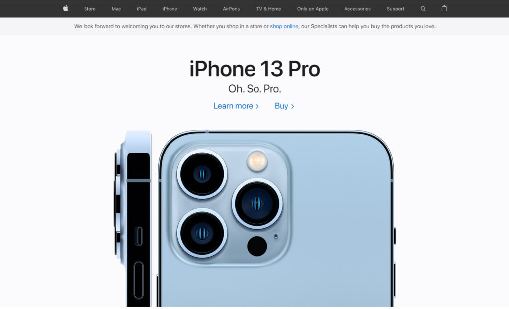
Looking at the most successful companies is always a great idea when you’re looking for inspiration to optimize your website.
Apple is a tech titan, and their website is ultra simple.
Rather than cramming all of their products into the hero banner, Apple focuses all their attention on the iPhone 13 Pro. The iPhone 13 is their latest phone model and their best seller.
So, there’s a good chance that the majority of website visitors are looking for the iPhone 13.
Below the iPhone 13 Pro image is another image featuring the iPhone 13.
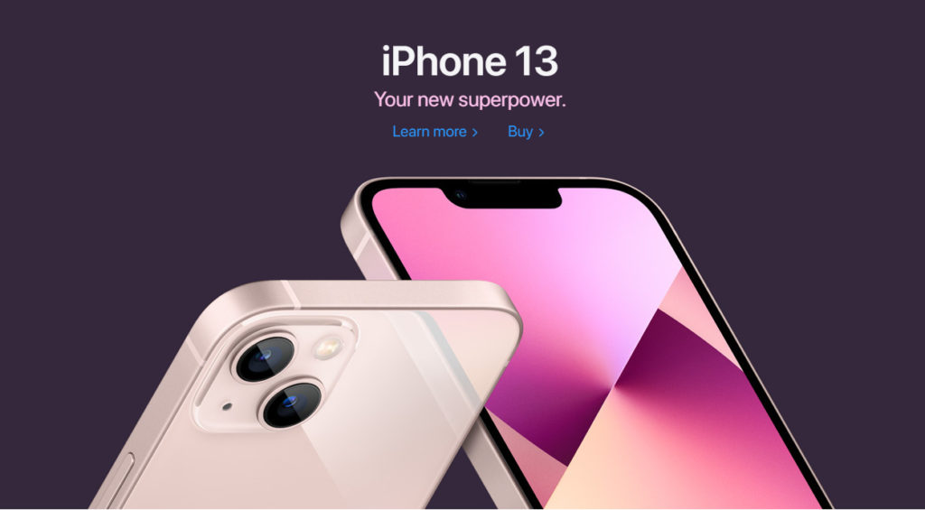
Apple decides to promote the iPhone 13 again instead of any other product. As you continue scrolling down, you’ll find images that feature the Apple Watch, MacBook Pro, and AirPods. However, the iPhone 13 is the centerfold of the Apple website.
I recommend analyzing the most prominent leaders’ websites in your industry. Examine how they designed their websites and what their user experience is like.
You can then take inspiration from their websites to optimize your own.
Remember.
Simplicity is key when it comes to conversion optimization and improving your landing pages. The easier you make it for the customer to complete the conversion, the more likely they’ll complete the conversion.
2. Include a Search Box
Another common mistake I see is websites without a search box. Users should be able to browse through your website quickly and conduct searches without a hiccup.
According to Polonioli, 30% to 60% of visitors usually conduct an on-site search. Furthermore, the users who do conduct a search query are two to four times more likely to convert than visitors who do not.
This is why I recommend having a search box that’s easy to find and use.

Nike’s search box is directly on every web page’s navigation bar.
Once you click the search bar, you are taken to a full-screen search experience.
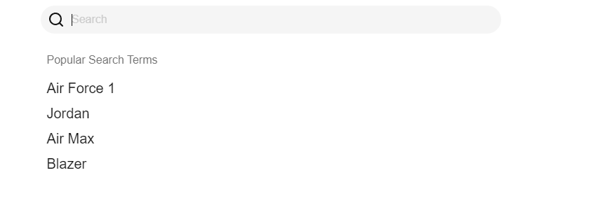
There is also an auto-complete suggestion feature as you start typing your query.

I began typing “air” in the search bar, and a bunch of products with “air” in the title appeared.
Nike’s search function is outstanding.
3. Have Clear CTA Buttons
Your CTA buttons are what visitors will click in order to purchase a product or service. Without clear CTA buttons, visitors won’t know how to proceed to the next step in the customer journey.
If visitors don’t see a CTA, how likely are they to click it?
Not very.
In fact, 70% of small businesses don’t even have a CTA on their home page.
Even if you do have CTA buttons, it’s important to choose the right color and design.
It would help if you tried to include words like “Now”, “Free”, or “Today” to convey urgency.

This is how Adidas attempts to convince visitors into joining their Creators Club.
Here’s how I recommend structuring your website’s pages:
- Decide the primary goal of the page
- Build the design around funneling users into the first goal
- Decide on the secondary goals of the page
- Make your primary CTA the most prominent element
- Include your secondary CTAs and nothing else
Your CTA buttons should be bold and stand out from other content on your website.
Patagonia’s homepage is clutter-free, with a clear CTA located right in the middle of the hero image.
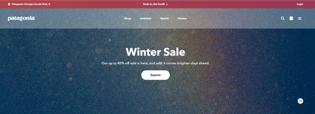
Let’s look at another example from Backlinko:
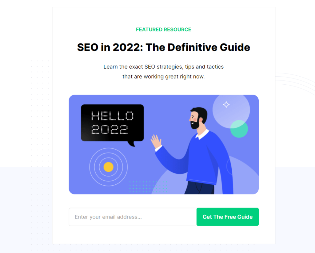
The “Get The Free Guide” button is bold, noticeable, and enticing.
4. Highlight Items That Are on Sale
75% of shoppers report searching through their inboxes just to look for relevant discounts. Price is the most important factor when it comes to a purchase decision. This is why sales and promotions can provide an exponential boost to your website’s conversion rate.
If you do have discounted items, it’s essential to highlight them. Never hide your discounted items.
Ecommerce powerhouse, Fashion Nova, is a clothing company specializing in discounts.
Please take a look at their homepage.
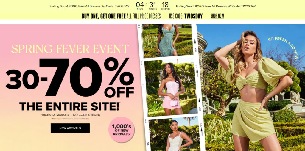
Since there are so many sales going on, customers will spend more time browsing around on the website. The more time a customer spends on a website, the more likely they are to make a purchase.
I’m not recommending you to go overboard on your sales as Fashion Nova did, but to take inspiration from their strategy to highlight your own promotions.
Online shoppers love deals and saving money whenever they can.
5. Include Detailed Product Descriptions
Whether you’re selling a product or a service, you need to have a thorough description of the item.
First-time visitors will always have questions about how the product works or what the services include.
Think about it like this.
If you were to walk into a physical store for the first time, there would be employees to answer your questions and help you.
Online shoppers don’t have that same luxury.
All they have are photos and descriptions.
They can also email you their questions, but most customers don’t take to time to do it.
Patagonia includes a section with detailed information about the company on their homepage.

Interested shoppers can read what Patagonia stands for as a company and where the products are made.
Their product pages are just as detailed:
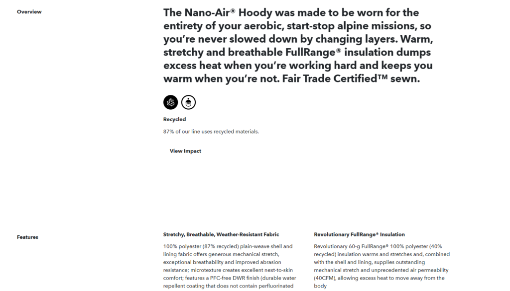
This product page goes through a brief overview and then dives deep into each feature of the jacket.
The level of detail and attention to their website is admirable.
I recommend spending a few days adding valuable copywriting to your homepage and product pages.
6. Offer Easily Accessible Customer Service
Some visitors will still have additional questions even if you have a website as informative as Patagonia.
But what if there’s nobody there to help the customer when they have a question?
This is why I recommend giving your website visitors several options to reach a customer service agent:
- Live chat
- Phone
This involves training your customer service team and being by their side for the first few weeks. You’ll need to help them answer questions and compile a database of common questions.
If you can’t get a phone or live chat agent, make sure your email agent responds as quickly as they can. You should also tell your visitors the best time to send an email if your support isn’t working 24/7.
Once again, Patagonia does a brilliant job when it comes to customer service options:
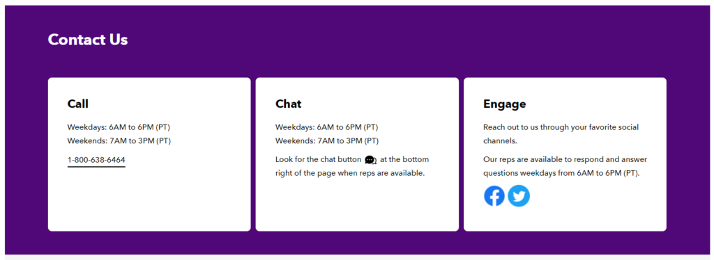
You can call, chat, or reach them through social media during the right hours. These are all methods where customers can receive an answer to their questions very quickly.
I recommend setting up a customer service team as soon as possible if you don’t have one already.
7. Simplify the Checkout Process
Is your checkout process complicated and cluttered? Are visitors abandoning your website as soon as they reach the checkout page?
If so, it’s time to simplify your checkout process. The checkout process’s entire goal is to help the customer complete their checkout as quickly as possible.
It involves cutting down the number of steps there are and removing all external links.
If there are too many steps on your checkout page, you’re giving the visitors more excuses to back out and leave.
So only ask for the information that is absolutely required:
- Name
- Shipping information
- Payment information
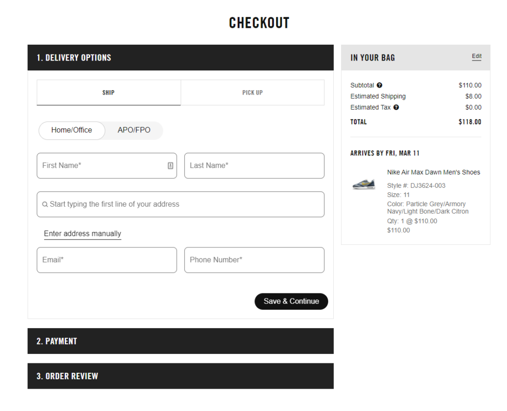
That’s all you need.
It would be best never to force a visitor to create an account to checkout. I recommend offering guest checkouts if your website has an account option.
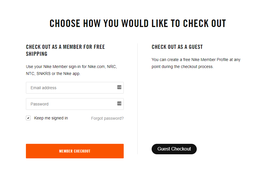
Making the visitor create an account creates a lot of friction and dramatically lowers your conversion rate.
Nike even makes it easy for you to type in your shipping address:

After typing the first few words of your address, it will pop up, and you can select it to fill it in automatically.
Simplify your checkout process accordingly and make sure it’s optimized on both mobile and desktop devices.
Don’t force your customers to fill out a form that’s longer than the paperwork at the DMV.
8. Include Customer Reviews
Social proof and user reviews are some of the best ways to increase your website’s conversion rate.
In fact, 88% of users say they trust online reviews as much as personal recommendations, and only 12% don’t read reviews at all.
This shows how convincing positive reviews can be.
If you don’t have a review application for your website, I recommend installing one. If you already have a review application but not many reviews, you should be proactive in getting feedback.
This involves reaching out to previous clients or customers and asking them to drop a genuine review to support your business.
You will then need to display the reviews on your website in areas that make sense. Product reviews should go under the product description. They can also go near the bottom of your home page to display more credibility immediately.
9. Add a Video Demonstration
If you’re selling a complex service or product, making a video demonstration is extremely helpful.
Pictures and words aren’t enough to describe a unique item.
Here’s an example from Training Mask.
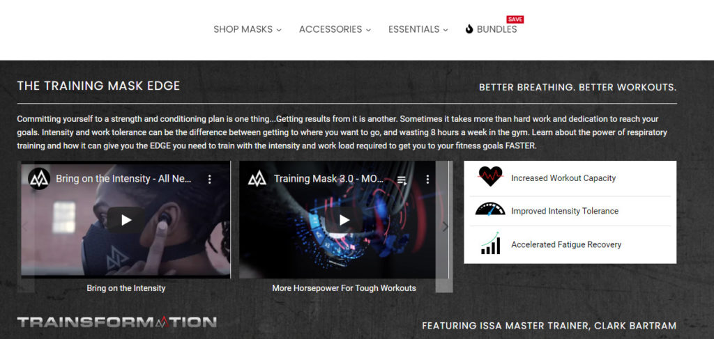
Their product is a training mask that helps people train harder and smarter. Since this product is so unique, they needed to provide several training videos that showcase the product being used.
This helps answer all potential questions a visitor may have about the product.
Here’s another example from Doodly, a whiteboard animation software company.
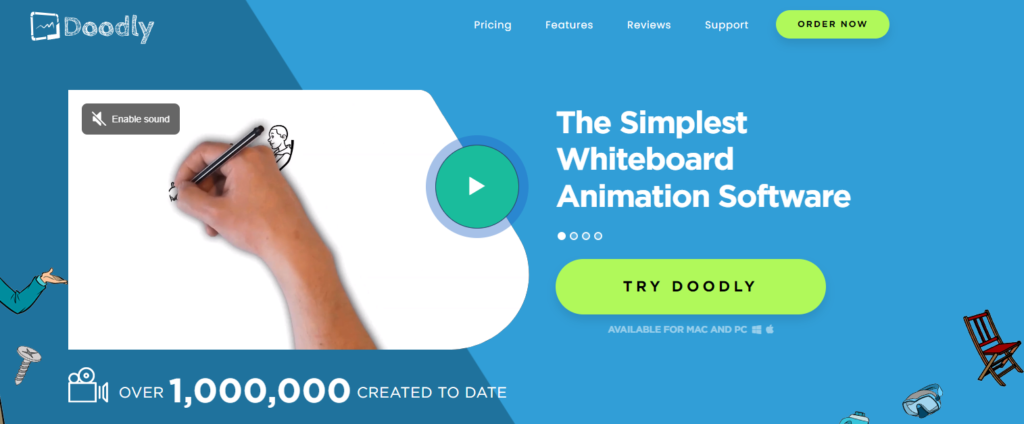
This video is the first thing visitors see on their homepage. It goes over what the software does and how the customer can use it to improve their business.
If you have a product or service that requires further explanation, make a quick demonstration video or hire an agency to create one for you.
10. Eliminate Hidden and Surprise Fees
It’s true.
Nobody likes hidden fees that appear on the checkout page.
In fact, extra costs are the biggest reason why customers abandon their carts.
Online shoppers are extremely price sensitive, and you need to be upfront and completely transparent with the prices on your site.
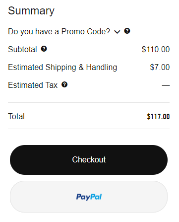
Nike includes the estimated shipping fees on the cart page. However, the tax rate depends on where the customer is located, so Nike can’t disclose that information until user fills in their payment information.
But Nike still mentions that there will be a tax fee, so customers know what to expect on the checkout page.
A technique you can use to reduce surprise shipping fees is by offering free shipping if a customer reaches a certain purchase threshold.
For example, you can run a promotion that states ‘Free Shipping On Orders Over $100’.
This is a great way to provide conversion optimization and a higher average order value.
11. Send Retargeting Emails
One of the most effective ways of converting your visitors is by sending retargeting emails.
These are visitors who filled in their information on the checkout page and left your website before completing the purchase.
Think about it.
Somebody was just a few clicks away from buying something on your website, and now you have their email.
It will be much easier to try to get this visitor to convert than to find a brand new customer.
This user is already familiar with your brand and interested in what you’re selling. They need a little motivation to complete the purchase.
Here’s a retargeting email I received from The Oodie:
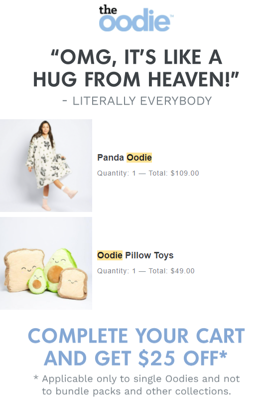
The product will still be fresh in the visitor’s mind, and a discount code may be just what they need to fill in their payment information.
This email can also be enough to trigger an impulse buy.
12. Run Tests On Your Landing Pages
Your landing page is the first thing a visitor will see after clicking on your website. For this reason, this is the most important page on your website.
It needs to look trustworthy and professional. Furthermore, it needs to convince the visitor to buy whatever you’re selling.
To optimize your landing page, run A/B split tests to identify your best design and content elements for your audience.
For example, A/B testing allows you to easily and quickly test different versions of your website copy, images, form questions, and content offers.
Using a tool like CrazyEgg or HotJar can help you examine what your website visitors are doing when they enter your website and where they’re navigating to.
You can then use this data to inform your split tests.
13. Improve Your Page Load Speed
Page load speed is often overlooked but is a highly important component of conversion optimization.
Many tests have proved the benefits of site speed. For example, a 2007 Amazon case study showed that they lost 1% of sales for every 100 ms of additional site latency.
Think about it from a customer’s perspective.
What would you do if the website you’re entering takes too long to load?
You can improve your page load speed by optimizing your images, reducing the payload of CSS/Javascript, and more.
I recommend using Google PageSpeed Insights. This is a free tool that shows how fast your website loads. It gives your website a rating and tells you how to improve the slow-loading elements on your website.
Conclusion
Your website is the centerpiece of your entire online business. It’s where new visitors learn about your products or services. It’s where old clients or customers come to interact with you.
Yes. It’s everything.
So don’t settle for an average website. I recommend offering an unmatched user experience and customer experience.
In fact, take a look at your biggest competitor’s website and brainstorm ways to make your website even better.
Remember, there’s always room for improvement.
Now I’d like to hear from you:
Which strategy was the most helpful from today’s guide?
Are there any quick conversion optimization wins I didn’t mention?
Let me know by posting a quick comment below.

