


Building a landing page isn’t hard. There are templates, and certain software includes drag-and-drop builders that make the process a snap. Anyone can build a landing page.
Creating a landing page that converts, on the other hand, is another matter.
Landing page optimization (LPO) is a process that takes time and finesse. And if you want to see your conversion rates increase (get more sales, generate more leads), you need to know what you’re doing. You need to research your target audience, analyze your page’s data, learn the best practices, and most importantly, you need to split-test.
Below, we’ll talk about some of the most common problems businesses have with landing page optimization. Then, we’ll dive into our top twelve picks for LPO best practices.
Best practices should be used as guidelines, not absolutes, however. What works well for a lot of landing pages may not necessarily work well for your business. As stated above, you need to split-test to make sure you’re acting in your business’ best interest.
That said, let’s get started…
Problems Businesses Face With Landing Page Performance
A landing page is a standalone, destination page where visitors land after clicking an ad or some type of promotional content. Its purpose is to convert visitors into sales or leads.
The most common way marketers go wrong with landing pages is by misunderstanding their target audience. Not knowing who your visitors are and what they need or expect is a surefire way to create a misfiring landing page.
Other LPO problems businesses often face include the following:
- Too many distractions that take away from the page’s main purpose
- Poor readability
- Unintuitive design
- Slow loading time
- Copy that doesn’t match what’s said in the promotional content.
Once visitors arrive at your landing page, you have only a small window to compel them to convert. And you can’t take any chances by making one of the mistakes mentioned above.
Landing Page Optimization Best Practices
To whip your landing page into the best shape possible, use this list of our top LPO best practices as your guide.
Position Your High-Value Elements And Content Above The Fold
“Above-the-fold” is a newspaper term. It refers to the area above where a traditional newspaper is folded in half. It’s where the most important and interesting stories are positioned so customers notice the headlines and purchase a copy to learn more.
“Above-the-fold” on a landing page refers to the section of the page that’s visible without needing to scroll. As with a newspaper, the above-the-fold area of a landing page is where the page’s most important elements and content are placed. It’s your prime landing page real estate, reserved for your most value-packed elements and content.
Now, you might be wondering “Well, which landing page elements are considered the highest value?”
The highest value elements are those that contribute directly to your landing page’s primary purpose: capturing conversions. These are the elements you want to hit your visitors with first so you optimize your chances of getting them to stay on your page and convert.
To optimize your landing page design, these are the high-value elements we suggest positioning above the digital fold:
- Your offer and its key benefits
- Your value proposition (a statement indicating why visitors should do business with you)
- One or more easy to find, high-contrast calls-to-action
- A prominent search bar
- Your company logo
- Testimonials, ratings, or reviews.
Since visitors access your page using a variety of devices with varying screen sizes, the location of your page’s digital fold can vary. To find your page’s average fold location for both desktop and mobile devices, try using a scroll map.
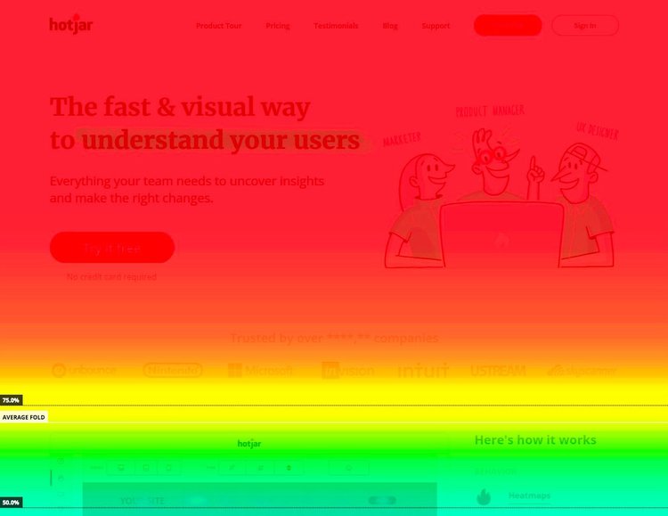
The data a scroll map provides lets you position your landing page’s high-value elements above the fold in a way that works with multiple devices.
Re-Position Less Important Images And Information Below The Fold
Now you should have a better idea of which elements belong above the fold of your landing page. With this in mind, you might find your page in need of a significant redesign. You may need to bump some of the elements you currently have above-the-fold down below to make room for more high-value items.
As mentioned earlier, everything that’s above the fold on your landing page should serve your page’s primary purpose. Anything that doesn’t directly help this goal should be re-positioned.
For starters, rethink any hero images or sliders you have above the fold. These types of images occupy a lot of real estate and may force visitors to scroll before they see your call-to-action or value proposition. (Any additional action you force visitors to take causes friction, making them less likely to convert.)
Hero images and sliders can be eye-catching and engaging, but they do not directly help you fulfill your landing page’s main function.
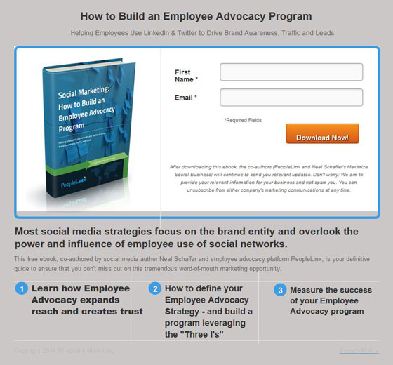
Make A Darn Offer
When visitors arrive on your page, they want to know why they’re there, what’s the point, and what’s in it for them asap. So don’t waste time. Dazzle visitors with your offer straight away.
Your landing page’s offer should be crystal clear and tell people what they’re going to get and what they need to do to get it. Your offer should also reveal the cost of entry. This could be pricing information if your offer requires a purchase. Or, it could be an email address if your landing page aims to generate new leads.
Your offer doesn’t need a ton of details at this point. But your offer’s copy should evoke a positive emotional response from visitors. Think about your visitors’ goal—what they hope will happen as a result of your offer—and speak directly to that in your offer’s headline and text.
Use High-Resolution Images
We previously talked about how you may want to remove hero images and sliders from the top of your landing page, especially if they prevent you from including more important elements above-the-fold.
This isn’t to say that images, in general, aren’t important parts of your page. On the contrary, images are often more engaging and compelling than text. They are better equipped to evoke an emotional response from visitors. And their content is typically processed much faster than other types of content.
You just have to choose the right images and place them in the right spots of your page. Plus, they need to be high-resolution.
To quickly convey what your offer is and why visitors should want it, an image is highly effective. But it has to be high-quality and show a lot of detail, especially if your offer is a product. With ecommerce, visitors are unable to see or handle your products first-hand and a photo is the next best thing. So you need to make sure your photos do your products justice.
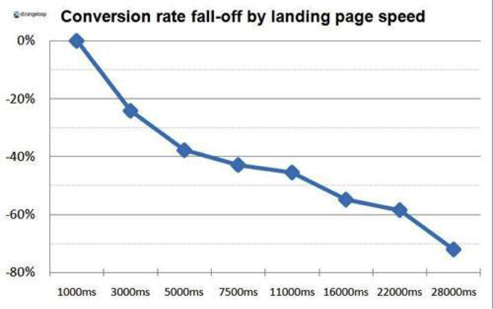
Improve Your Site’s Speed
Site speed matters a lot. If your site isn’t fast enough, you’re going to see fewer conversions. Slow-loading pages frustrate visitors and hinder the user experience, making visitors less likely to convert or return to your site.
To determine your landing page’s current loading time, use a performance evaluation tool, such as…
Many websites don’t load in the recommended amount of time. So optimizing your landing page’s loading time can give you a leg up on your competition.
Here’s a list of strategies to improve your page’s loading speed:
- Get on a better server
- Optimize your page’s code
- Use website caching
- Delete plugins
- Reduce redirects
- Use fewer web fonts
- Compress your images to reduce their size (tools like ImageOptim and JPEGmini can help).
Rid your page of any unnecessary elements that slow it down. Slow and steady may have won the race for the fabled tortoise. But it won’t win you many conversions. So dump and baggage and increase your site’s speed.
Reduce Distractions
Your landing page should be straightforward and clutter-free. You want visitors to focus on your offer and a single conversion goal with your call-to-action. That’s it.
Too many distractions cause friction or lead visitors off track, possibly causing them to leave your site. So keep your layout clean and simple with ample white space to enhance readability and prevent visitors from feeling overwhelmed.
Also, remove any unnecessary links that send visitors away from your landing page. This includes page navigation and links to your homepage, about page, or contact page. Your landing page should stand on its own. Any time you send visitors away from your page, you risk them never returning. Hang on to them while you’ve got them.
Address Objections And FAQ Upfront
Addressing potential objections and answering common questions upfront helps visitors make a decision faster about whether to convert. Knowing this information in advance instills confidence in visitors that they’re making the right decision because there are fewer unknowns and less for them to worry about.
For example, if you sell any type of apparel, it’s helpful to add sizing information. Visitors who’ve never purchased from you before may hesitate over concerns about the fit. But when you include a size chart that visitors can refer to, you provide them with a response to their hesitation, putting their minds at ease.
Leverage Trust Elements And Social Proof Throughout Your Page
People do business with companies they trust. For people with whom you’ve done business in the past, that trust comes naturally. But what about visitors who are new to your page and unfamiliar with your company?
The way to establish trust with first-time visitors is to add social proof and trust elements to your landing page.
Nothing yields trust (and consequently, conversions) quite like social proof. No copy you write—no matter how good—compares to an honest, unbiased customer review. People trust referrals from their friends and family most of all. But a note from a stranger goes a long way as well… that is, as long as the review is authentic.
If all of your 5-star reviews and enthusiastic testimonials come from Jane and John Doe, Anonymous, or Satisfied customer, your visitors are going to be suspicious. Are these people actual customers, or did you write these glowing reviews yourself?
You need to humanize your social proof whenever possible. You can do this by including personal details about your reviewers, such as their full name, a photo or video, or proof of purchase.
Here’s an example from our website:
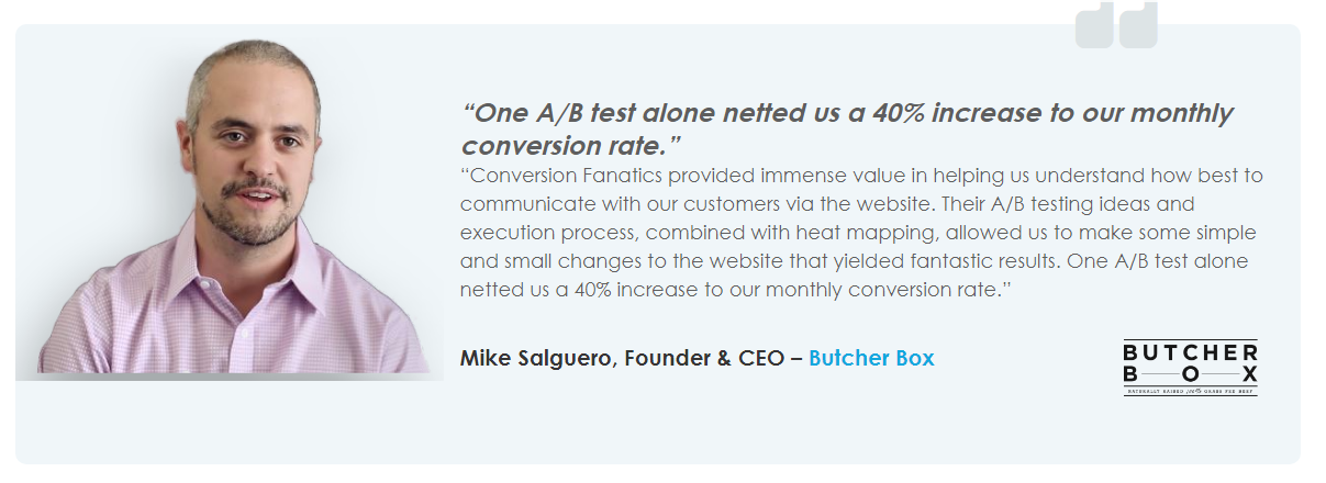
As you can see, the testimonial includes the reviewer’s first and last name, plus his job title, company website, and a photo, leaving little doubt about whether this reviewer is, in fact, a real person and happy client.
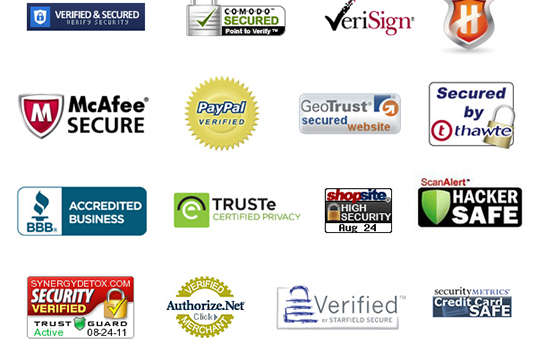
Trust elements are another powerful means of establishing trust on your landing page. Trust elements include press mentions, endorsements, and third-party certifications, such as VeriSign and the Better Business Bureau (both of which are internationally recognized as trusted organizations offering consumer protection). When customers see the Verisign and BBB seals on a landing page, they know the site is legit and feel more comfortable.
You can also establish trust simply by proofreading your copy for grammar and spelling errors and by matching your ad copy to your landing page’s headline. Matching your page’s headline to your ad copy lets visitors know right away the page they’ve landed on intends to deliver what was promised.
Lead With Benefits, Not Feature Statements
There are two basic approaches you can take with your landing page copy. The first is feature-based, which focuses on what your offer is, has, or does, including all of its bells and whistles. And the second is benefit-oriented, which concentrates more so on how your offer makes peoples’ lives better.
The two approaches are related but fundamentally different. And if you want your offer to convert, you need to follow the second, benefit-oriented approach, not the first.
When you focus on an offer’s features, you speak to the solution it provides. This used to be an effective sales tactic. But today’s consumers are savvy. They can discover the answer to virtually any problem with a few keystrokes and the help of a search engine. Today’s consumers know what the solutions are and what features they’re looking for. They also know what the solutions and features are worth.
To compel today’s consumers to convert, you need to let them know what’s in it for them. Yes, you do still need to mention your offer’s features so visitors know they’re getting everything they want. But you need to do so in a way that tells visitors how that feature will enhance their life.
For example, here at Conversion Fanatics, we’re a big fan of Slack as a communication platform. Slack offers several useful features to help streamline our team’s interactions. But the benefit of these features—and what matters most—is how they save our company time and boost productivity and transparency. And that’s the type of thing you want to lead within your landing page copy.
Your offer is not just the sum of its features. It’s a way to improve visitors’ lives. And that’s what people care about and what gets them to convert.
Optimize Your Forms As Well
A poorly designed form can undo all of the hard work you’ve put into your landing page. Visitors are on the cusp of converting, but a form with friction or too many steps will cause them to rethink and retreat.
Your forms should ask for only must-have information, depending on your offer and its value. So keep your form fields to a minimum. For example, if your offer is a free download, you should only need two fields: name and email. Only ask for more if your offer truly warrants more information and keep in mind where visitors are in the buyer journey when they visit your page.
Optimize Your Page For Mobile As Well As Desktop
Your landing page has to be mobile-friendly. End of story.
According to Optin Monster, “51% of shoppers say that they use mobile devices to find new brands and products.” That’s huge. So if you haven’t optimized your landing page for mobile devices, you can kiss most of those leads and potential conversions goodbye.
Really, though, you shouldn’t just optimize your page for mobile devices. You should design a separate landing page specifically for mobile use. Mobile visitors don’t browse and interact with sites the same way as desktop visitors, so their conversion journey is different as well.
Here are a few strategies you can implement to create an optimized mobile landing page for your business:
Keep It Simple
Your desktop landing page should be simple as well. But your mobile landing page should be even simpler. Small screen sizes make scrolling a pain. People don’t want to search high and low for important elements, like buy buttons, pricing information, testimonials, and calls-to-action. Visitors are more willing to spend some time browsing on a desktop landing page. But on a mobile device, they want what they’re looking for quickly.
Your copy should also be simpler on a mobile landing page. Paragraphs and sentences should be short and concise. Remember, you’re operating with a small screen size in mind. So a headline that would normally appear on one line on a desktop could take up as much as seven lines of above-the-fold real estate on a mobile device.
Also, to enhance readability, use bullet points whenever they make sense. Bullet points cut to the chase of your main points with less supporting text. Plus, they’re attention-grabbing.
Use Click-To-Call And Click-To-Scroll
Click-to-call and click-to-scroll make mobile navigation easier. A click-to-call button lets visitors get in touch with the push of a button. That way, they don’t have to hunt for your contact information or manually type your number into their phone’s keypad.
Click-to-scroll is another great functionality to add to your mobile landing page. Simpler and shorter mobile landing pages do tend to perform better, but if you have a lot of pertinent information, click-to-scroll is a great way to enhance your page’s usability.
Click-to-scroll buttons are navigation elements that allow visitors to jump from section to section rather than having to scroll. This way, visitors access the most important information upfront while also accessing other content quickly and easily if they so choose. Click-to-scroll buttons are an effective means of reducing your page’s bounce rate.
Use A Single Column Layout
Multiple columns work for desktops, but they look cluttered and clunky on mobile devices. Plus, they make navigation difficult and can overwhelm visitors.
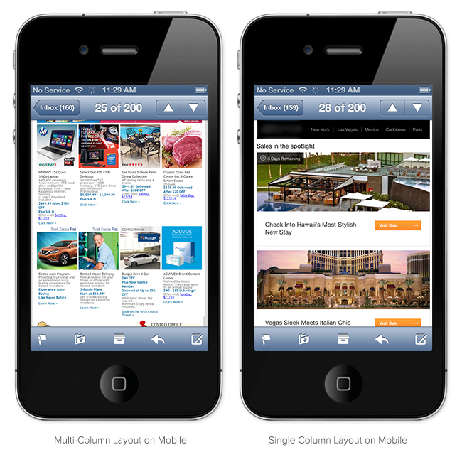
For example, take a look at the image above. Which of these two pages would you rather browse on a mobile device? The option on the left is far less overwhelming and way more readable and engaging.
So, to enhance the usability of your mobile landing page, stick to a more streamlined single column layout. Your visitors will thank you for it (by sticking around and converting).
TEST, TEST, TEST
Landing page best practices service as good guidelines for your LPO. But the best way to make your landing page convert like crazy is to split-test.
Use landing page best practices as starting points to get ideas about tweaks you might make to your page to improve its performance. But keep in mind what works well for one page may not be as effective on another page. Different target audiences engage with and respond to landing page elements in different ways.
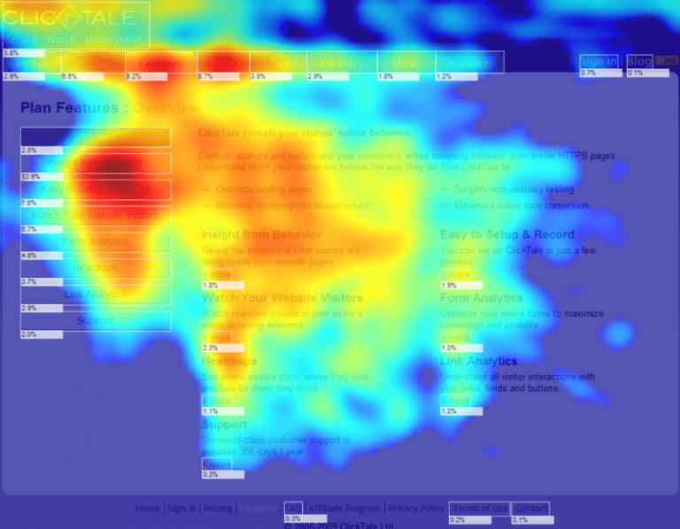
To gain insights about your audience, use heat maps to see how visitors interact with your page. Heat maps use a color-coded system to track visitors’ eye or mouse movements.
Tracking visitors’ eye movements is the most accurate way to assess user behavior on a website, but it’s also the most costly and inconvenient. For many businesses, eye-tracking experiments are not feasible, so they track visitors’ mouse movements (clicking, scrolling, hovering) instead. This technique isn’t quite as accurate but it still provides valuable insights that you can use as the basis for your split-tests.
Whatever you do, don’t split-test variants at random. Your split-test decisions should be based on data, not gut feelings.
Conclusion
Your landing page is an integral part of your marketing success. A well-optimized landing page can increase your sales or serve as an impressive lead-generation tool. To transform your landing page into a conversion powerhouse, you just need to make the right tweaks and adjustments.
What are your thoughts on this list of LPO best practices? Is there anything we missed, something you disagree with? Please leave a comment below and share your thoughts. And if you have any questions or would like to chat more about landing page optimization, please feel free to call or email. We love hearing from you!