


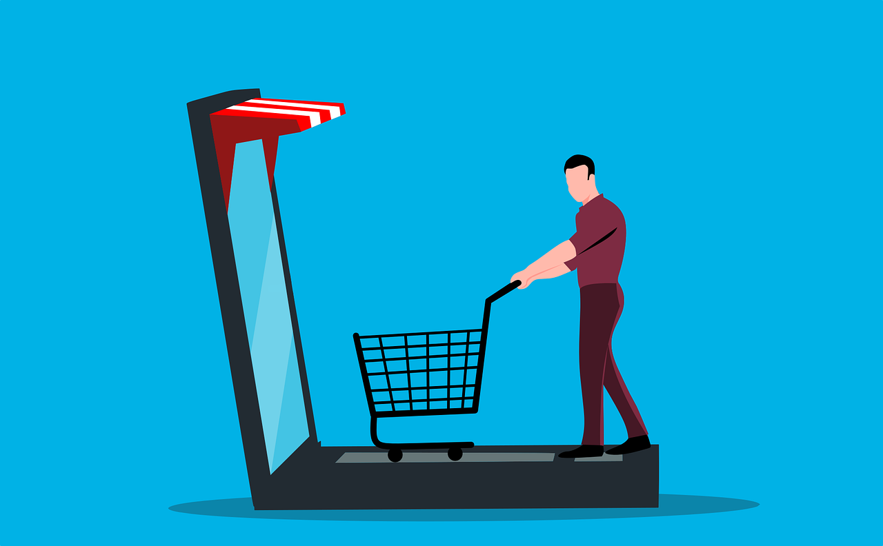
The majority of ecommerce store owners deal with high shopping cart abandonment and conversion rate drops on their checkout page.
For this reason, I’ll show you how to fully optimize your ecommerce cart and checkout experience today.
In this in-depth guide, you’ll learn:
- 40 ways to improve your ecommerce cart and checkout experience
- How to reduce your overall cart abandonment
- How to increase your store’s conversion rate
- Examples of the best ecommerce cart and checkout pages
- Lots more
So if you’re ready to revamp your ecommerce store, this guide is perfect for you.
Let’s get right into it.
What Is Checkout Abandonment?
Checkout abandonment occurs when users add products to their cart but leave the website before completing the purchase.
Your ecommerce store’s checkout abandonment rate is a crucial metric to monitor as it’s highly related to your store’s overall profitability and conversion rate. Ecommerce stores facing a high cart abandonment rate usually have underlying issues with their cart and checkout process.
How Do I Calculate the Shopping Cart Abandonment Rate of My Ecommerce Store?
Your ecommerce store’s cart abandonment rate should be displayed in the analytics on whichever platform your store is hosted on.
However, if you can’t find it, you can easily calculate the shopping cart abandonment rate by yourself.
Simply divide the total number of completed purchases by the total number of created carts. Then, subtract this number from one and multiply it by 100.
For instance, let’s say you had 100 completed purchases and 500 total carts created. You would take 100 divided by 500 to get 0.2. Now, take 1 minus 0.2 to get 0.8. After, multiply 0.8 by 100 to receive 80%.
As such, your shopping cart abandonment rate would be 80%.
Why Is Cart Abandonment Important to Ecommerce Stores?
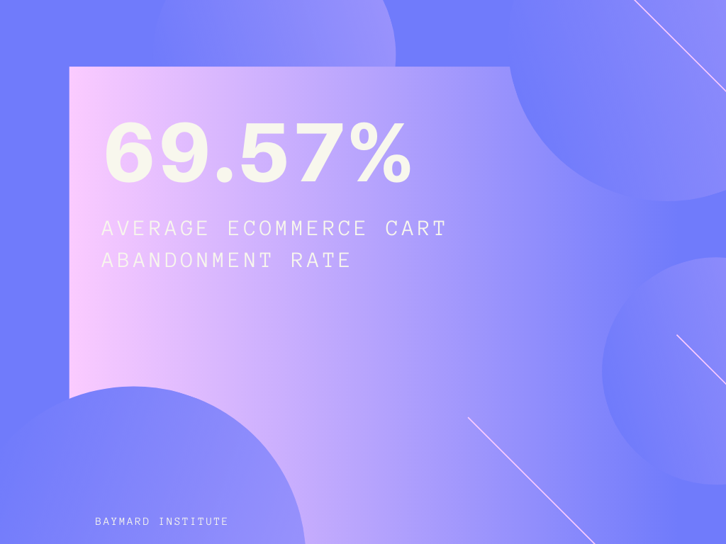
Ecommerce stores are traditionally plagued with high cart abandonment rates. In fact, the average ecommerce cart abandonment rate is 69.57%. That means for every 100 users that add a product to their cart, on average, 70 of them will leave without completing the purchase.
Furthermore, the average mobile ecommerce checkout is a whopping 85.65%. This is 16% higher than desktop abandonment rates and costs businesses a heap of lost revenue.
According to Forrester research, ecommerce stores lose nearly $18 billion in yearly sales revenue because of abandoned carts.
For this reason, it’s essential to optimize your cart and checkout page as much as possible to reduce cart abandonment and improve your store’s conversion rate.
Why Do Customers Abandon Their Checkout?
There is a multitude of reasons why customers abandonment their checkouts. From something as simple as getting a text message and forgetting about their cart, your customer’s attention is constantly being dragged in multiple directions.
The worst part is, users who abandon their shopping carts usually never revisit your online store. So, it’s essential to get everything perfect on the first visit.
Let’s take a closer look at why customers abandon their checkouts.
1. Long or Complex Checkout Process
In the fast-paced society we live in today, people want to complete their goals as quickly as possible. A complicated checkout page with excessive forms and steps will create friction and slow the shopper down. So, a complex checkout process can cause the customer to get impatient enough to the point where they leave the website without checking out.
2. Unexpected Shipping Costs
Customers who find unexpected fees on the checkout page, such as shipping costs, will potentially be deterred away. They may reevaluate how much they value the product with the introduction of additional fees and deem that it’s not worth it.
3. Mandatory Account Creation
Requiring the customer to create an account on your ecommerce store slows them down and prevents them from quickly completing their purchase.
4. Payment Security Concerns
If your checkout page isn’t giving customers the confidence and trust to complete the purchase, they will inevitably abandon their cart.
5. Lack of Payment Options
It would be best to ensure your website is equipped with all the popular payment options so that any customer has a convenient way of checking out.
6. Vague Return and Refund Policy
If customers are new to your ecommerce store, an ambiguous return policy may frighten them into abandoning their cart. Online shoppers want to be sure they can return the product and receive their money back if it doesn’t meet their expectations.
40 Ways To Improve Ecommerce Cart And Checkout Experience
Now that you understand why your ecommerce cart and checkout experience is so important, let’s dive into the strategies on how the optimize these processes.
1. Don’t Forget About Mobile Shoppers
With over 50% of all online ecommerce sales coming from mobile devices, your mobile cart and checkout process must be optimized.
Your ecommerce store’s checkout page should be mobile-friendly and offer a responsive design.
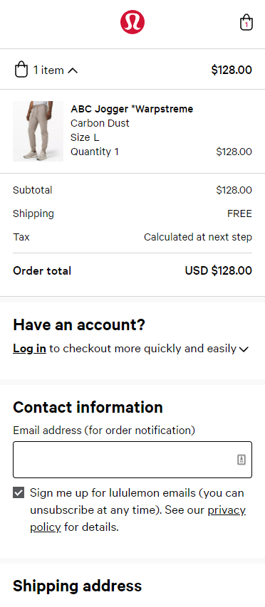
If you’re interested in examining a well-designed and optimized mobile checkout page, I recommend looking at Lululemons. Their mobile checkout page is clean, simple, and highly functional.
Furthermore, each form is clearly labelled and easy to type in. Although Lululemon’s checkout page is simple, it gets the job done quickly and efficiently.
2. Offer Guest Checkout
Although it’s crucial to grow your recurring customers and increase each customer’s lifetime value, not having a guest checkout option will deter away many potential first-time buyers. So, implement a guest checkout option on your checkout page so that customers can check out by simply providing an email address.
This allows them to complete their checkout as fast as possible without needing to register for an account.
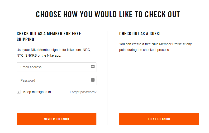
Above is an example of how Nike offers a guest checkout. By clicking guest checkout, Nike customers can instantly fill in their contact information, shipping information, and payment information to complete their checkout.
3. Allow Easy Order Editing
Online shoppers are quick to change their minds, so you need to ensure that it’s easy for them to amend their orders if you want to keep them from abandoning their carts. So, provide quick and convenient opportunities where customers can adjust quantities, delete items, and add more products.
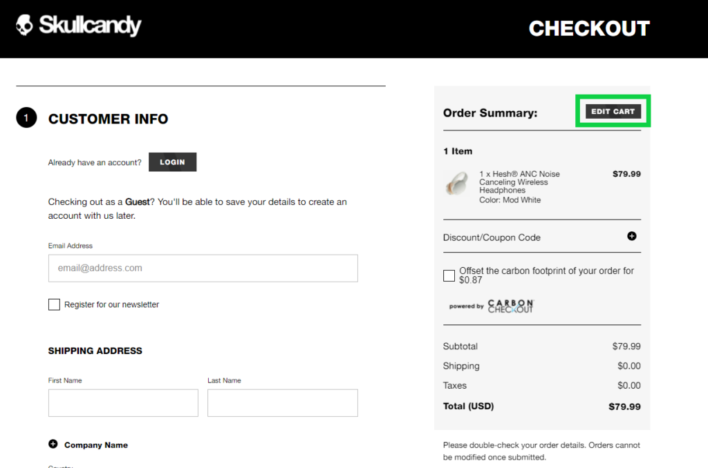
Skullcandy offers a sticky order summary on their checkout page that allows customers to edit their carts at any time. Any information they’ve filled out on the checkout page is saved for when they come back as well.
4. Offer All Popular Payment Methods
Your online store must provide as many payment options as possible. Losing potential customers due to inadequate payment methods drastically reduces your companies revenue in the long run.
So be on the lookout for customer service emails from users who couldn’t purchase due to your payment options. You’ll want to take note of these inquiries and consider adding the payment option to your ecommerce store.
5. Remove Clutter and Focus on Simplicity
Your checkout page should solely focus on allowing customers to quickly and easily fill in all the necessary forms to complete their purchase.
For this reason, you should eliminate any distractions such as headers, menu buttons, additional items to look at, or anything else unnecessary that can consume the customer’s attention.
So, I recommend using a clean design where every form is clearly labelled.
6. Don’t Request Unnecessary Information
Avoid asking for unnecessary information on your checkout page. Your goal is to collect only the information that’s going to be used to fulfil their order. Any additional information creates friction on your checkout page and increases the chance they abandon their carts.
7. Enable Social Log-In To Speed Up Registration
Allowing users to log in to your ecommerce store with their Google, Facebook, or another social account will enable them to complete their purchase quickly.
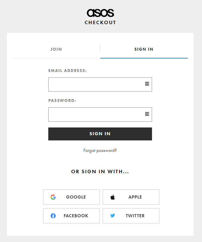
Asos offers Google, Apple, Facebook, and Twitter logins. This allows customers to remember their account information quickly and look up previous orders.
8. Auto-Save Cart Items When Abandoned
If customers ever abandon their checkout, the items in their cart should be saved and pre-loaded for when they revisit your website. This helps them find the products they were interested in before.
Think about it like this.
Imagine spending an hour browsing around for products on an ecommerce store, and then your computer suddenly restarts. If you had a list of 10 items saved, finding them again would be a hassle, and you may consider cancelling the purchase altogether.
9. Offer Crystal-Clear Help on Errors
Your checkout page should be equipped with proper form validation and error notifications. Here’s an example of how Bonobos offers clear guidance on errors.
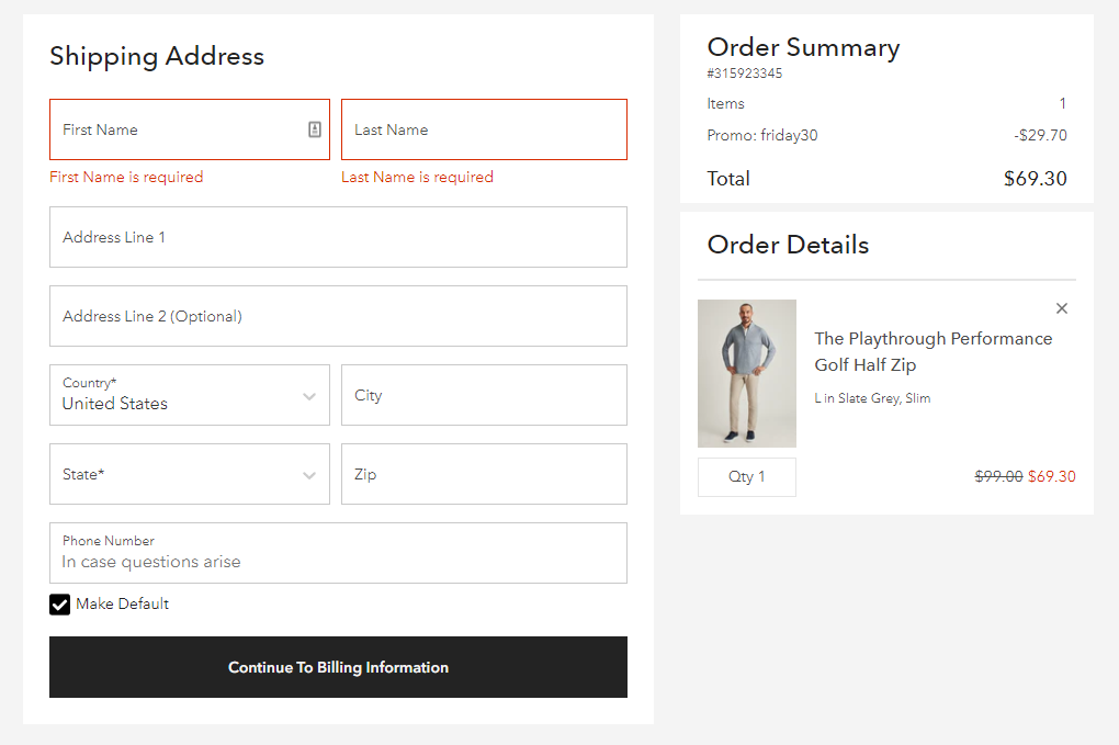
Your form validation errors should be displayed in real-time so that customers know what information to provide to complete their purchase.
Proper error notification alerts tell the customer what details are required and what they need to include to move forward in the checkout.
10. Use Progress Indicators on Checkout Pages
Progress indicators allow customers to know which step they’re at in the checkout process and will enable them to rotate between steps to review information easily.
Here’s an example of how Bonobos uses a progress indicator on their checkout page.
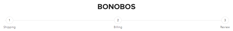
Even though there are only three steps, it helps customers track their stage and how many more steps are required to complete the checkout.
11. Be Transparent About Delivery Costs and Shipping Times
Around 49% of online shoppers abandon their carts because of additional fees at the checkout page. So, customers must know how much shipping costs are before even getting to the shipping page. It would be best to offer either free shipping on all orders or free shipping once a specific price target is met.
Skullcandy showcases the proper way to provide transparent shipping options. Each shipping option comes with an estimated delivery time and cost.
12. Make Sure the Back Button Is Functional
Although your checkout pages may have a dedicated ‘Back‘ button that allows customers to return to previous pages, customers will often use the back button on their browser instead. So, the back button on their browser must bring them to the last page with all the information they filled out saved.
13. Capture the Customer’s Email Address Early
Reducing your cart abandonment rate to 0% is an impossible task for any ecommerce store. For this reason, it’s essential to capture the customer’s email address as soon as possible. With their email address, you can launch retargeting campaigns to bring cart abandoners back into your online store.
Furthermore, you can also launch dedicated campaigns to cart abandoners with any seasonal promotions or discounts your ecommerce store offers.
14. Keep the Domain Consistent
Make sure you use the same domain name for your ecommerce store and checkout page. Some online stores use a third-party checkout provider, which can scare potential customers away.
This ultimately disrupts the user flow and creates distrust.
15. Autofill Shipping Information
Your ecommerce store’s checkout forms should have autofill enabled so customers can quickly fill in their shipping addresses. Customers checking out on mobile will have difficulty checking out if they need to fill in their information manually.
Furthermore, enabling autofill also ensures that the customer’s shipping information is correct. This avoids potential mistakes and items being shipped to the wrong address.
16. Display Trust Signals
Trust signals are elements displayed on your cart and checkout page that helps customers feel more secure in purchasing items from your ecommerce store.
Patagonia provides a great example of how to utilize trust badges. In addition, Patagonia includes their shipping and returns policy to give even more clarity to customers.
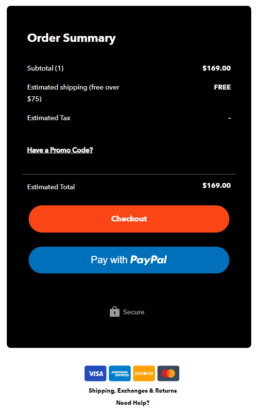
17. Summarize Cart Details
The customer’s cart and last screen on the checkout page should offer cart summaries that describe the entire order. Order summaries should include each item the customer is purchasing, the specific variant, the cost of each item, and the total order cost.
This allows customers to review their orders before ultimately checking out.
18. Implement Live Chat Support
A 24/7 live chat support function on your website can quickly answer any questions customers have. Furthermore, your support agents can promptly handle any customer issues during the checkout process to ensure the purchase is completed.
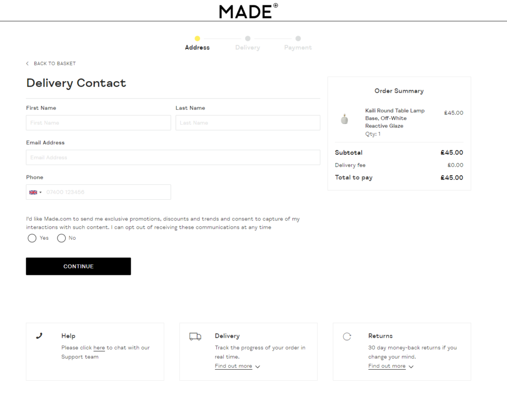
Made offers a live chat feature on their checkout page that allows their customers to get the help they need during the final moments before the purchase is finalized.
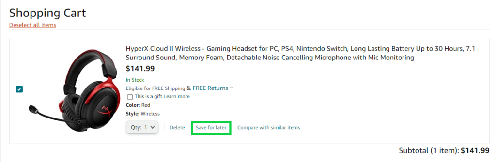
19. Allow Customers to Save Their Cart
Giving customers the ability to save their cart allows them to revisit your ecommerce store to complete their order. Sometimes customers just aren’t ready to go through with their purchase yet and need some time before finalizing their decision. As such, a save for later option allows these individuals to find the products they want to purchase later on.
20. Distinguish Button Colors
Each CTA button on your cart and checkout pages should be distinct and helpful. Each button should be labelled with text to easily understand where the button will take them. So, it’s essential that each button visually stands out on the page.
21. Offer a Wish List
A wish list on your ecommerce store allows users to send products they want to friends or family. In other words, it enables them to create a personalized collection of products they’re interested in but not ready to purchase yet.
Moreover, wish lists also allow you to run personalized campaigns by offering direct discounts on the products in their wish list.
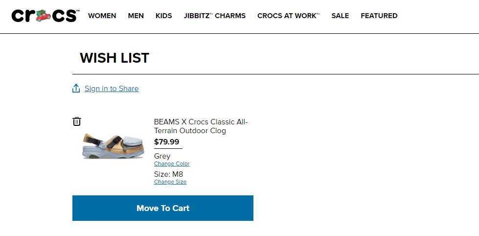
Crocs have a great wish list function that allows customers to share their wish lists by logging in.
22. Offer Last-Second Discount Codes
A last-second discount code can finalize the customer’s decision to complete the purchase. This is often seen in ecommerce stores offering free shipping or a 10% off discount code if they register for an account on the website.
23. Offer Incremental Payments
Depending on the price of the products on your ecommerce store, offering incremental payments allows customers to pay for more expensive items conveniently. Sometimes customers don’t have enough money to purchase the product outright. So, incremental payments will enable the customer to buy the item immediately but also guarantee the full payment later on.
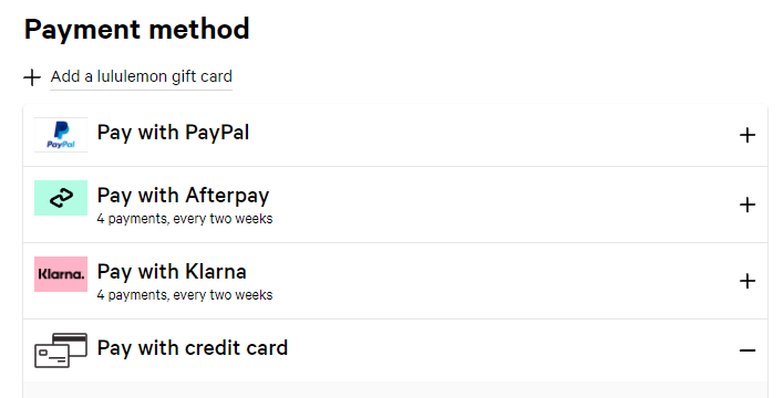
As you can see, Lululemon offers two different options that allow for incremental payments every two weeks.
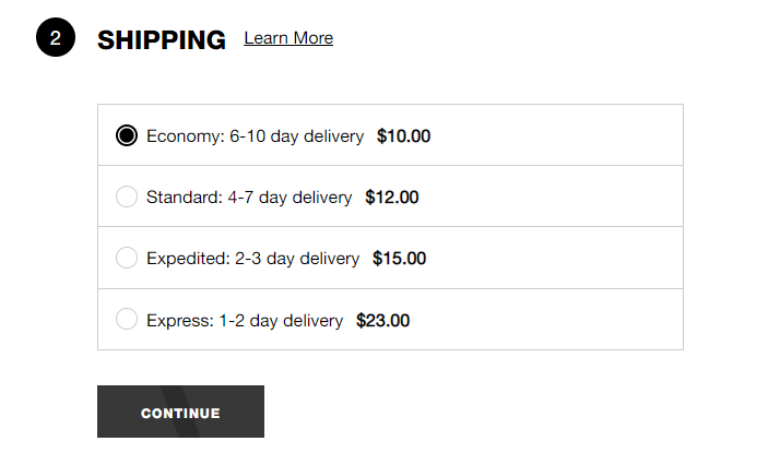
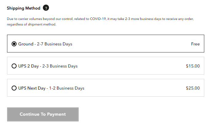
24. Provide Multiple Shipping Options
It’s essential to offer multiple shipping options on your checkout page. The options usually include express shipping or standard shipping. If your ecommerce store doesn’t provide express shipping, customers who are in urgent need of their item may look elsewhere.
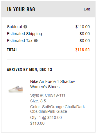
25. Specify Estimated Shipping Date
Specifying an exact date that the customer’s item will arrive is an essential task of all ecommerce stores. Online shoppers already dislike having to wait for their product to arrive. So, if they don’t even have an estimated delivery date, they will be turned off to your ecommerce store even more.
26. Utilize Abandoned Cart Emails
Retargeting abandoned carts is an essential marketing task of all ecommerce stores. You can use email cart recovery applications such as Klaviyo to send dynamic abandoned cart emails. These emails specify the exact products that were in each unique customer’s cart. Furthermore, you can add additional promotions or incentives in each cart recovery email.
27. Consider Single-Page Checkout
As mentioned earlier, the goal of your checkout page is to get users to complete the process as quickly as possible. Having the checkout process on one page allows users to fill in their information without moving between different pages efficiently.
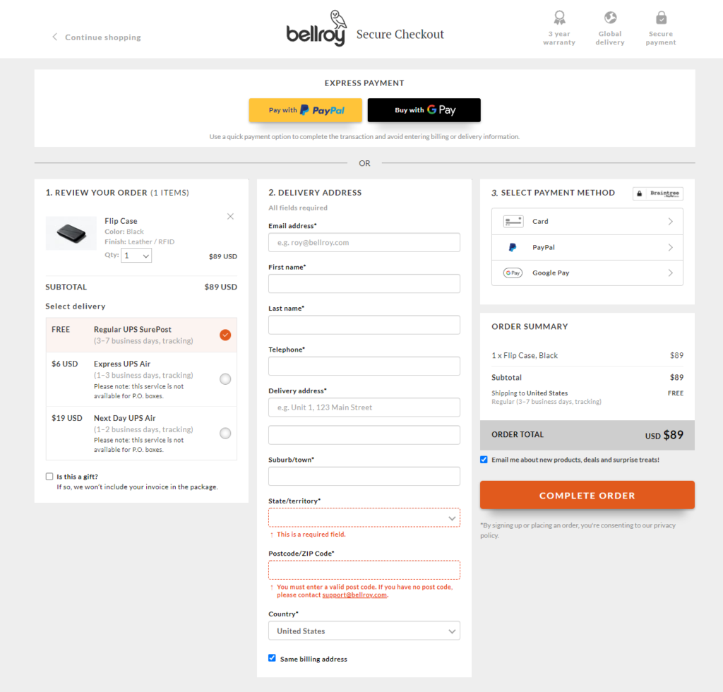
Bellroy showcases a fantastic example of a checkout page that only uses one screen. Each section is separated clearly and every form is easy to fill in.
28. Highlight Customer Reviews on Cart Page
If your ecommerce products have outstanding reviews, it’s helpful to indicate the star ratings of each product on the cart page. This reminds customers how popular the products are and how much previous customers enjoyed their purchase.
29. Highlight Savings
Any savings from discount codes or special promotions should be clearly indicated on both the cart and checkout page. Online shoppers absolutely love saving money on their online purchases, so having their savings stand out is a conversion booster.
30. Ask For Payment Information Last
It would be best if you always asked for payment information last during the checkout process. This is where customers are most likely to abandon the checkout page so putting it last reduces the time spent between filling out their payment information and clicking complete checkout.
31. Use Smaller Font Sizes to Indicate Costs
I recommend using smaller font sizes on the price of the items in the customer’s cart. This has a psychological impact on consumers’ minds and shows them that the price isn’t a big deal.
32. Make the Order Summary Sticky
A sticky order summary means that the order summary stays on the checkout page as the customer scrolls down. This allows them to constantly remember what they’re purchasing without navigating to different pages to do so.
33. Display Wide Buttons
Wide buttons on your cart and checkout pages allow customers to see what the next objective is clearly. On mobile, each button should fill the entire width of the screen and be easily accessible.
34. Eliminate Scrolling
Although having a single-page checkout is optimal, you should aim to reduce the amount of scrolling customers need to complete. This can be accomplished by having previous steps on the checkout page collapse down as they are completed.
35. Place the Checkout CTA Last on Cart Page
On your cart page, ensure that the ‘Checkout’ CTA button is the last item. This allows the customer to thoroughly review their cart and products without having to go back once they’re at the checkout page.
36. Use Product Images to Reinforce the Checkout Journey
Your cart and checkout pages should show the product images of the products the customer is buying. This helps them remember exactly what they’re purchasing and gets them excited to receive the product in person.
37. Use Clear CTA Buttons on Each Page
Each unique page during your checkout process should have a clear CTA button. Pages without a clear CTA will act as dead-end pages and confuse customers on where to proceed next.
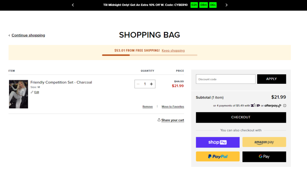
38. Consider Utilizing FOMO and Urgency
It’s not uncommon for ecommerce stores to utilize timers on their discounts or promotions. For instance, you can add a countdown on when your free shipping or 15% discount code will expire. This convinces customers to make their purchases as soon as possible.
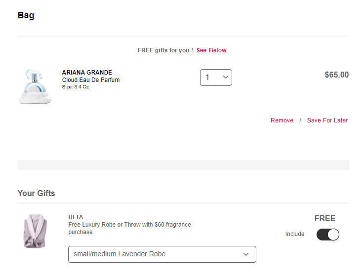
39. Offer Surprise Gifts
Online stores that sell cosmetics often offer free surprise gifts in the form of product samples on the cart page. This is always a pleasant surprise for online shoppers and creates a sense of friendliness and trust between the ecommerce store and customer. So, think about what kind of gifts you can add to each order for free.
40. Test, Review, and Optimize
As always, it’s important to split test, review, and optimize your ecommerce store cart and checkout pages. Split testing, or A/B testing, is when you test a few different variations and see which one provides the most value.
Conclusion
All in all, your ecommerce store’s checkout page is one of the most essential pages on your website. It will be challenging to grow your online business and customer base without a secure and functional checkout page.
So, I hope you can take advice from this in-depth guide on how to optimize ecommerce cart and checkout pages.
Now I’d like to hear from you: which tips will you implement first on your ecommerce store?
Are there any vital tips I forgot to mention?
Either way, let me know by leaving a quick comment below.