Here we take a look at a good example of encouraging visitors to scroll by maximizing the above the fold section on a home page bringing up additional products.
Maximizing the above the fold section on a site is one of the best ways to increase engagement on a page. The quicker you can get visitors shopping and engaging with your product offerings the better your conversions will be. This also reduces friction on the page which we have proven many times to improve your conversion rates.
Dr. Axe is a leading nutritional supplement company and the idea was to reduce the sections above the fold on the homepage so there are more product listings showing, which should encourage people to scroll down and click through to those products.
By encouraging scroll and click through to popular products we will increase engagement and ultimately increase conversions.
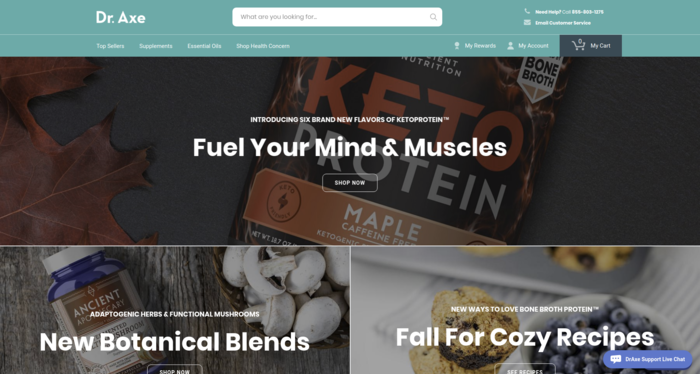
The original homepage (pictured above) showed multiple calls to action which can be confusing to the visitor. The goal here is to get visitors engaged, help them find the solution they are looking for quickly and start shopping. Above the fold is prime website real estate to encourage shopping.
Based on our hypothesis we wanted to reduce the hero image size to put more emphasis on the popular products.
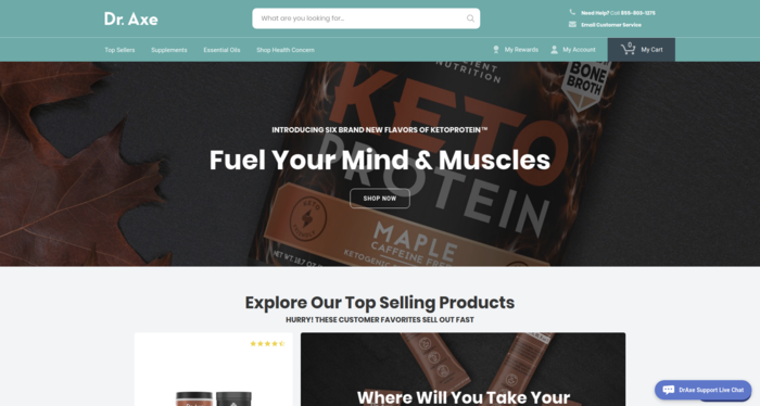
Variation 1: We removed the two secondary calls to action sections which brought the top selling products up above the fold of the page as well as put the main focus on the singular call to action in the hero section. By doing so this ultimately helped us add a bit of urgency to the shopping experience by featuring the “Hurry! These Customer Favorites Sell Out Fast.”
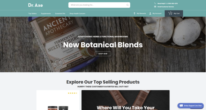
Variation 2: Here we incorporated similar elements as variation 1 but changed the main call to action to emphasize the new botanical blends.
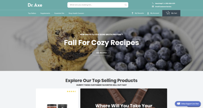
Variation 3: Sticking with the concept of a singular call to action and pulling up the top selling products, for variation 3 we put the main call to action emphasis on the recipes to measure if they had more impact on the engagement and conversions.
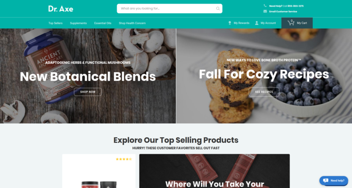
Variation 4: Lastly we wanted to test the impact having two calls to action on the hero section had on conversions and engagement versus having a singular focus.
The Results?
The Original: Conversions to sale were 7.84% with a revenue per visitor of $6.78
Version 4: Having the two calls to action actually increased conversions by 16% (9.10%) and increased revenue per visitor by 10% ($7.49) which shows that having a second call to action doesn’t impact conversion as much as bringing up the top selling products.
The winner: Variation 2 ultimately came out as the winner with a conversion increase of 26% (9.9%) and a lift in revenue per visitor of 37% ($9.30) at a statistical confidence level of 100%.
What does this tell us?
As with all tests we want to learn more about visitors behaviors, regardless if the test increased or decreased conversions. We want to know what the visitors liked and disliked to lead us to further experiment ideas.
In this particular case we know that by reducing the hero section to bring up the top selling products had the most impact given every variation showed a statistically confident improvement over the original in all goals measured. What is more interesting is that although not a huge improvement difference from variation to variation, the offer presented in the hero section made a difference in the overall conversion rate.
Their home page is quite a bit different now given we have done more experimentation on the page, but took all these learnings into account when continuing the optimization process.
The question I leave you with is… How can you reduce friction and engage your visitors in the shopping experience quicker on your own store? Look for ways to maximize the above the fold section of the site and let us know what results you come up with.
Want help optimizing your e-commerce store or help discovering where you may be under-performing? Reach out to us for your complimentary in-depth conversion analysis.

