


Every site has at least one. We are talking about “buttons.” More specifically, we are talking about the color of the buttons, and more importantly, are you testing yours?
With the onslaught of landing page builders and out of the box themes, it makes it easy to overlook your buttons. After all, they all come with a set of them, usually with a couple of color options with a handful of wording phrases like “Get Access,” “Continue,” “Register Now,” etc.
The Importance of Color
Now I will touch base on the wording as well, but I want to focus on color.
Color has been scientifically tied to emotion; emotion has a direct correlation with buying decisions. People tend to tie their buying decisions with emotion, usually it is either to avoid pain or gain pleasure.
So my question is are you testing the colors of your site? More importantly, are you testing your key areas that lead to a desired action?
One of the first places we always test is the color of the key elements, such as buttons.
Nothing is more irritating than loading a perfectly good website and seeing the out of the box Yellow gradient button slap me in the face.
Not only does that tell me that the site owner doesn’t care about their conversions, but they obviously aren’t testing. Which in our book is a big no-no.
Does color make a difference in your conversion rate?
We had one particular client where we did a BUNCH of testing particularly on the button. The landing page was pretty simple in design so one of the key elements was the button.
This was a free offer to get a free membership.
The original button was as pictured… A yellow gradient button that said… “Give Me My Free System!”
We tested not only the color but tested just about every wording combo you can think of that made sense with the offer.
From “I Want My Free System” to “I’ll Take It.” While testing all the different wording options, we also tested the color of the buttons.
This includes the highly used yellow gradient button, orange gradient, and of course, the red gradient.
The result?
The yellow button actually got crushed in every test we ran with it, no matter what the button said. Orange gradient came in a close second.
The winning combo which came as a huge surprise was the red gradient button that simply said “Free Instant Access.”

How much did it win by you may be asking…
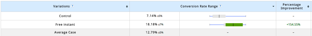
The red “Free Instant Access” button converted at 154.55% better than the control in this case.
The numbers looked pretty close in just about all tests ran. What the actual button said moved the needle quite a bit as well but not nearly as much as the color of the button.
We hope this little case study helps you to finally pay attention to the key elements of your site that lead to the desired action. Now, this exact button might not boost your conversions, and you might find that the yellow button converts better for your particular market or product/offer. The critical thing to understand here is that you don’t know until you test it.
So get out there and test it.
Find the winning combination for your site and see some dramatic improvements.
You will never hit 100% conversion rate, but you should die trying.
If you would like to see how we can work together to improve your overall conversion rate and make you more money, request your complimentary strategy session by clicking here.