


You’ve seen them before. Exit-intent popups are messages that present to visitors as they try to leave a website. Their purpose? Persuading people to stick around.
But are exit-intent popups actually effective? Do they prevent visitors from leaving and can they increase your e-commerce conversion rates?
Popups, in general, often get a bad wrap. Many people find them to be annoying or distracting. They’d rather not have their online browsing involve messages getting in the way of the content they came to see.
This perception more so applies to immediate popups than exit-intent popups, however. Immediate popups interrupt visitors’ navigation, as they appear within a few seconds of a visitor arriving on a website regardless of the visitor’s activity.
What Is An Exit Popup?
Exit-intent popups, on the other hand, show up only when visitors are about to leave.
Of course, some people may still find exit-intent popups to be annoying. But these people were already exiting your site. And if they weren’t interested in your business, they can simply click away from the popup and exit. No harm, no foul.
Other exiting leads, however, may be willing to re-engage given the right popup message.
According to Conversion Sciences, “10 to 15 percent of lost visitors can be ‘saved’ by using exit-intent popups. In other words, between 10 [and] 15 percent of visitors leaving your site will respond to a well-crafted message.” So regardless of some people’s perceptions of popups, exit-intent popups do work.
Exit-intent popups have been around for a long time and they have become significantly more sophisticated. Exit-intent popups can be attention-grabbing. They can re-focus visitors’ attention. They can create a sense of urgency. And all of these things can help increase your sales and conversion rates and reduce your bounce rates.
When you get people on your website, you need to do what you can to keep them engaged and make them want to take action. Exit-intent popups can be a means to that end.
Below, you’ll learn six effective ways of using exit-intent popups including examples. Plus, you’ll learn how to optimize your popup’ effectiveness. And you’ll discover a list of the best exit-intent tools available today.
Let’s get started…
How Exit-Intent Popups Work
Before diving into how to use and optimize exit-intent popups, you first need to understand how these popups work.
To determine when visitors are about to leave your site, exit-intent popups rely on exit-intent technology, which works in the following way:
On desktops, exit-intent technology adds a script to your website that tracks visitors’ mouse movements. And whenever they move their cursor towards an exit option (e.g. the address bar, a new tab, or the back button), the script sends a signal that triggers the popup to display.
Here’s a demo from ItaliaRail:
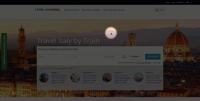
Exit-intent technology works similarly on mobile devices. But instead of tracking mouse movements, a mobile exit-intent script signals the popup to appear whenever visitors either hit the back button or scroll up to engage with the address bar.
How To Use Exit-Intent Popups
There are multiple ways that exit-intent popup can increase your ecommerce conversion rates.
Basically, “you can use exit-intent popups for any purpose that might help you acquire or retain more customers,” says HelloBar.com.
But here are a few of the most common situations in which to use an exit-intent popup:
- To save a sale or prevent shoppers from abandoning their carts
- To promote a special offer or deal
- As a lead magnet
- As a friendly warning
- To redirect visitors
- To get feedback about your brand, business, or website.
Let’s take a closer look at each of the aforementioned situations. Then, we’ll dive into a big list of examples of exit-intent popups. We’ll focus on specific techniques for these types of popups and tips for optimizing your results.
Using Exit-Intent Popups To Save A Sale Or Reduce Cart Abandonment
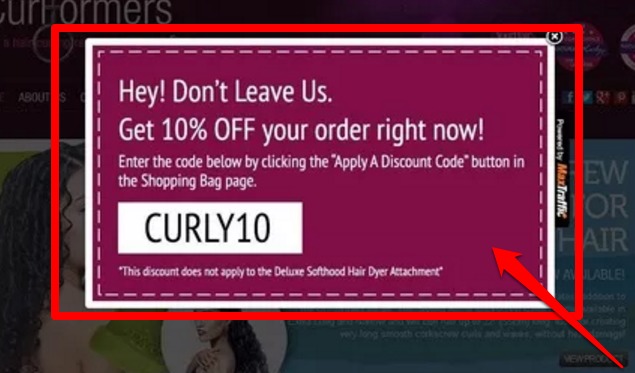
This is one of the most common ways that businesses use exit-intent popups.
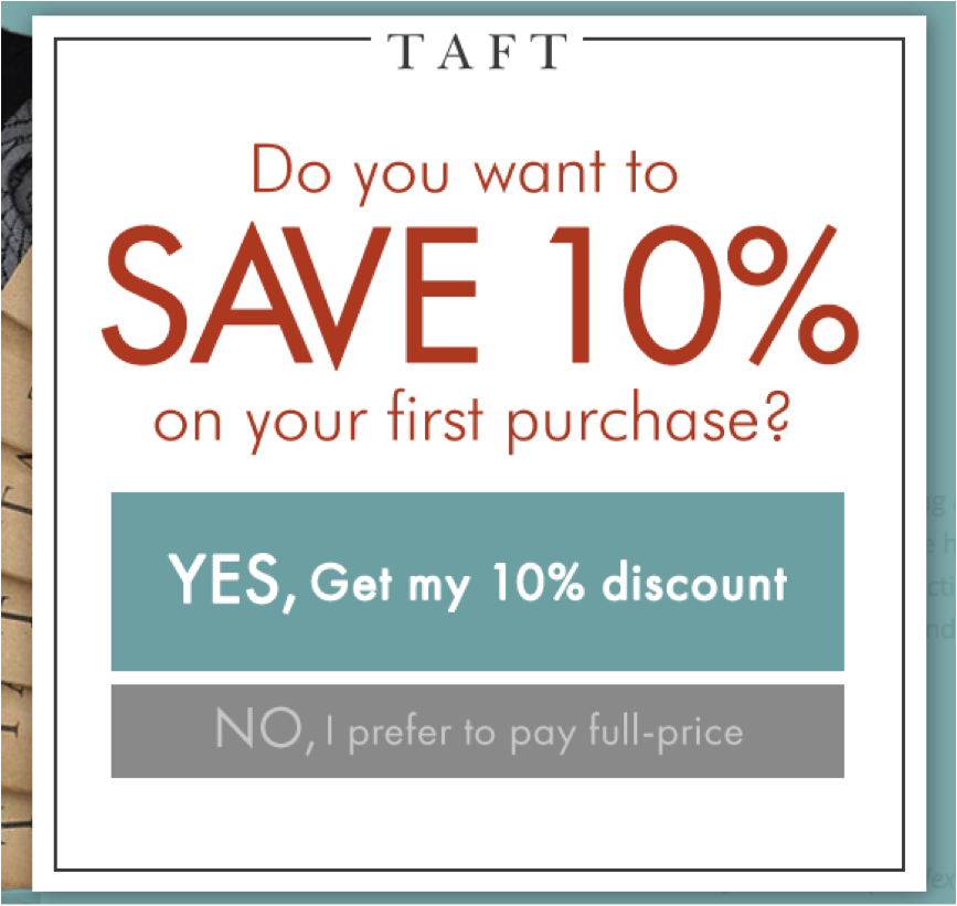
When customers are about to abandon their carts, an exit-intent popup can ask, “Are you sure you want to leave without completing your purchase? Here’s a coupon for 10% off. Click ‘Yes, I’ll stay!'”
Shoppers abandon their carts for a variety of reasons, one of which is the expense of the items they’re considering. So by offering shoppers a coupon, you can address this point of friction and motivate more people to stay and complete their purchase.
Similarly, if you provide free shipping at a certain threshold, you can use an exit-intent popup to motivate people to continue shopping by letting them know how close they are to receiving that deal. For example, the popup might say, “You’re only $10 away from receiving free shipping. Do you want to continue shopping?”
Also, if shoppers seem like they’re about to leave even after reaching the minimum spending threshold, you can use an exit-intent popup to remind visitors of this and convince them to stay. In this case, you might say, “You’re eligible to receive free shipping. Are you sure you want to leave and miss out?”
Coupons and free shipping aren’t your only means of reducing cart abandonment, however. But we’ll talk more about your other options later on.
Using Exit-Intent Popups To Promote A Special Offer Or Deal
Another way to get more people to stay on your site is to use exit-intent popups to promote special offers or bonuses, such as a free gift with purchase.
For example, if you’re offering a discount on some of your products, you could have your exit-intent popup say, “Are you sure you want to leave this page? This offer expires in 24 hours. Don’t miss out on 20% off all spring merchandise.”
The above example promotes a special deal you’re running. It also instills a sense of urgency in visitors by making the deal time-sensitive (it expires in 24 hours). This lets visitors know they need to act quickly if they want to enjoy the special savings. (We’ll talk more about urgency and other psychological principles you can use to influence visitors a little further down.)
Using Exit-Intent Popups As A Lead Magnet
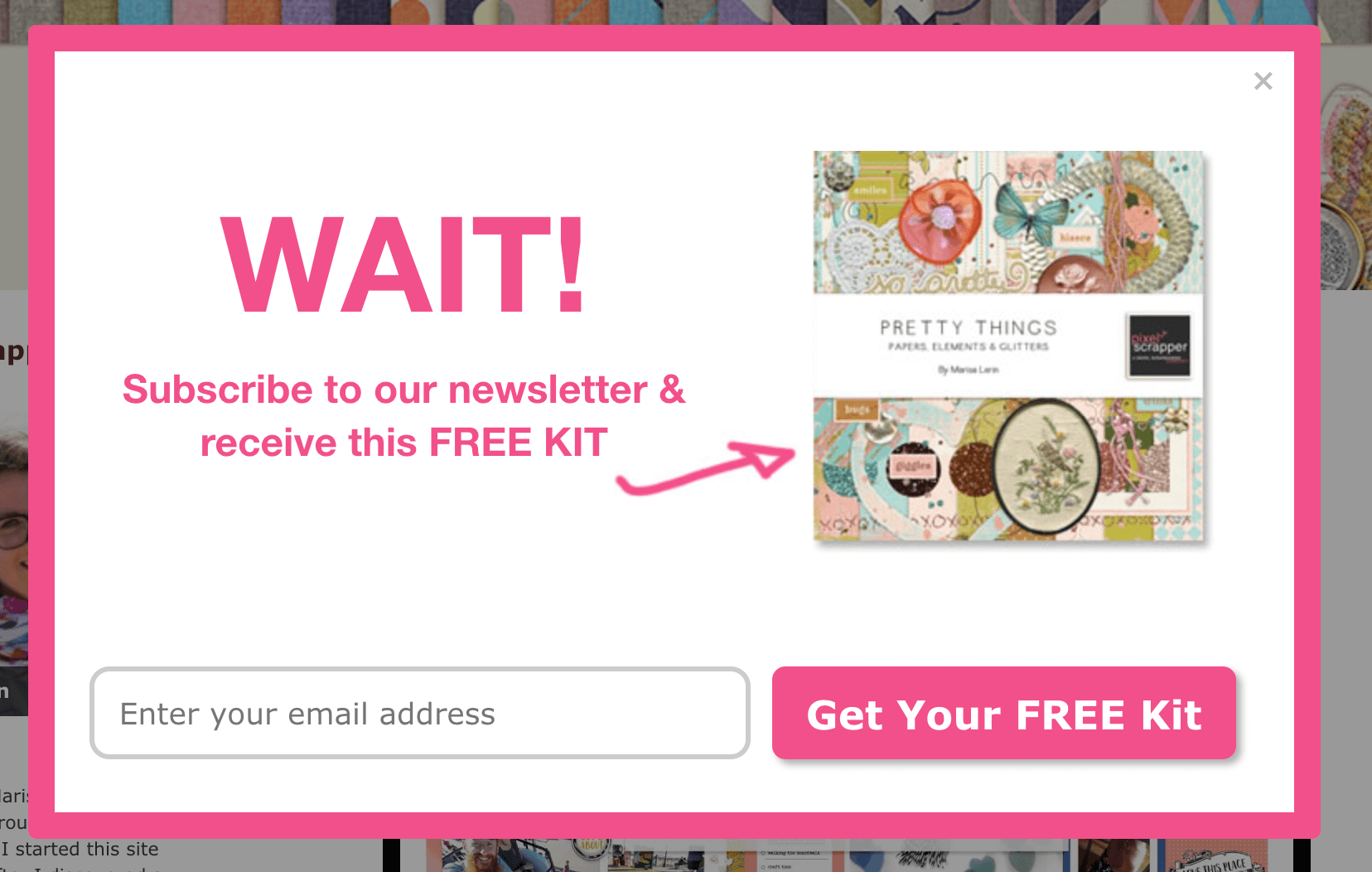
You can also use exit-intent popups as a means of enticing visitors to opt-in (e.g. subscribe to your newsletter, download a piece of content).
Depending on your product or service, you could give away something of value that has a lower barrier of entry. For example, you could create a popup asking visitors to provide their email address in exchange for getting a free, downloadable report or eBook.
Your opt-in offer needs to be compelling, however. Visitors are on their way out so you need to provide them with something worth sticking around for and opting in. (We’ll talk more about how to make your popup’s copy more engaging down below.)
Using Exit-Intent Popups As A Friendly Warning
Exit-intent popups can serve as friendly warnings about missing out on certain opportunities that are either time-sensitive or have a limited amount available. This could be a special discount that won’t last long, a product whose stock is running low, or a bonus that’s available for only a limited amount of time.
Just be courteous when using exit-intent popups. If people feel like they are being bombarded, you can pretty much kiss those conversions goodbye. With your popups, always keep your visitors’ best interest at heart and be crystal clear about what you have to offer, why people should want it, and how they can get it.
Using Exit-Intent Popups To Redirect Visitors
Redirecting visitors to other offers or content on your site is a way of responding to visitors’ presumed lack of interest in what they’re navigating away from. It’s a way of saying, “Hey! You may not think what you’re looking at is engaging or relevant. But just wait until you check this out instead!”
Then, you can encourage visitors to click through to another section or page of your website. For example, if a visitor is attempting to leave one of your product pages, you might redirect him or her to another one of your offers. Or, if it’s a piece of content that a visitor is abandoning, you could send him or her to a different but related article or video on your site.
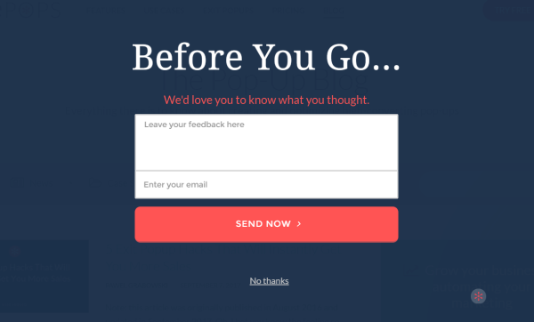
Using Exit-Intent Popups To Get Feedback
Learning more about how visitors perceive your brand, site, and business helps you respond accordingly, making any necessary improvements or adjustments to better serve your target market and ensure your long-term success.
Getting the timing right in asking for feedback can be a challenge, though. “Ask too early and the user won’t have anything to say. Ask too late and she/he might be gone already,” says Greg d’Aboville.
But an exit-intent popup asks for feedback at just the right moment. Visitors have done some navigating around your site so they are at least somewhat familiar with it. And they are already on their way out so you won’t interrupt their browsing.
Here’s a feedback-collection template shown by Wisepops, which reports that its customers “get a response rate of about 5%.”
Examples Of Exit Intent Popups
Exit-intent popups consist of four key components:
- Copy
- Offer
- Call-to-action
- Design
And when it comes to each of these things, you have a variety of options and decisions to make about your popup’s look, tone, and intent.
Your Popup’s Copy
The importance of your popup’s copy cannot be understated. Your visitors are about to leave, potentially forever. So what you say in your exit-intent popup needs to be enticing enough to stop people in their tracks and get them to take action.
No pressure, right?

Your copy needs to be straightforward, relevant, and engaging. “Even if you do everything else wrong with your exit-intent popups, getting your copy right will win you some conversions,” says CrazyEgg.com.
In your copy, you need to convey what your offer is and why visitors should care enough to learn more. And you need to get that across as concisely as possible, as popups have only a limited amount of space available.
There are numerous strategies you can employ to improve your copy’s effectiveness while focusing on your offer. This includes personalizing the message, using psychological principles, and tapping into visitors’ cognitive biases.
Let’s take a look at personalization first.
Personalization
In the case of exit-intent popups, personalization refers to making your message all about your visitors and speaking to them directly.
This doesn’t mean you need to address your visitors by name, however. Speaking to visitors directly in an exit-intent popup involves using a conversational tone and words like you, your, yours and me, my, mine.
Check out this example posted on CrazyEgg.com and notice the use of personalized language (you, your, my, and I):
This approach “will automatically help [visitors] picture [themselves] alongside the value proposition. It instantly makes your message more about [them] and less about your business,” writes Vanhishikha Bhargava.
Another way to add a touch of personalization to your copy is to say something in your headline such as, “Before you leave…” This signals to visitors that you understand their intent so you are offering them something special based on their actions.
Loss Aversion
Loss aversion is a concept that comes from cognitive psychology and decision theory which marketers frequently use to influence their target audience. According to Talia Wolf, “Loss aversion refers to people’s tendency to strongly prefer avoiding losses to acquiring gains.”
For example, people, in general, want to not lose money more than they want to find money. Or, another way of putting that would be “the thought of losing $5 is much more painful than the joy of receiving $5,” says Jordan Lore.
Loss aversion is a cognitive bias to which most people are susceptible and you can easily tap into it in your popup’s copy. Here’s an example posted on Wishpond.com:
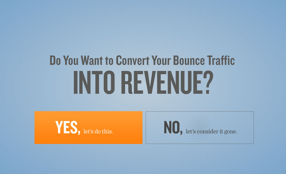
Image Credit: Wishpond.com
In this popup, the company uses a negative call-to-action (more on that later) that leverages visitors’ fear of losing web traffic (and consequently, missing out on revenue opportunities) as a means of getting them to click “YES, let’s do this.”
Urgency
Conveying a sense of urgency is another popular technique marketers use to influence their target audience. In addition to having an aversion to loss, many people also have a fear of missing out. (The #FOMO is real.)
FOMO is most common among millennials, but it affects other age groups as well and is more prevalent among frequent social media users. And if you can convey a sense of urgency by making visitors feel as if they’ll miss a great opportunity if they don’t act fast, you can leverage their FOMO to incite them into action.
One way you can do this is by making the offer in your exit-intent popup time-sensitive. For example, “Grab your 15% off coupon! Offer expires in 24 hours.”
Another strategy is to imply scarcity, which you can do by mentioning the number of offers still available: “Only 7 left in stock. Act now!”
You can’t be disingenuous, though. Your offer really has to have an expiration time and the number-count needs to be real and not just a ploy to get people to do what you want.
Also, urgency is less about persuasion and more about thwarting procrastination. So if visitors simply do not want what you have to offer, no amount of urgency is going to persuade them to act now. Urgency doesn’t work unless you couple it with a compelling pitch about your offer’s value.
Joel Klettke says, “Winning a conversion takes two things: A feeling of desire (‘I’ve got to have this thing!’) and a nudge that refuses to allow the lead to procrastinate (‘But I’ll get it later’). Your sales copy is the hook, and urgency is the tug on the reel.”
Exclusivity
Similar to urgency, exclusivity can tap into visitors’ fear of missing out. When something is exclusive, it’s hard to get. This makes people feel as if they’re missing out on something if they’re unable to have the thing in question. Plus, when something is exclusive, only select people can have it or gain access to it, which makes it seem elite, and consequently, more desirable.
An easy way to convey exclusivity in your copy is to include the word ‘unlock.’
The word ‘unlock’ communicates to visitors that the offer they are about to receive is a privilege or something special and valuable.
Here’s an example from Tim Ferriss, author of The 4-Hour Workweek, in which he adds the word ‘unlock’ to his call-to-action button:
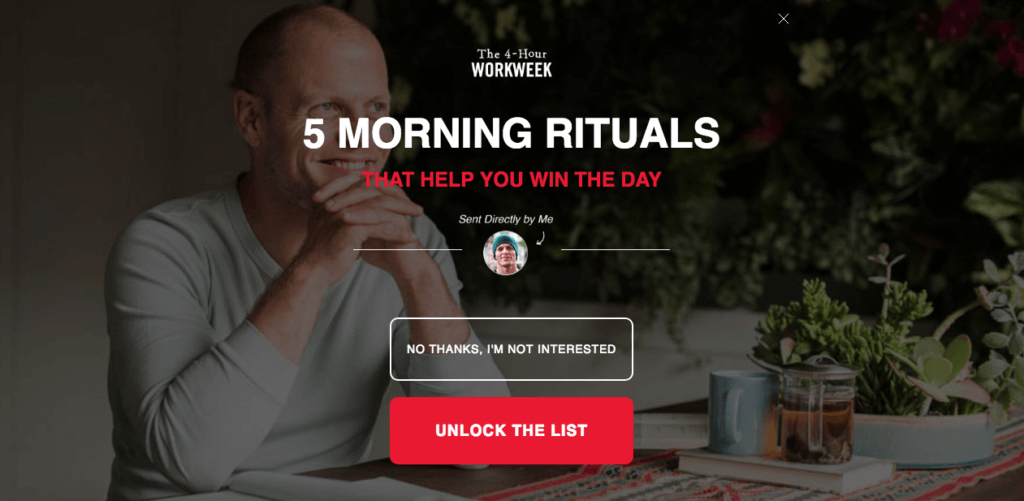
There are several other words he could have used in place of ‘unlock.’ For instance, he could have said, ‘Get the list’ or ‘View the list.’ But ‘unlock’ is more intriguing; it makes his list seem like rich, premium content put together with expertise.
Curiosity
Piquing visitors’ curiosity is a means of persuading them to learn more or continue exploring. An easy way to do this is to start by asking a question, such as want to learn how to _____? For example, want to learn how to get 10,000 Facebook followers for free?
Another easy question format is want + specific benefit? Check out what the WordPress hosting company Flywheel asked visitors in one of its exit-intent popups:
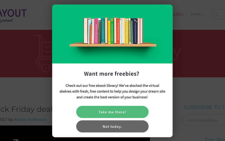
In this popup, the question “Want more freebies?” is highly engaging. Who doesn’t love free stuff, after all? That question followed by the explanation about the company’s eBook library piques visitors’ sense of intrigue, especially since the content is free.
Authority
Adding authority to your copy increases your offer’s credibility, especially if what you’re offering is a piece of content, like an eBook. If visitors believe you or your company possess expertise or authority in your industry or niche, they are much more likely to want what you’re offering.
Take a look at the copy Brian Dean of Backlinko uses with his checklist offer:
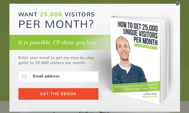
In his copy, he demonstrates his proven success with SEO. Then, he offers visitors a resource to help them achieve similar results. After conveying his expertise, Brian is more likely to be perceived as trustworthy, and his visitors are more likely to see value in his checklist. This, in turn, makes his visitors more likely to convert.
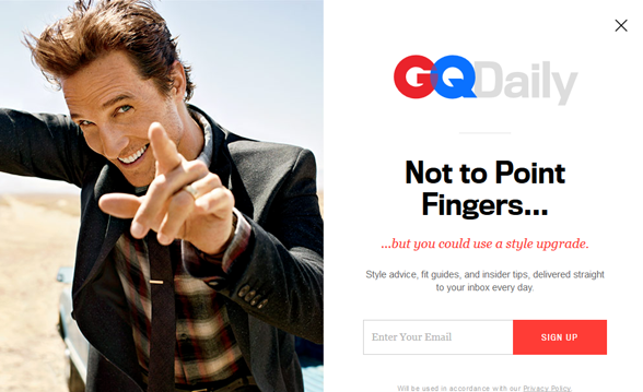
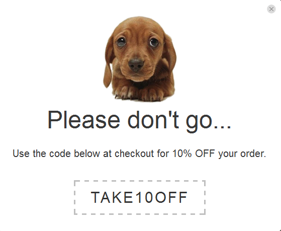
Humor
One of the most effective ways of piquing your visitors’ interest is to make them laugh. Of course, using humor isn’t appropriate for all brands and businesses. But if a little laughter fits your business’ style, then go to town. It’s a surefire way of getting people to remember you.
Here are three examples of businesses adding a dash of humor to their exit-intent popups:
- Don’t be that guy who only watches Adam Sandler movies…
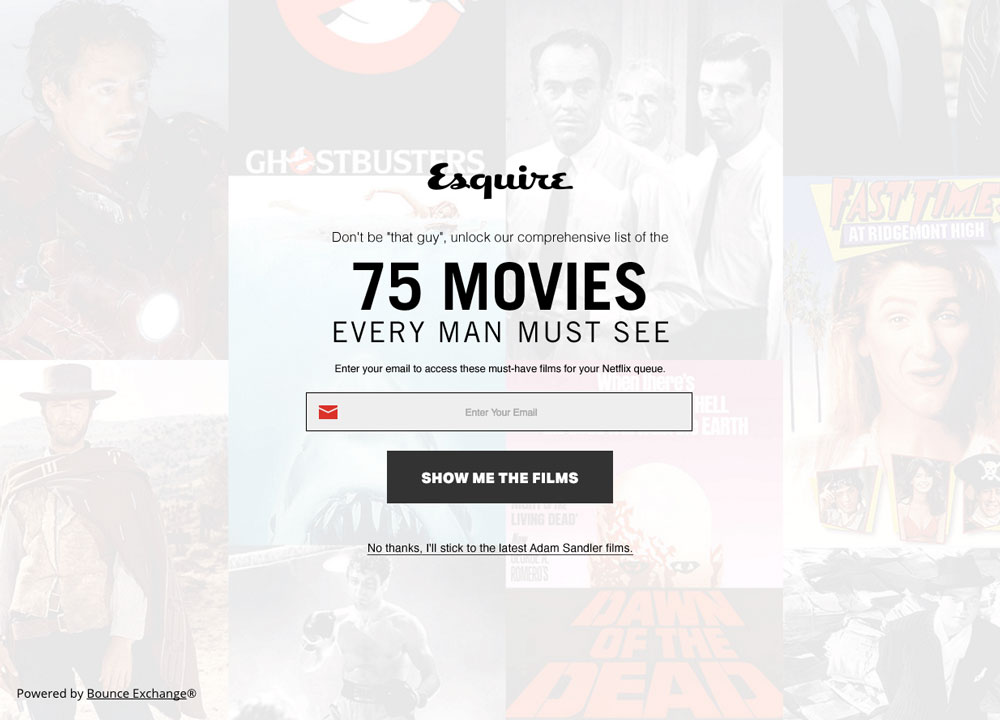
Image Credit: Wishpond.com
- Matthew McConaughey is pointing at you to get a style upgrade…
- How could anyone abandon that sweet puppy face?
Social Proof
Social proof is powerful. Knowing other people have engaged with your brand or made purchases and had good experiences reassures shoppers that they’re likely to have a good experience too. Social proof helps build trust and makes people feel like doing business with you is the right call.
Social proof can come in several forms:
- Reviews, testimonials, numeric or star ratings
- Engagement, such as likes, shares, retweets, re-pins
- Comments
- Numbers or data (e.g. number of subscribers or data about users success rates).
Here’s an example of an exit-intent popup that includes social proof in its copy:
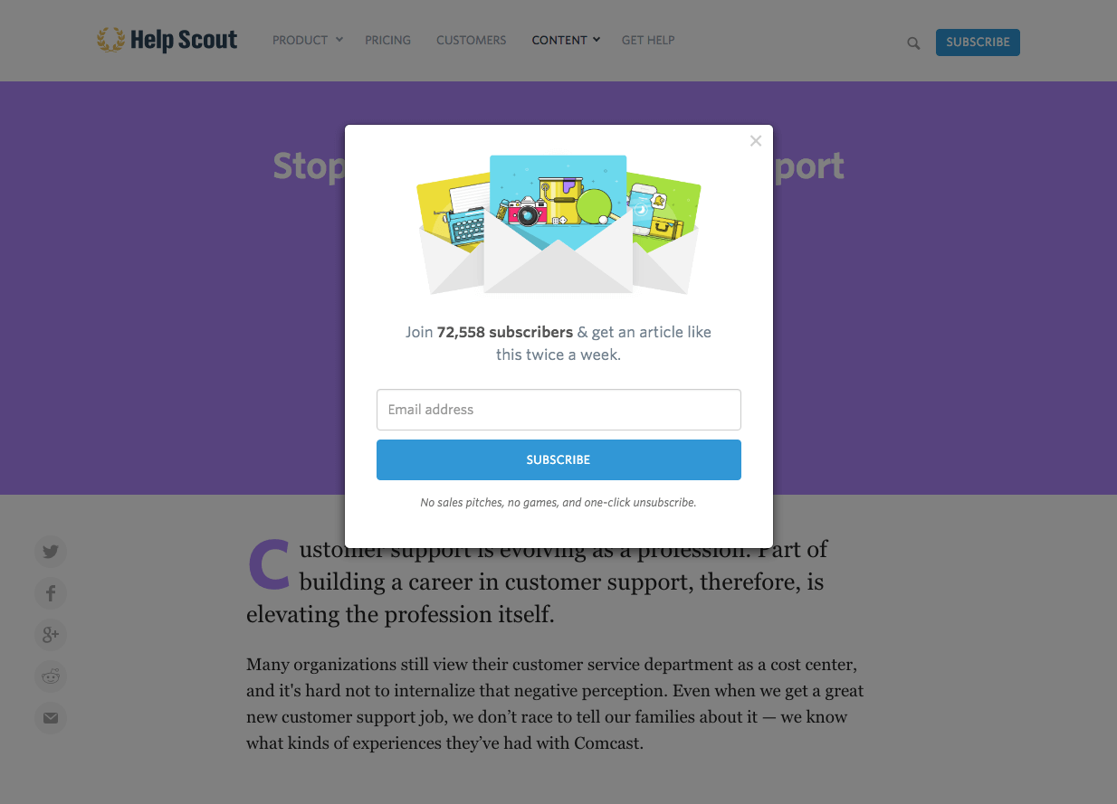
Image Credit:Wishpond.com
In this popup from HelpScout.com, the company uses social proof (72,558 subscribers) as a means of persuading people to provide their email address.
HelpScout isn’t obvious about it, though. The company doesn’t come right out and say, “We have over 72K subscribers! We’re super popular! So you should sign up too!” Instead, the copy weaves the social proof into the popup’s headline as part of a directive statement specifying HelpScout’s offer.
Here’s another good example of a company weaving social proof into its copy using numbers:
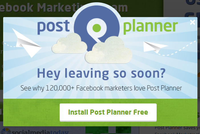
The popup uses a bold question as a headline and notes the large number of Facebook marketers who love Post Planner. This subtly encourages other people to install this tool too, because if 120,000 marketers use Post Planner, it must be good, right?
Potential Objections
When shopping, customers always have questions and concerns, however mild, about what they’re considering buying. For example…
- Is it too expensive?
- Will it fit?
- Will it actually work?
- How long will it take to arrive?
- What’s the quality like?
- Is it safe?
- Can I get a refund if I don’t like it?
…And it’s your job to help people overcome these concerns or potential objections and make the barriers to convert as low as possible.
You can do this in your popup’s copy by addressing issues upfront. “If you acknowledge potential objections, consumers won’t see them as quite so scary,” notes HelloBar, which then goes on to outline the following list of objections consumers commonly have about investing in a product or service:
- Unable to afford it
- Unsure of whether they’ll get their money’s worth
- Unfamiliar with your brand or business
- More familiar with a competitor
- Unsure of how the product or service works
- Concerned about how difficult it may be to use
- Unable/unwilling to wait for it to arrive or
- Uncomfortable trying something new
- Unwilling to act now, would prefer to wait.
While you won’t have the space (and your visitors won’t have the attention span) to address all these objections in your exit-intent popup, you can pick 1-2 of the most relevant objections, based on your offer, and address them in your copy.
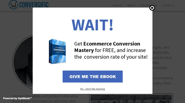
Trigger Words And Phrases
There are many effective words and phrases you can include in your copy that command visitors’ attention, most notably the word ‘wait.’ “Perhaps it’s due to our need for closure, but there’s something alluring about the word “wait,” isn’t there? What are you waiting for? So mysterious!” notes Jacinda Santora.
The word ‘wait’ can even work as a standalone headline for your popup. ‘Wait’ isn’t the only effective power word, however.
Here’s a list of additional trigger words and phrases:
- stop
- join
- hold on
- hang on
- before you leave/go
- don’t miss this
- instant savings
When you include trigger words in your copy, make sure they stand out. You can do this by making the text bold or using high-contrast print.
Your Popup’s Offer
You have a lot of options when it comes to what your exit-intent popups use as an incentive to get people to stay. Here’s a list of some of the most common offers you encounter with exit-intent popups.
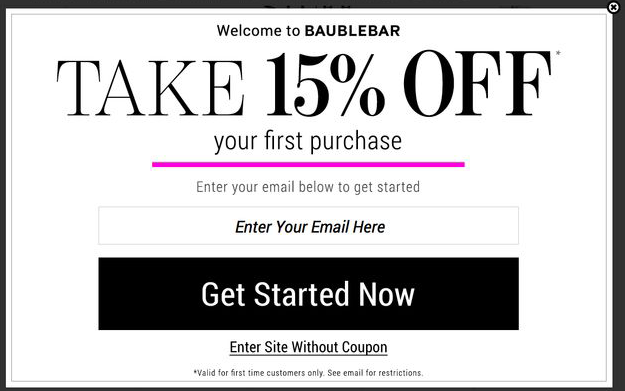
Discount Offer
The discount could occur as a percentage or dollar amount off of a particular type of product or service (e.g. 10% off all spring merchandise or $10 off your first deep-conditioning treatment). Or, the discount could apply to your entire store.
You see a lot of companies offering discounts to first-time customers in their exit-intent popups. Check out Baublebar, a jewelry and accessories company, which entices visitors with 15% off customers’ first order.
You can also offer coupons for visitors’ next purchase, like Win In Health, natural products, supplements, and vitamins.
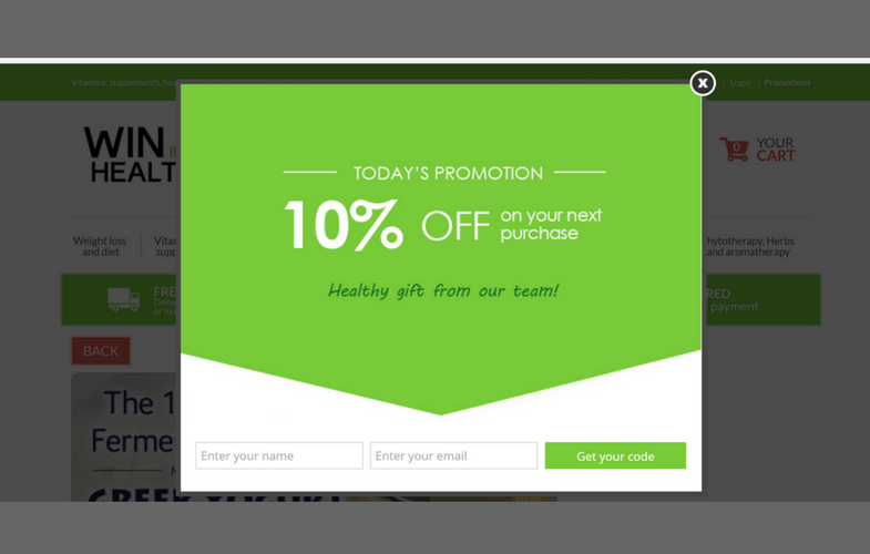
This way, even if people do decide to leave, you’ve given them a reason to return.
Your popup’s discount offer doesn’t have to be for customers’ first or next purchase, though. You can make the discount apply to any order customers make as well.
Free Bonus Or Gift With Purchase
In place of a coupon code, you can offer visitors a free bonus or gift with purchase in your exit-intent popups (depending on your business).
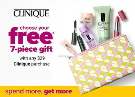
This is something you see a lot of cosmetic companies do. If you spend a certain amount, you get a free lipstick or makeup bag, for example. In a special offer from Clinique, shoppers receive a free 7-piece gift with any purchase of $29 or more.
Not all businesses are able to dole out free gifts, of course. But bonuses and free gifts don’t always have to be tangible. You could also give items such as downloadable eBooks, a free consultation or one-on-one call, or one free month on a subscription plan.
Free Shipping
Free shipping (with or without meeting a minimum spending threshold) is another popular discount companies offer in their popups. Anytime you can eliminate a point of friction from your sales funnel, you bring visitors one step closer to converting.
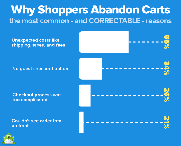
According to OptinMonster, the number one reason shoppers abandon their carts is due to unexpected costs. This includes taxes and shipping and handling fees.
So if the goal of your exit-intent popup is to coax more shoppers into completing the checkout process, free shipping can be a very persuasive deal.
When you offer free shipping in your popup, you can include a copy-and-paste code that visitors can apply as they’re checking out, similar to what’s shown in the example below:
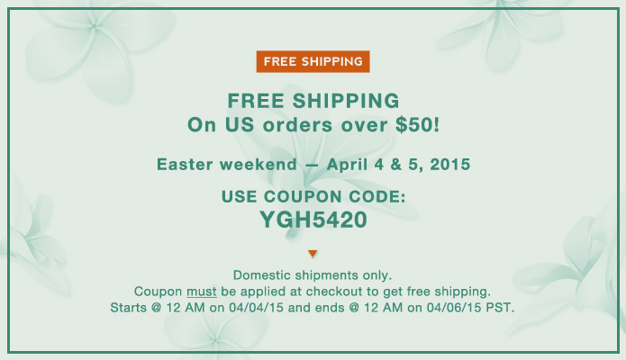
Notice how the fine print lays out the offer’s terms and conditions, most notably the start and end dates and how the free shipping offer applies to domestic orders only.
Including a code to redeem the free shipping offer is one option you have for your popup.
But if you want “to make the purchase easier, you might even include a link back to the product [visitors] were viewing, or a link back to the shopping cart,” says Jacinda Santora on OptinMonster. Then, you can make it so the free shipping is automatically applied to visitors’ orders.
Here’s an example:
Free Download
It may make more sense for your business to entice people with content as opposed to discounts. In which case, you have multiple options when it comes to the types of free downloads you can offer.
For instance, your exit-intent popup could give away any of the following:
- checklists
- scripts
- transcriptions
- collections (e.g. quotes, recipes, helpful tips or resources)
- templates
- infographics
- eBooks or reports.
Here’s an example of a popup from John Chow’s website giving away a free eBook:
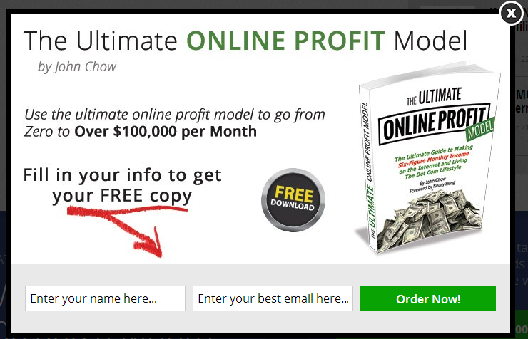
Notice how he highlights the benefit of his eBook in his copy: “go from zero to over $100,000 per month.” Even if what you’re giving is free, exiting visitors still need to be persuaded that the offer is worth the additional effort (however small that effort might be) to opt-in.
Free Trial
Depending on your business, you may be able to incentivize your exit-intent popup by offering a free trial.
Free trials can work well if you’re an SaaS company or if your business uses a subscription model, such as Hello Fresh, the food delivery service. A free trial can also be an appealing offer for consumable products, including many beauty items, such as gels and lotions.
There are some scenarios, though, when a free trial doesn’t make sense as an exit-intent offer. The purpose of offering a free trial is to remove the risk factor, putting customers at ease about committing to your product or service. And sometimes, a free trial isn’t able to achieve that goal.
Here are two scenarios in which you shouldn’t use a free trial as your offer:
- Your product or service can’t deliver results quickly. Free trials typically last between 7 and 90 days. And during the allotted timeframe, customers should be able to experience some degree of benefit or value from what they’re testing.
- Your product or service is highly complex. If effective use of your product or service requires extensive training or third-party integration, it may be too complicated for a free trial. Shoppers won’t get the most out of what you have to offer if they don’t fully understand how it works.
In these two scenarios, a better bet would be to offer visitors the following…
Free Demonstration
A free demonstration is a good alternative if your product or service doesn’t deliver fast results or it involves a learning curve.
Demonstrations can convey the quality and value of what you have to offer without overwhelming or confusing people. Plus, they can show your offer’s long-term potential better than a free trial in some cases.
A free demo can be an effective means of encouraging exiting visitors to return to your site and further explore your business’ possibilities in a risk-free manner.
Here are two ways of offering a free demonstration:
- A product video or webinar – Provide visitors with a link to a video where they can see the product in use and get a better feel for its features and benefits.
- A one-on-one call with screen share – Invite visitors to set up a call during which you (or someone on your team) share your screen and walk them through how your product or service works. You can also answer any questions people have along the way.
Related Products
People leave websites for a lot of reasons. Perhaps they couldn’t find what they’re looking for or maybe what they’re looking for is unavailable, out of stock, or the color or size isn’t right.
As long as visitors aren’t about to leave your site because they’re totally uninterested, you can use an exit-intent popup to persuade visitors to stay by showing them products related to the ones they were just browsing which they might like better.
New inventory and sale items are especially persuasive at getting visitors to explore more of your offerings.
Micro-Conversion
“Sometimes it takes a little bit of convincing to make a visitor convert into your customer,” says Vanhishikha Bhargava. With exit-intent popups, your visitors are on their way out and you may not know why. In which case, you may want to take a more delicate (i.e. not pushy) approach to get them to stay.
Vanhishikha Bhargava suggests presenting your visitors with a micro-conversion. The goal here is to make signing up for your offer seem like less of a commitment and a total no-brainer.
She says, “If you want [visitors] to sign up for a free trial of your product, suggest a demo instead so that [they understand] what you offer first. Or if you want [them] to subscribe to your newsletter, nudge [them] to follow you on social first so [they] can see what kind of content you share.”
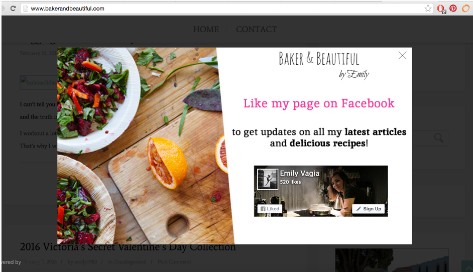
Here’s an example of a site that encourages exiting visitors to like its Facebook fan page instead of signing up for the blog’s newsletter, which could feel like too much of a commitment.
Your Exit Intent Popup’s Call-To-Action
Your exit-intent popup needs to have a prominent CTA with powerful copy highlighting the benefit of taking action. For instance, Send me my coupon code now or Sign me up to receive my free eBook. Obtaining a coupon code is the focus and benefit of the first CTA. And in the second example, the benefit is getting a free eBook.
Whatever the benefit may be, your CTA copy needs to be strong. In a post about high-converting call-to-action words and phrases, Crazy Egg details a list of CTA copy formulas that can increase your clicks. Here’s a sampling from that list:
- “Yes, I want X!” – X is the benefit or the incentive. It could be a coupon code, an eBook, a subscription upgrade—anything, really, as long as it has value.
- “Snag/Grab/Seize/Score/Gain X now” – Again, X can be anything, including a percentage or dollar amount discount (e.g. “Snag 10% off now” or “Score $5 off now”). Just pair your incentive with a unique, active verb. But avoid using”get.” “Get” is boring, passive, and overused. Bust out a thesaurus and choose a word that packs a little more punch.
- “Start your journey toward X” – In this context, X still serves as a benefit, but this time, it’s more result-oriented. For example, you might say, “Start your journey toward earning 6 figures a year” or “Start your journey toward getting the body you’ve always wanted.”
- “You’re running out of time!” – Other variations of this CTA include “Act now before it’s too late,” “Grab your discount while it’s available,” and “Don’t miss out!” The point is to instill a sense of urgency in your visitors and compel them to think twice about leaving your website.
Other power words and phrases you may wish to include in your CTA include…
- wait
- try
- free
- now
- save
- explore
- discover
- my/my/you/your
- start/stop
There are many power words you can add to your exit-intent popup’s CTA. But there is also many strategies you can use when it comes to your CTA’s tone and focus.
For instance…
Negative Call-To-Action
Not everyone loves negative calls-to-action, but they are effective.
A negative call-to-action forces visitors to make a choice. They can either choose yes or no. But if they select no, they’ll have to “internalize a message that [they] don’t agree with, such as ‘No, I don’t want more traffic’ or ‘No, I don’t want to save money.'” says business writer, Rob Powell.
The intent of a negative CTA is to appeal to people’s aversion to loss or missing out (more on that later). In the above examples, you’d be hard-pressed to find a web owner who didn’t want more traffic. And there’s not likely anyone on the planet who’d prefer spending full-price when they could spend less.
This makes choosing ‘yes’ in both of these scenarios obvious, which is the goal of the negative CTA — to create an offer visitors feel compelled to say yes to so they’ll take action.
Here’s an example from Skullcandy, a headphone company, working the money-saving angle:
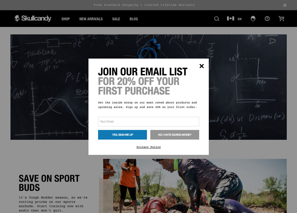
Notice the colors of the two buttons as well. The ‘Yes sign me up’ button is blue and inviting while the ‘No, I hate saving money’ button is grey and somber. Which button color captures your attention? Probably the positive, blue one.
Other examples of negative calls-to-action you can create include…
- No, I’d rather do it the hard way.
- Special deals are the worst. No thanks!
- No, I hate free stuff.
Negative CTAs can be really engaging. But they can also imply visitors are dumb or don’t know what’s good for themselves, which obviously won’t sit well.

So be mindful that your negative CTAs don’t cross the line from interesting to insulting.
Benefit-Driven Call-To-Action
You have to provide visitors with some kind of incentive or benefit for taking action on your popup. And with this type of CTA, you highlight what that benefit is right in the CTA’s copy, responding to the question, “Why should visitors care?”
“Using a benefit-oriented CTA implies a reward or the end of a problem for the visitor,” says Jordan Lore of Wishpond. For example, that reward could be a coupon code or a free download, or it could be a means to earn more money, lose weight, or convert more visitors into customers.
A benefit-driven CTA doesn’t simply say “Click here” or “Subscribe now.” A benefit-driven CTA spotlights the reward, saying something like “Click here to receive free shipping” or “Subscribe now and double your traffic.”
Or, if you’re offering visitors information about how to do something or achieve a specific goal, like Backlinko.com, your benefit-driven call-to-action could be…
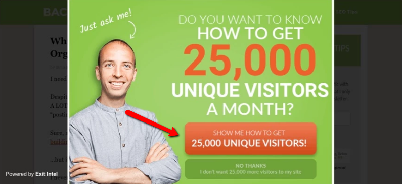
Also, take note of how Backlinko uses a negative CTA right below the benefit-driven CTA: “NO THANKS I don’t want 25,000 visitors to my site.”
Action-Oriented Call-To-Action
Action-oriented CTAs make crystal clear what’s going to happen when visitors click through. They use strong, active language with clear directives. And the words they include align with the incentive or reward they propose.
For example, if your incentive to get visitors to stay is to offer them something for free, such as an eBook, your CTA could be “Give me the eBook.”
Here are a few more examples of action-oriented CTAs along with the incentives they pitch:
- Offer: A merchandise discount; CTA: Claim my 50% off coupon.
- Offer: A free checklist; CTA: Download my free checklist.
- Offer: A free trial; CTA: Start my 7-day free trial.
Your Exit Popup’s Design
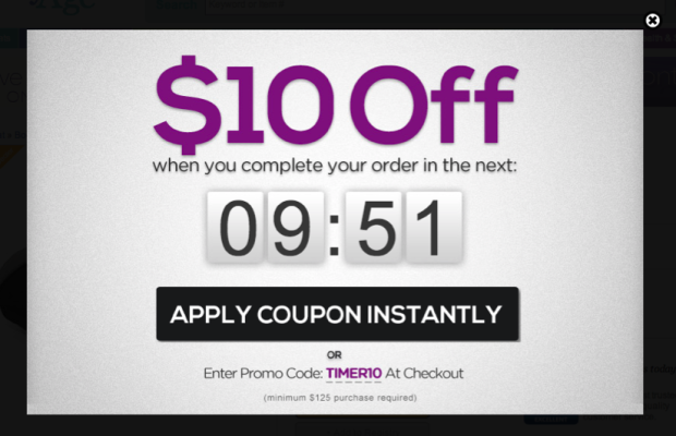
Progress Bar
Sometimes, visitors decide to click through on your popup only to fall off at the next step.
To prevent this, you can add a progress bar to your popup showing visitors how close they are to completing the sign-up process and receiving their reward (your offer). Take a look at the example below and notice the progress bar at the top:
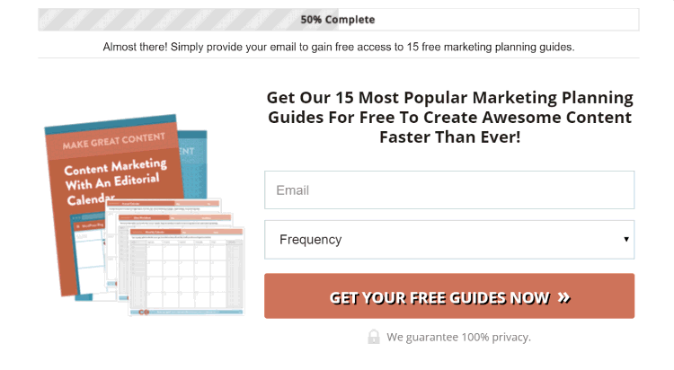
Image Source: Wishpond.com
“A progress bar that shows a 50% completion harnesses what is called the Zeigarnik effect. It refers to the nagging effect one gets when they leave a task incomplete,” says Jordan Lore of Wishpond. So including a progress bar in your exit-intent popup can help coax visitors into finishing what they started.
Multiple Options
Creating an offer for your popup that appeals to the majority of your target audience isn’t always easy. “Many businesses have several different buyer personas, and each persona is going to respond to their offers differently,” says Jacinda Santora.
Say your popup offers a free eBook about how to achieve a specific goal. If one segment of your audience is more advanced, they aren’t going to see the value in that offer. And if another segment has fewer skills and experience, they won’t find the offer appealing either because the content is over their heads.
A solution to this issue would be to include multiple options (2-3) with your exit-intent offer. For example, if your business is in the health and fitness niche, you might ask visitors to first choose the option that best describes what they need help with—for example, losing weight, building muscle, or healthy eating.
Then, after visitors make their selection, you can hit them with the opt-in form to receive a special offer based on the selection they made. This way, the offer is more targeted and therefore more appealing to visitors because it better serves their needs.
Strategic Images
Never underestimate the power of visual content when it comes to conversion rates. According to BandwagonCreative.com, conversion rates are seven times higher for businesses that use custom visual content versus those that don’t. So if possible, be sure to add a relevant, eye-catching image to your exit-intent popup.
There are multiple ways that you can include visuals in your popups to make visitors more likely to convert.
First, you can use images to direct visitors’ attention to specific parts of your popup, such as your core message, offer, or call-to-action.
If your popup features an image of a person, have the person look towards the popup element you want to highlight.
For example, an eye-tracking study analyzing peoples’ reactions to an ad for Sunsilk shampoo reported that most viewers followed the model’s gaze when she was pictured looking at the shampoo bottle. Conversely, when the model was photographed looking straight ahead, viewers were more likely to overlook the shampoo.
See how the two photos compare below:
![]()
Second, if your popup’s offer involves something like a discount on a specific item or a free eBook, show an image of what you’re offering.
This may seem obvious, but you’d be surprised how many businesses don’t do it.
Images can convey a lot of information all at once, so your offer will feel a lot more compelling if you’re able to show not just tell visitors what it is. This is especially true for offers involving specific items. For example, if your offer is for 15% off a handbag, show an image of the bag and show it being used. You might show an image of a woman holding the bag while walking down the street.
Showing the item in use helps build a narrative about who the product is for and how it fits into people’s lives and can meet their needs. Anyone who relates or aspires to this narrative is more likely to convert.
Similarly, if your offer involves a free eBook, show an image of your eBook’s cover. You chose the cover for a reason. And that reason likely involved connecting with your target audience. So use that image to get more visitors to convert with your popup.
Third, whenever relevant, include people in your images.
We talked about how you can use an image of a person to steer visitors’ attention toward an important part of your popup. But there’s another reason that images with people can help increase your popup’s conversion rate.
Images of people help build trust. They add a human touch to your message and establish an emotional connection. “People sell. Faces are unique. As humans, we are naturally drawn to look at faces,” says Neil Patel. The people should be real, though, and relevant to the popup. In other words, use unique photos, not images of random people from stock photography.
Two-Step Opt-In
As the name implies, a two-step opt-in requires visitors to take two steps to opt into your popup’s offer. So instead of filling in their email address in the first step, visitors would click a button or link on your popup and then provide their email address in the second step.
In the example below, visitors must first click the “YES, PLEASE” button to opt-in. This action implies that they’re interested in the offer. Then, they input their email address in the next step.
Image Source: Wishpond.com
But doesn’t requiring visitors to complete an extra step add a point of friction to the opt-in process?
While normally the answer to that would be yes, Oli Gardner says there are two main reasons why a two-step opt-in can benefit your conversions, and both reasons are rooted in behavioral psychology.
“Foot in the Door (FITD): The FITD technique is an example of compliance psychology. By design, it’s good because the form is launched after a user-driven request. They clicked the link to subscribe with the intent to do exactly that, subscribe (or whatever the form’s conversion goal is). The click demonstrates the reaction to a modest request, creating a level of commitment that makes the visitor more likely to complete the form (the larger request) when it’s presented.
Perceived friction: Because there is no visible form, the idea of filling out a form is not really top of mind. This reduces the amount of effort required in your visitor’s mind.”
Two-step opt-ins can provide you with better quality, more committed leads in some cases. But they won’t work every time or for every business. As always, you should test this strategy before making assumptions about its effectiveness.
Directional Cues
This is something you would want to test as well. But in case your popup’s conversion goal isn’t immediately obvious to visitors, you may want to add some built-in assistance to your popup’s design. You can do this by adding a directional cue, such as an arrow, to help direct visitors’ attention to a specific area of your popup.
“Attention is a limited resource,” says Kendra Cherry. And people are constantly being bombarded with an overflow of sensory information. Consequently, they rely on “selective attention” to zero in on the most important information while tuning out or skimming over less important details. This leads people to naturally seek cues about what they should pay attention to. And this includes when they’re looking at exit-intent popups.
Arrows and other visual cues guide your visitors to important parts of your popup, especially your call-to-action. They are easier and faster to process than written directions alone. And they help prevent visitors from getting distracted by less important information.
Movement
Another way to steer visitors toward a specific part of your popup is to incorporate movement. One way to do this is to add animation, like in the example below:
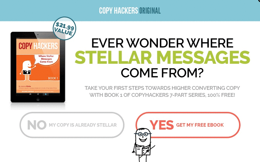
Image Source: Wishpond.com
It’s almost impossible to not notice the blinking call-to-action accompanied by the cartoon figure pointing at it. In this case, a moving animation is combined with a direction cue, and the resulting effect makes for one powerful popup.
Full Overlay
While most exit-intent popups display at the center of viewers’ screens, you could have your message span their entire screens instead. Rather than creating an exit-intent popup, you can create an exit-intent, full-screen overlay.
“What makes an exit-intent overlay so great is that it only provides the visitor with the option of opting in or clicking the no button, nothing else,” says Jordan Lore. “Clicking elsewhere has no effect, visitors must make a decision.”
Here’s an example of a full-screen overlay from Furless, a cosmetic company:
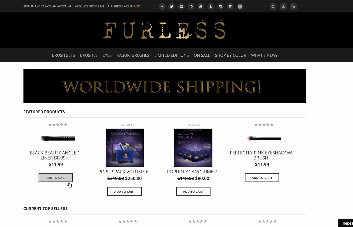
Full-screen overlays are unmissable. Plus, they are surprising, and research shows that “we tend to pay close attention to things that surprise us,” notes Wisepops.com.
Top Exit-Intent Popup Tools
Justuno
Justuno can handle pretty much any type of popup you want to create, including exit-intent. It’s one of our personal favorites here at Conversion Fanatics. Justuno helps you create high-converting popups. It lets you implement design changes to your popups and quickly test their results. Plus, it helps you target low-converting traffic sources with your popups.
You can try a 14-day free trial of Justuno. After that, pricing starts at $25 a month.
OmniKick
This tool uses advanced exit-intent technology, allowing you to create a variety of popups, including slide-in, floating bar, inline, and full-screen overlay.
OmniKick also offers a 14-day free trial. And you can learn more about their paid plans here.
WisePops
WisePops makes creating exit-intent popups simple. You use a drag-and-drop editor to design and customize your popups according to your brand and target audience. WisePops helps make sure you reach the right people at the right place and time. And you can measure your popup’s results on your dashboard.
Give WisePops a try with its 14-day free trial. Then, choose from three plans starting at $41 a month.
OmniConvert
OmniConvert lets you make a variety of exit-intent popups with different triggers. Plus, it offers more than forty segmentation criteria so your offers can be highly targeted and based on visitors’ behavior.
To get a better feel for how OmniConvert works, you can book a free demonstration of the platform. And you can learn more about your pricing options here.
OptinMonster
OptinMonster’s exit-intent technology lets you create popup forms, slide-ins, full-screen splashes, and mobile-specific popups. Plus, you can customize any popup you create with features like floating bars, countdown timers, and inactivity sensors. To get a feel for the types of popups you can make with OptinMonster, check out the company’s exit-intent popup gallery. It includes almost four dozen examples.
Pricing options that include exit-intent technology start at $29 a month.
Custom-Built Exit Offers
Here at Conversion Fanatics, we can also assist you with creating custom-built exit offers for your business. To learn more about the services we provide and how we can help your business grow, click here to get your free analysis.
Conclusion
You’ve now learned a variety of scenarios in which to use exit-intent popups as well as a bunch of strategies to make your popups more effective and some of the best tools available to create your popups.
Whenever possible, target your popup’s offer to a specific audience and use an eye-catching design that reflects your business. Your popup’s copy, including your CTA, should be relevant, concise, and make your offer seem too valuable to pass up. Incorporate mental triggers, like urgency and scarcity, to make your copy extra persuasive. And always keep your visitors’ interests and needs in mind, especially when deciding on your popup’s offer.
Exit-intent popups can be a fantastic way to capture more leads, reduce your bounce rate, and recover sales and conversions that might otherwise be lost for good.
But as with any other component of your website, exit-intent popups yield the best results after being split-tested. So you want to A/B test elements like your popup’s headline, color scheme, button copy, images, and even your offer.
What kind of exit-intent popup are you going to create for your business? Have you tried using them on your website before? What effect did they have on your ecommerce conversion rates?
Use our contact page to get in touch and share your insights! And if you enjoyed this post, please consider sharing it with your friends and followers.