


This is the ultimate guide to optimizing your eCommerce health foods website.
In this in-depth guide you’ll learn:
- What website optimization is
- The importance of eCommerce optimization
- How to optimize your eCommerce healthy foods store
- Lots more
So if you’re ready to modernize and transform your online business, this guide is perfect for you.
Let’s jump right in.
What is eCommerce Optimization?
The ultimate goal of eCommerce optimization is to increase your website’s conversion rate. This leads to higher revenue and profitability.
You can accomplish this goal by implementing changes across your entire website to make customers more likely to purchase your products.
An example of conversion optimization is to build social proof by showcasing notable celebrities using your products.
By showing this type of content on your website, your brand will seem more trustworthy and reputable to potential customers, thus increasing your store’s conversion rate.
Why Is eCommerce Optimization Essential for Your Health Foods Site?
By increasing your website’s conversion rate, you can receive more value from the visitors who already visit your website.
For example, if your website currently has 10,000 visitors per day with a conversion rate of 2%, you average 200 purchases every day.
If you increase your conversion rate to 4%, you will average 400 purchases per day. As such, your store’s revenue effectively doubles.
Conversion rate optimization is so powerful because it extracts more value from the visitors who already come to your website on a daily basis. Rather than investing more into marketing, you can grow your business by optimizing your website instead.
I recommend finding the biggest pain points on your website and locating where users most often leave. Then, you can focus the majority of your optimization efforts on solving this pain point and creating a frictionless eCommerce website.
Nonetheless, let’s dive into my top 10 ways to revolutionize your eCommerce store.
10 Methods To Optimize Your eCommerce Healthy Foods & Beverage Site
Now that you understand the power behind eCommerce optimization, let’s dive into ten actionable strategies you can implement in your health foods store today.
I include examples with each strategy to inspire you to create your own offers and designs. Furthermore, this list consists of a variety of different methods. However, the main theory behind each strategy is that each landing page is supported by beautiful graphics.
For this reason, keep note of the visuals each example uses and think about why they’re so effective.
1. Membership Subscription Program
The main trend within the eCommerce healthy foods niche is only offering subscription-based memberships. This means that customers can’t make one-off purchases. Instead, customers will need to enroll in a subscription to receive shipments on a weekly or monthly interval.
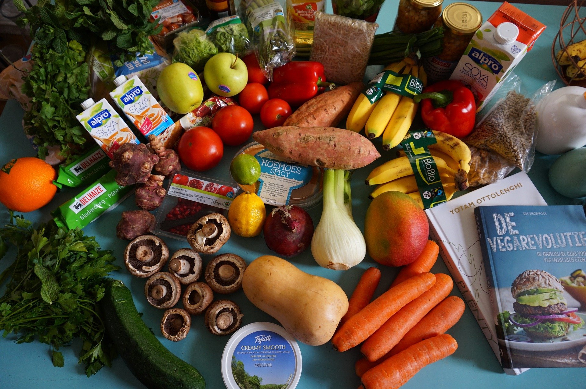
Through subscriptions, your healthy foods and beverage eCommerce website can provide all the groceries your customers need each week. This means they won’t ever need to physically go grocery shopping ever again.
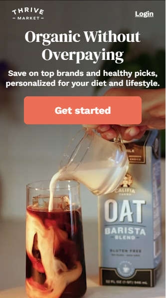
Here’s an example from Thrive Market:
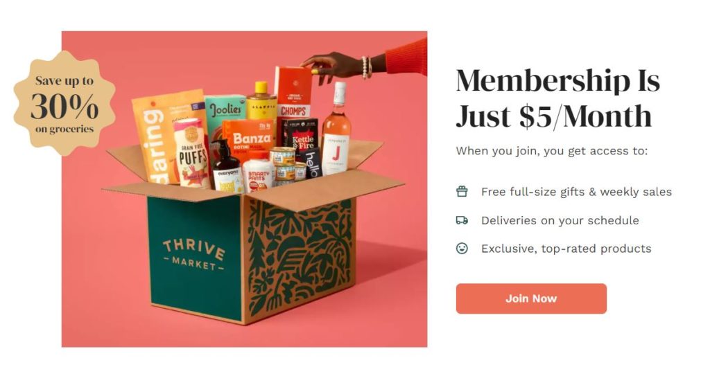
Thrive Market’s membership costs $5 per month and is required if the visitor wants to purchase food from Thrive Market’s website.
With the $5 monthly membership, customers get access to:
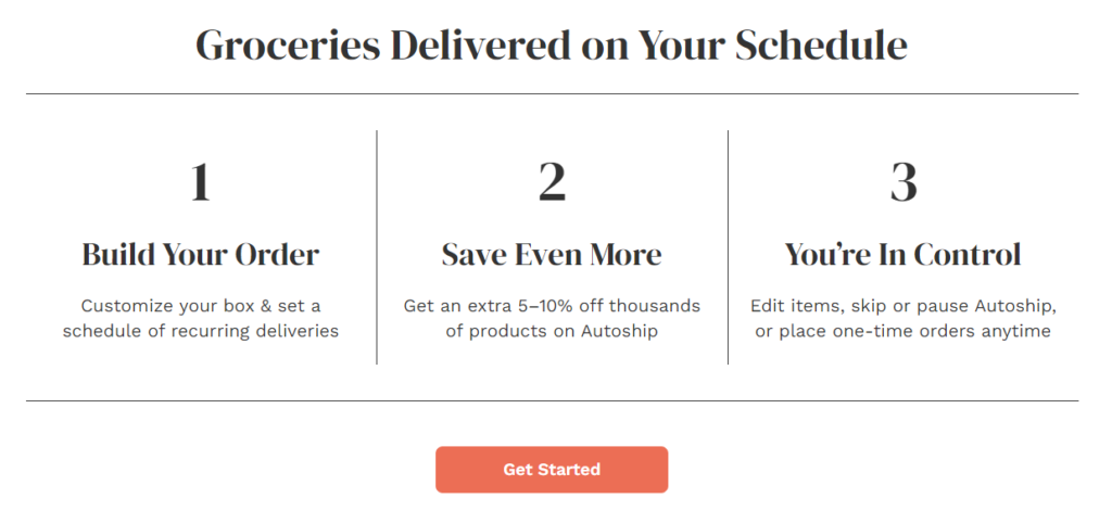
As you can see, customers can customize their grocery hauls, get access to additional savings, and choose if they want to edit items or pause deliveries.
Customers can also place one-time orders in addition to their weekly or monthly grocery deliveries.
Here’s a thorough explanation of how grocery subscriptions work from Hungryroot:
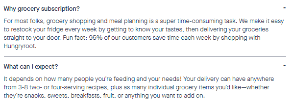
Grocery subscriptions are all about finding the customer’s food preferences and delivering a full set of groceries to their door whenever they need them.
Why Are Grocery Subscriptions So Important?
Now that we understand the overall trend among popular health foods websites, let’s talk about the impact behind grocery subscriptions.
In essence, grocery subscriptions provide recurring revenue and a high customer lifetime value (CLV).
Recurring revenue is a business model where customers are charged periodically for a service that’s provided on an ongoing basis. This type of business model is robust because it offers predictable revenue and consistent cash flow.
Unlike one-time purchases, which are sporadic and uncertain, recurring revenue offers stability and the opportunity to expand your business due to the steady source of income.
Grocery subscriptions also offer a high customer lifetime value, which is the total worth to a company of a customer over the entire period of their relationship.
Here’s an excellent way to think about the importance of customer lifetime value.
If your website allows one-time purchases, many customers will purchase once and never return again. This means that the total profitability from each customer is low when you factor in the marketing dollars it took to bring them to your website.
With grocery subscriptions, customers may continue purchasing from your website for a span of a few months to several years.
As such, the customer lifetime value of your customers may range from a few hundred dollars to well over one thousand dollars.
This is exponentially higher than the customer lifetime value of a customer who makes a one-off purchase and never makes another one.
2. Introduction and Preference Quiz
Healthy eaters are extremely particular about what they eat and have a variety of different food preferences. Creating a preference quiz is the best way to give your visitors the type of food they want.
Hungryroot, a trendy healthy foods eCommerce store, tells their visitors about the quiz on their homepage banner. This means that Hungryroot’s goal is to get every website visitor to take their preference quiz.
Since Hungryroot uses a subscription-based business model, they need to understand each visitor’s food preferences before offering them the ideal grocery haul.
Here’s what their homepage banner image looks like:
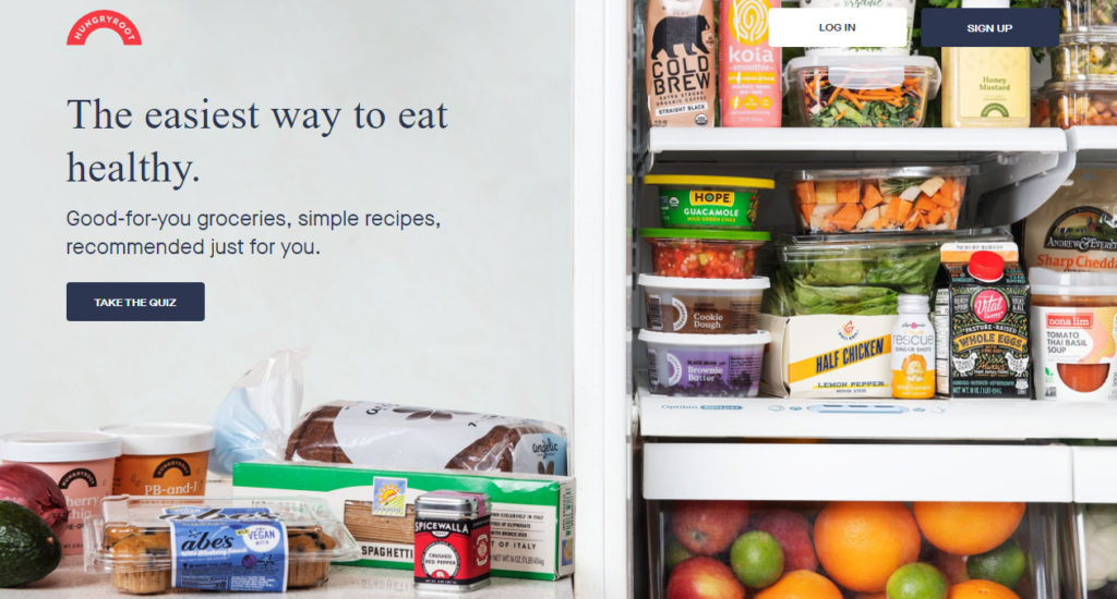
As you can see, they use a beautiful image of a variety of healthy foods. Furthermore, they explain how visitors can receive personalized and simple recipes if they take the quiz.
Once a visitor clicks Take The Quiz, they are first brought to this page:
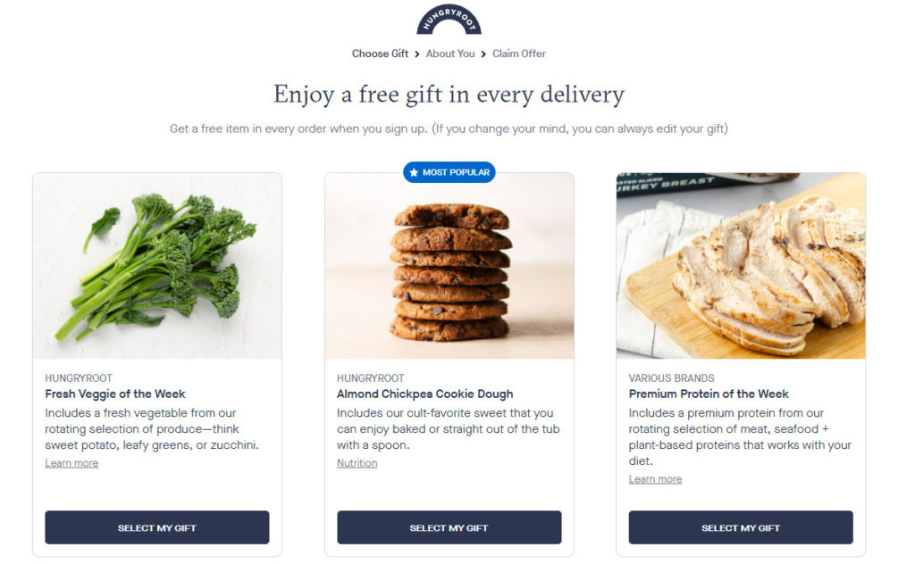
Before the quiz even begins, the visitor can choose a free gift that’s sent in every delivery. Online shoppers absolutely love free stuff. By offering a free gift first, visitors will be more intrigued to finish the entire quiz.
Once the visitor selects their free gift, the quiz begins:
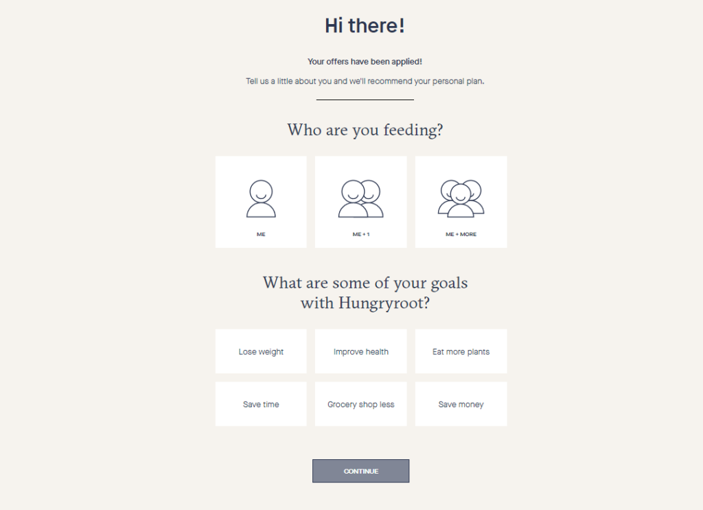
First, the visitor chooses who the groceries are for and their goals.
After choosing these preferences, the visitor is brought to the following question:
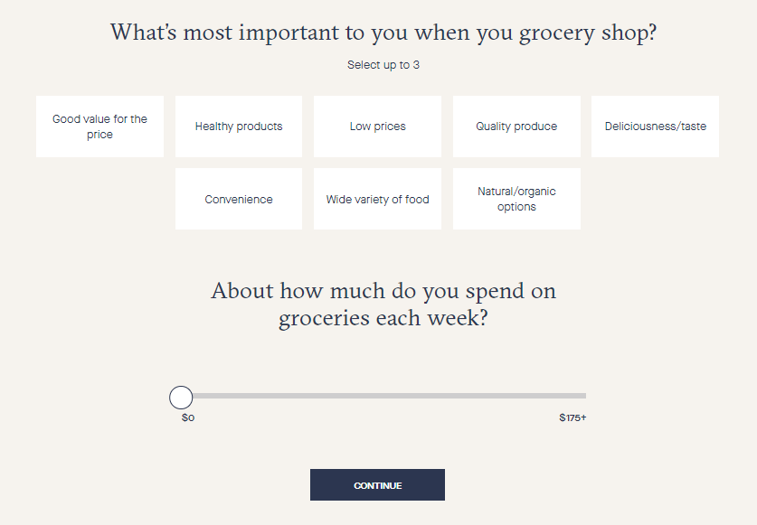
The quiz asks the visitor about their grocery shopping values and how much they typically spend on groceries in a week.
Next, the quiz starts diving into the visitor’s dietary restrictions:
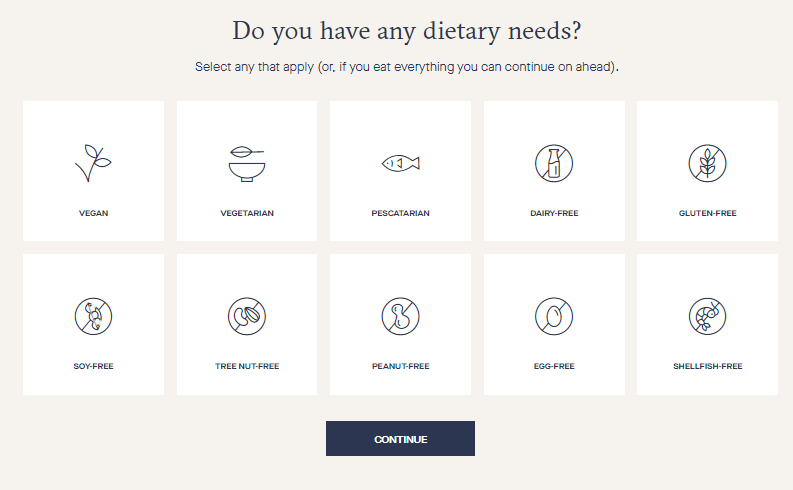
Hungryroot lets the visitor choose from 10 of the most common dietary needs.
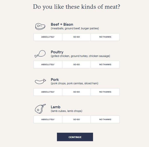
Afterward, the quiz starts asking about specific foods, beginning with meat:
Then seafood:
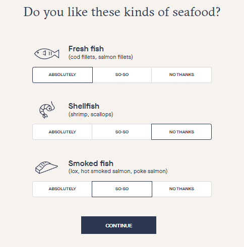
The quiz asks questions about every type of food, but I won’t include pictures of each page since you get the idea at this point.
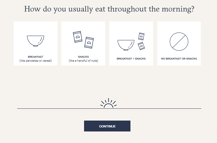
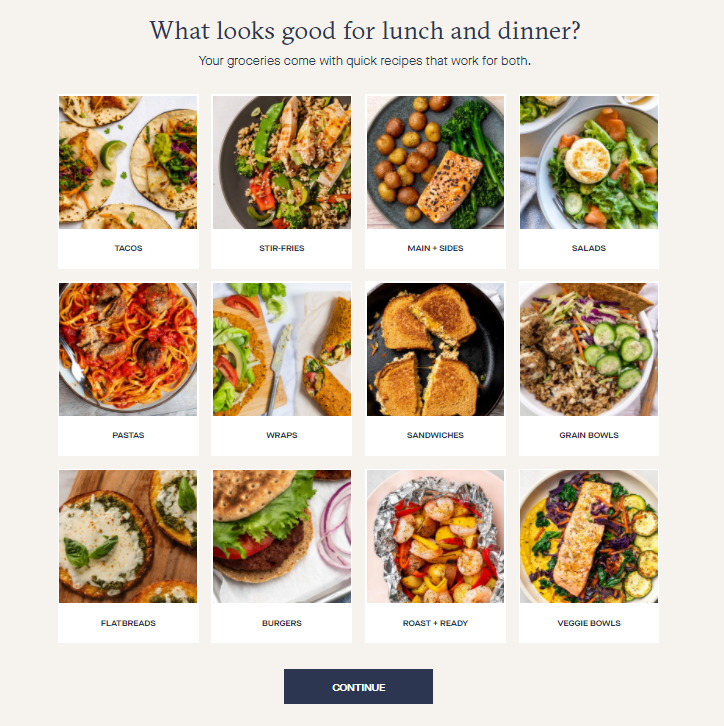
After the food preference questions are complete, the quiz asks the visitor about their eating habits during breakfast, lunch, and dinner.
Next, the quiz asks the visitor what type of food looks tasty based on a series of pictures.
Once the quiz is finished, the visitor will need to create an account on Hungryroot to see the quiz results.
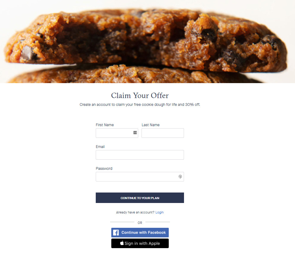
Rather than showing the visitor their results immediately, Hungryroot cleverly forces the user to create an account.
The goal of any eCommerce business is to capture your visitors’ information whether they purchase an item or not. Once you have a visitor’s email address, you can begin running your email campaigns to them.
As such, Hungryroot asks the user for their information at the perfect moment. Since visitors just spent a heap of time going through the quiz, they will be extremely curious to see the results.
The chances of the visitor creating an account at this stage compared to at the beginning of the quiz are night and day.
Furthermore, Hungryroot makes it easy for a visitor to create an account.
The visitor can log in with Facebook, Apple, or type 4 short lines to get their account up and running.
Once the visitor creates an account, Hungryroot displays their personalized meal plan.
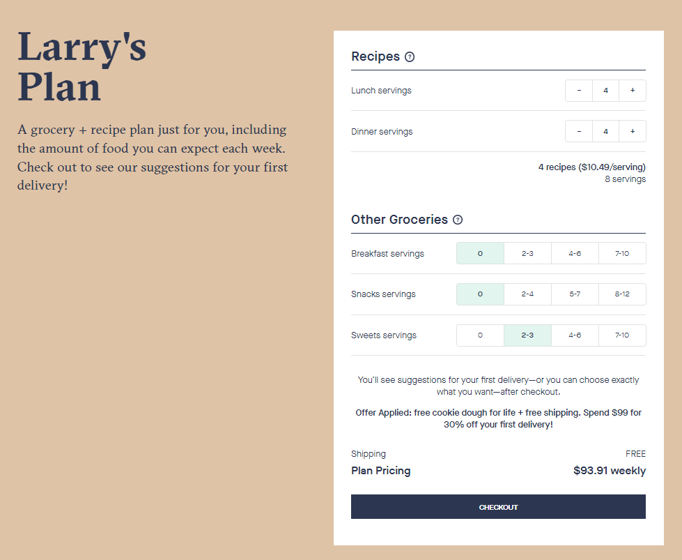
However, Hungryroot doesn’t show the exact food items they recommend until AFTER checkout. This means you can’t see any of your personalized grocery items until after paying.
And although you can order the grocery list Hungryroot recommends, you are free to edit the list and choose exactly what you want.
Before you checkout, the only thing you can see is the plan size and how much the plan costs every week.
3. Effective Product Filtering
Online shoppers all have unique desires, so you never know what kind of products they want to purchase. For this reason, it’s important to make it easy for your visitors to find what they’re looking for.
Here’s an example of effective product filtering from Thrive Market:

Thrive Market has organized their product offerings in a convenient and well-designed manner. They use trendy power words such as “sustainable”, “clean”, “organic”, and “plant-powered” to describe their product categories.
Furthermore, they include pictures so the visitor understands what kind of products they can expect to see if they click a particular category.
4. Social Proof
I’ve written extensively about social proof and why social proof is so important for eCommerce businesses, but I’ll share the same story again.
Simply put, people are attracted to things that other people like. For example, if your friend told you about a terrific new restaurant, the odds of you visiting that restaurant would be very high.
Social proof is the same reason we all look at customer reviews before purchasing a product. If somebody else had a good experience using the product, why wouldn’t we have one too?
As such, it’s important to build high-quality social proof on your eCommerce healthy foods and beverage website.
With the fierce competition in the market today, social proof can help your business stand out.
Here’s an example from Thrive Market:
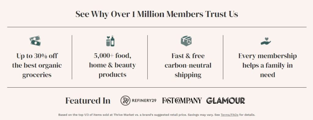
This section appears directly on their homepage. First, Thrive Market explains that they have over 1 million members. That is an extravagant number of members and shows the visitor how popular Thrive Market is.
Furthermore, Thrive Market also explains how their brand was featured in Refinery29, Fast Company, and Glamour. These are various media outlets that further Thrive Market’s legitimacy in the eyes of the visitor.
Your social proof can be even more specific by showing real customer testimonials.
Here’s an example from Hungryroot:
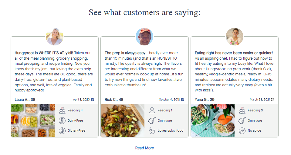
Directly on Hungryroot’s homepage, there is a section that shows a series of customer reviews. The reviews are informative, speak to Hungryroot’s quality, and answer questions that a potential customer might have.
The testimonial also includes a picture, the reviewer’s dietary preferences, and how many people the food is for.
Since food is involved here, first-time visitors may be cautious about purchasing anything. They might be worried about the food’s quality, taste, and price.
Showing genuine reviews from satisfied customers can ease the mind of your visitors and build the trust needed to gain new customers.
Here’s another example from Misfits Market.
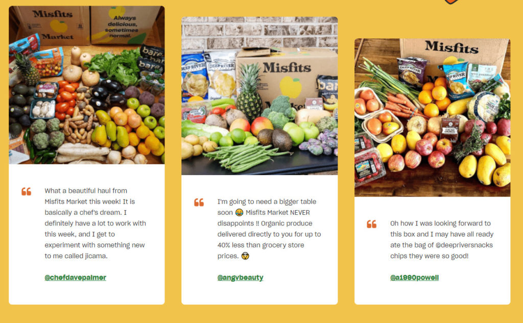
This is another innovative testimonial section because it links to the reviewer’s Instagram page. This boosts the legitimacy of the testimonial and shows real people enjoying Misfits Market’s products.
5. Inclusive of All Diets and Dietary Restrictions
There are all kinds of different diets and dietary restrictions people have. For this reason, it’s essential to be inclusive of as many people as you can.
You should try to support as many diets as possible and offer food and beverages that everybody can enjoy.
This may involve conducting a lot of research to see what types of diets there are and how you can better support those individuals.
Here’s an example from Thrive Market that shows their support for different diets and lifestyles:

As you can see, Thrive Market supports over 90 different diets and lifestyle practices. Thrive Market has it all, from nut-free and fairly traded foods to vegan and low sugar food.
6. Environmentally-Friendly Business Practices
It’s no secret that there’s a correlation among health-conscious eaters that also support green movements. As such, it’s crucial that you display your environmentally-friendly business practices if you have them.
Here’s an example from Thrive Market:
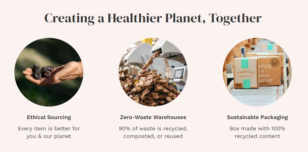
Thrive Market is proud to “Create a Healthier Planet” with their customers. They are committed to ethical soucing, zero-waste warehouses, and sustainable packaging.
This content shows the visitor that Thrive Market is doing more than just providing food. Instead, they are also focused on helping the environment.
Imperfect Foods, another eCommerce health foods store, prioritizes waste reduction as well:
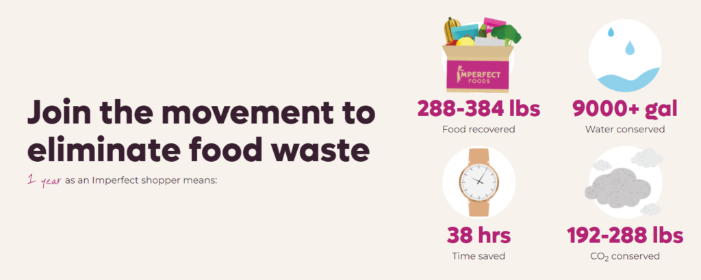
This content on their website shows how many resources a user would save by shopping with Imperfect Foods for a year.
In fact, Imperfect Foods’ entire strategy revolves around fighting food waste.
This is their homepage banner image, which is the first thing visitors see:
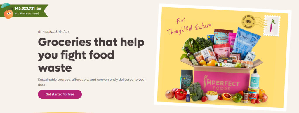
On the right-hand side of the image, you can see that Imperfect Foods is for “Thoughtful Eaters”. They are specifically targeting individuals who support the environment and want to reduce food waste.
7. Exit-Intent Popups
An exit-intent popup is when a popup appears as a user moves their mouse to the upper boundary of the page. This is a common practice among eCommerce websites and is an effective way to attract more conversions.
You can view exit-intent popups as a last stand to convince customers who are about to walk away forever.
Here’s an example from Hungryroot:
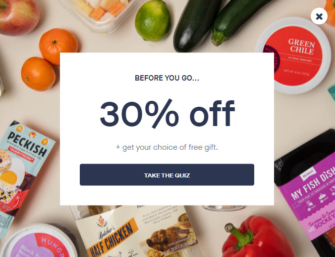
The exit intent shows a high-quality background picture of a few products. It also tells the user that they will receive 30% off and a free gift.
All they have to do is take the quiz.
As I mentioned before, Hungryroot’s goal is to get as many people to take their quiz as possible. So even during their last stand with a website visitor, Hungryroot will direct the visitor to the quiz.
8. Give Your Customers Delicious Recipes
Nowadays, only sending groceries is not enough. You also need to include delicious recipes that your customers can cook with the exact ingredients they receive.
Here’s an example from Hello Fresh:
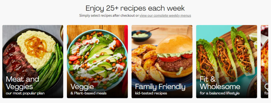
Hello Fresh offers 25 or more new recipes that their subscribers can pick and choose from every week.
The recipes are categorized by dietary preferences, such as ‘Meat and Veggies’ and ‘Fit & Wholesome’. This makes it easy for their customers to find the exact recipes they want to use.
Furthermore, you can see Hello Fresh’s weekly recipes before subscribing:
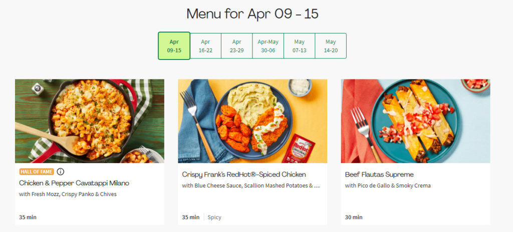
As you can see, Hello Fresh displays six weeks of recipes that their subscribers can look through.
The most important part of Hello Fresh’s recipe section is the images. Humans are highly visual creatures and naturally look at pictures instead of text.
For this reason, Hello Fresh uses incredibly high-quality pictures for each of their recipes. These pictures give their customers a preview of what to expect and get them excited to receive their meal kit.
Without pictures, recipes are boring, plain, and hard to stimulate anybody.
9. Create a Mobile-Friendly Website or Mobile App
As of 2022, mobile users have 56% of the global market share between desktop devices, tablets, and mobile devices.
So I highly recommend making your mobile website as user-friendly as possible.
Here are a few guidelines to help you create a better mobile website:
- Make sure the buttons are easy to press without the risk of misclicks
- Use big text that’s easy to read
- Ensure the formatting between each section is coherent
In essence, your mobile website should like exactly like your desktop website but converted for smaller screens and devices.
Thrive Market’s mobile website serves as a great example to take inspiration from:
I recommend using your phone to check out their mobile website yourself to see exactly how they’ve designed it.
You can also create a mobile app if you want to go above and beyond.
This is exactly what Hungryroot did.
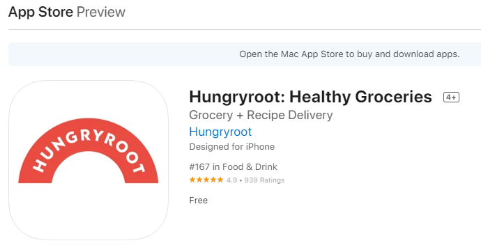
As you can see, Hungryroot’s mobile app has great reviews and is popular among their customers. The mobile app essentially offers all the same functions as their desktop website. Users can take the preference quiz, control their delivery schedule, and shop for personalized recommendations.
Mobile apps are more user-friendly than having a great mobile website because they’re easier to access. When mobile users want to log in on a browser, they may need to manually type in their username and password each time.
With a mobile app, users can stay logged in and check their food deliveries with ease whenever they want to.
Furthermore, mobile applications are more customizable in terms of design and functionality. However, developing a great mobile application can be a hefty investment, so this is only recommended for more established eCommerce health foods brands.
10. Create Clear Financial Benefits
People who look for eCommerce grocery providers mainly value convenience. However, this doesn’t mean they don’t want to save money too.
We’re all wired to cut costs whenever possible, so it’s important to provide transparent financial incentives for using your eCommerce health foods store.
Here’s an example from Misfits Market:
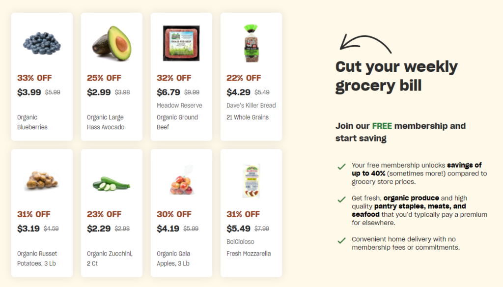
Misfits Market shows how much a few different products they offer cost compared to normal prices. Furthermore, they show the percentage discount in a different color font.
This draws the user’s attention to the cost savings and shows them the financial incentives for joining Misfits Market.
Remember that shoppers, in general, are always interested in saving money and looking for great deals.
Now It’s Your Turn
At this point, you should be ready to turn your eCommerce health foods and beverage website into a conversion powerhouse.
You have all the tools needed to make these changes, it’s up to you to spend the time implementing and executing.
I recommend making changes one by one and avoid overhauling your entire website at once. This way, you can ensure each change you implement is perfect. Moreover, you can take some time to review the effects of each change.
But now I’d love to hear from you:
What’s the most significant pain point your website currently faces, and where are users abandoning the most?
Which example from today’s guide do you think will have the biggest impact on your store?
Either way, let me know by leaving a short reply down below!