It pangs the writer in me to say this, but most people don’t read copy. We’re a bunch of scanners with the attention spans of goldfish (roughly eight seconds), and so we glide through material, taking in bullet points and select words and phrases, leaving much of the text unread.
According to Nielsen Norman Group research, “79% [of] users scan any new page they come across and only 16% read word-by-word. The same holds true today, with users finding time to read only 28% of the copy on an average visit.”
This presents a bit of a catch-22 for business owners, however. How are you supposed to establish trust, convey your value proposition, engage your visitors, and eventually get them to convert if they don’t read your copy?
Well, the short answer to that is to make your web copy more readable. But just how do you accomplish that?
Readability In A Nutshell
In its most basic form, readability refers to the “complexity of the words and sentence structure in a piece of content.” But web readability goes beyond that.

Wikipedia states the following about readability:
“Readability is the ease with which a reader can understand a written text. The readability of text depends on its content (the complexity of its vocabulary and syntax) and typography (font size, line height, and line length). Researchers have used various factors to measure readability, such as…
- Speed of perception
- Perceptibility at a distance
- Perceptibility in peripheral vision
- Visibility
- Reflex blink technique
- Rate of work (reading speed)
- Eye movements
- Fatigue in reading.”
Make Your Point ASAP
When it comes to delivering your message, there are two principal techniques to choose from:
- Inverted Pyramid
- Agree, Problem, Preview (APP).
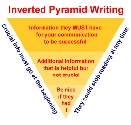
Inverted Pyramid: Widely used by journalists, this technique establishes the main point straight away and then presents the remaining details according to their level of importance, from highest to lowest, often including contextual headings and boldface keywords to guide readers.

APP: This technique works well for business and other content-heavy websites. Starting with a point that’s widely accepted in order to foster a sense of agreement, the APP method then states the problem and presents an accompanying solution, thus increasing the likelihood of readers feeling assured of the content’s value.
Pay Attention To Typography
Visual components, like font size, and line height and length, all matter. Here are five tips for improving your copy’s typography:
- Maintain a clear hierarchy with header 1, 2, and 3 levels so readers can understand your content at a glance.
- Make sure your font is large enough to read without causing eye strain. In general, anything less than 12 pixels is too small and anything more than 16 pixels is easy to read.
- Leave ample white space between text blocks. Also, no one likes a super-dense paragraph so keep your paragraphs short.
- Also, keep line length on the shorter side (45-75 characters), especially as you approach the end of your copy.
- Make links stand out by making them boldface or a different color (not by using a different font type or size). Check out what the Big Brothers Big Sisters‘ website does right with its links in the image below:

Assess Your Copy Objectively
Especially if you are the copy’s author, maintaining objectivity is difficult when evaluating readability. You’re too close to the work. Therefore, you need to use standardized tools and unbiased readability tests.
Some tests provide numerical scores that you should aim for and others provide school grade levels or the level at which your target audience reads.
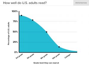
In the United States, most people are comfortable reading at a seventh- or eighth-grade level (11-13 years old).

To assess the grade level of your copy, try one of these tests:
You can also use The Readability Test Tool (free) to get a more comprehensive assessment.
What’s your opinion on this list of ways to improve the readability of your copy? What other advice can you share?


