


If you want to eliminate some of the guesswork from conversion rate optimization, then eye-tracking and heat-map research are your two best friends. Eye-tracking studies and heat-mapping provide you with hugely beneficial insights about browsing patterns and human behavioral elements, both of which are crucial for a marketer’s savoir-faire.
Let’s take a look at what the research shows about how people most often look at and interact with websites.
The Top Left Corner Is Prime Web Real Estate
According to an EyeQuant.com eye-tracking study, the area where your visitors’ eyes go to first is the upper left-hand corner of your website. Check out the chart below:
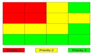
Review your website to see what content and images you have located in each of the three sections of color. And as a starting point for testing, try placing your value proposition in the red zone, if it isn’t already there.
With the exception of the bottom right-hand quadrant, another rule with web design (the Gutenberg Rule) presents a similar diagram to describe “a general pattern the eyes move through when looking at (usually text-heavy) content.” Take a look:
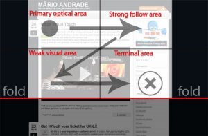
Peep Laja of ConversionXL says, “The fourth, bottom right terminal area is where you should place your call-to-action.” Again, though, this is just a starting point for testing, as individual results may vary.
Also, when it comes to web design, the letter F stands for the pattern in which most people read…or rather, scan…web content. So as you’re considering where to place your website’s most important information, such as the navigation menu and the value proposition, just say “F-it!”
![]()
Larger Introductory Paragraphs Attract More Attention
Putting the text of your introductory paragraphs in boldface or a larger font increases its readability and makes your website’s visitors more likely to look at it.
Moreover, while the size of your font typically matters more than its style, generally speaking, the most readable fonts are Ariel, Courier, and Verdana. Also, “Keep the paragraph line lengths short and in a single column,” as this is how most people are accustomed to reading text.
Bear In Mind The “Weight” Of Your Visual Elements
 Gregory Ciotti of Help Scout: “You don’t have to be an expert in UX (user experience) to understand the importance of Fitts’s law.
While seemingly complicated at first glance, one of the fundamental lessons Fitts’s law communicates is that object ‘weight’ (in the visual hierarchy) is a big determinant in what attracts eyes and mouse clicks.”
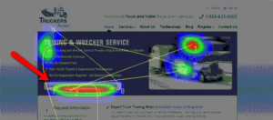
Notice how the heat-mapping in the image above indicates that the call-to-action, a visual that should carry a considerable amount of weight, is attracting a lot of attention.
Ciotti says, “When you are assembling a persuasive landing page, be sure the elements that ‘pop’ are the ones that matter, and that you aren’t giving too much weight to visuals that don’t encourage customers to take action.”
Use Visual Cues To Guide Your Visitors Around Your Site
As part of our nature as human beings, we tend to follow the gaze of other people. Plus, we have been conditioned since birth to heed directional cues telling us where to go and where to look. Check out the image below of a webpage featuring an adorable baby and a column of copy.
![]()
As you can see from the heat mapping results, visitors were drawn to the baby’s face (I mean, how could you not!), and with the baby’s gaze aimed at the text, the natural inclination was for visitors to follow the baby’s cue and also look at the text, making them more likely to actually read what it had to say.
Visual elements are an important part of a website’s design for multiple reasons, but when you leverage them to also serve as directional cues, they can be even more effective at increasing your conversion rates.
How much do you know about how your visitors view your website? How are you leveraging eye-tracking and heat-mapping to your advantage?