


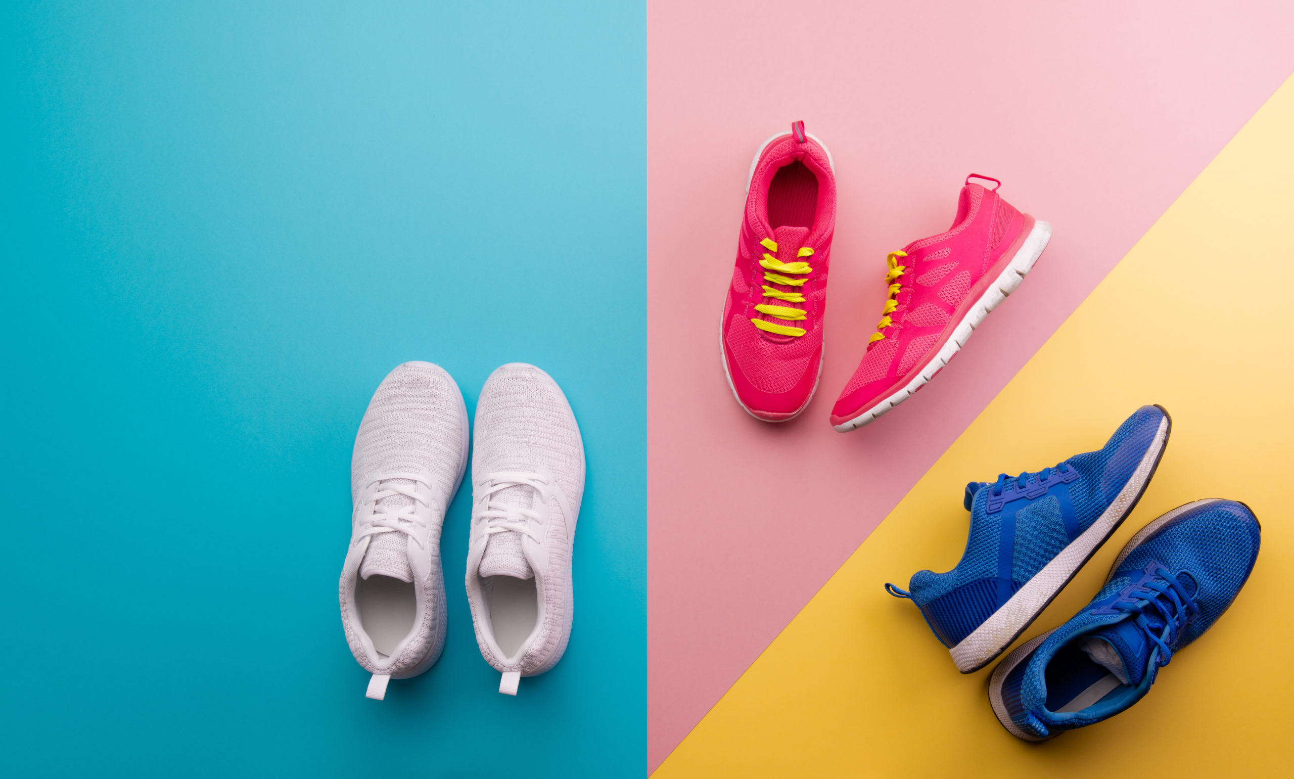
If you have an ecommerce store it is important that you create a simple user experience to not only help your potential customers find what they are looking for easily but also lead them down the path of least resistance to make a buying decision. Today we are going to take a look at the use of contrasting colors to accomplish this and increase ecommerce conversions.
Increase Ecommerce Conversions – Why Contrasting Colors Help
Take a look at your own store for example and pay close attention to your color scheme. Chances are you have multiple products each with their own sets of colors. More importantly, pay attention to the path to make a purchase and what colors are used there. Are they consistent? Is the main path in contrast to the remaining colors on the site? Is the path clear to the visitors on what you want them to do next?
If not you may need to reassess, especially if you want to increase ecommerce conversions.
A good example of this is a company selling women’s clothing and accessories. The main color scheme of their site outside of the product images was basically black and grey. All the text, logos, buttons, links, etc. all played on this scale of colors.
As a result, the most important elements such as the “next steps” blended in with the surroundings.
In an effort to increase ecommerce conversions for the company we decided to test some contrast in these elements to see how it impacted the ecommerce conversion and the response from the visitors.
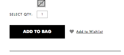
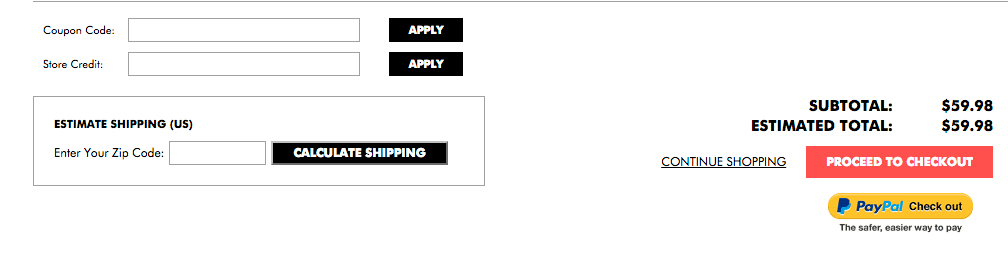
As you can see they have their main “add” button set to black. Which again sort of blended in with the rest of the page when looking at a specific product.
To add some contrast to the path we wanted the visitors to take, and entice the visitors to click to add the product to begin the checkout process we changed the color scheme to a brighter color. In this case a shade of “pink”.
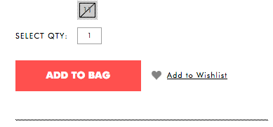
We continued this new color throughout the entire store as well.
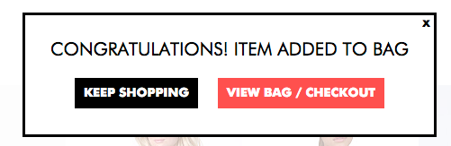
From the popup after they click the first “add” button taking them to the checkout page and even continued it over to the action checkout page.
 The reason behind changing it through every step was not only to provide contrast in the color but also to keep consistency and lead the visitors down the path we want them to take and that is to make a purchase.
Subconsciously they are used to clicking on the “first” button so the next step will be obvious as it is the same color throughout.
But the big question is does it actually help increase ecommerce conversions?
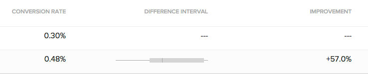
The results from the experiment showed that the “new” color contrast improved conversion rates by 57%.
As a result, it also increased every step of the process from clicking the first button to viewing the cart by more than 5% and in some cases as high as 10%.
This means we are getting more visitors to take the desired actions and ultimately 57% more of them are making a purchase.
So does this help increase ecommerce conversions? Well, you will have to test it out for yourself. The important thing to take away from this is to make sure you have contrast and you are leading your visitors down the path in which you want them to take.
We still have quite a bit of work to do across the site to help reach the goal of a 3% conversion rate as well as increase the average order value but I would say this is a good start.
Have something to say or have questions? Be sure to leave a comment.
Also don’t forget to like, share or subscribe.
If you want help finding areas where you can increase ecommerce conversions be sure to reach out for a no-obligation conversion acceleration session as we are happy to point you in the right direction, even if you don’t hire us.