


People are funny. It is always amusing to see just what changes and tests improve conversions on campaigns for different companies. Even the slightest difference could impact conversions and user experience. Today we are going to take a look at how different colors improve conversions.
How Different Colors Improve Conversions And Affect Marketing
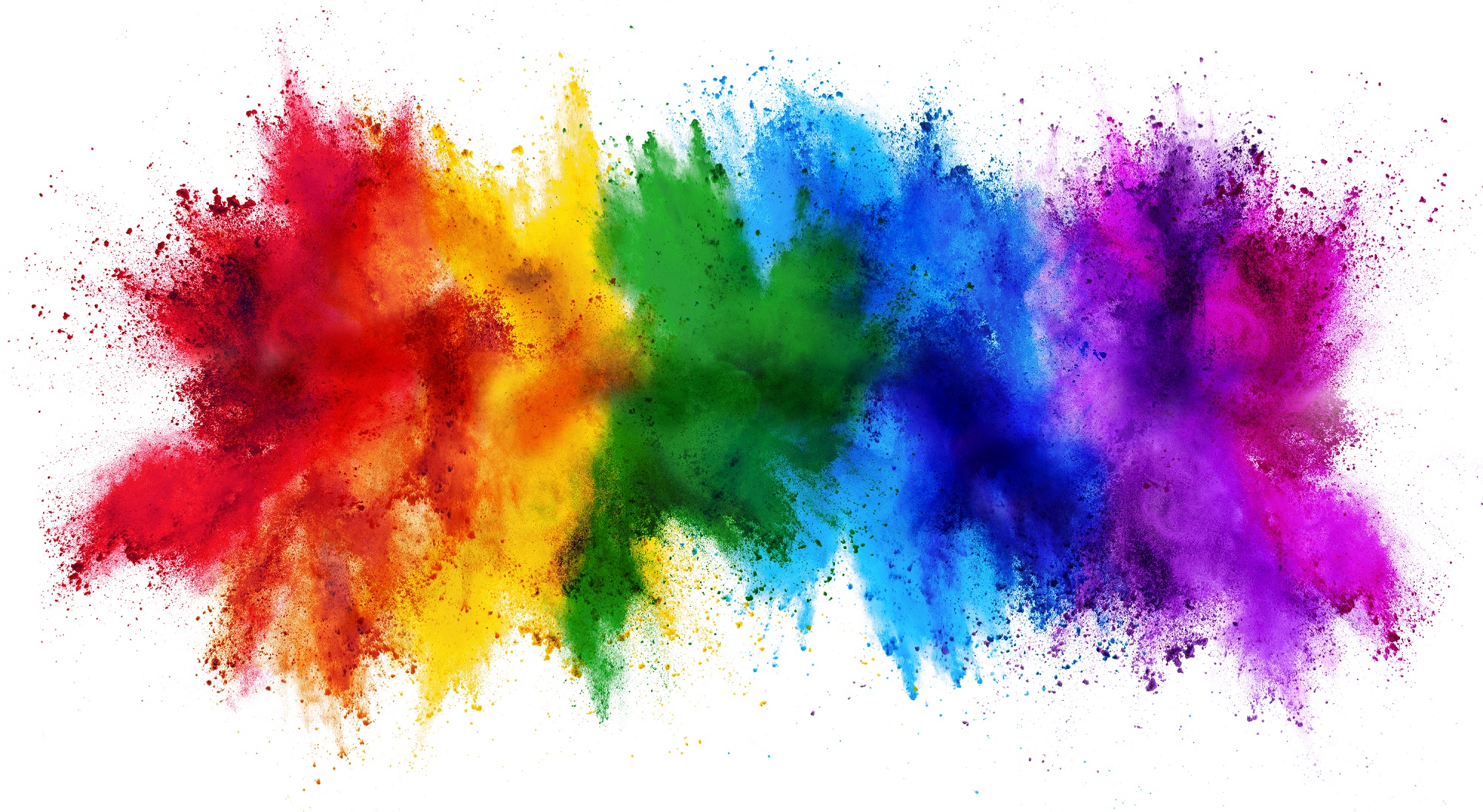
Colors have been scientifically tied to emotions and often times emotions are what drives people to take specific actions.
We use colors in marketing to peak emotions, get attention, provide contrast and lead a visitor down the path of least resistance to the end goal.
Like death and taxes, there simply aren’t any ways to avoid colors. They are everywhere. But how do they help improve conversions? To understand that we need to take a closer look at some of the most popular colors to find out.
1. Black
Black is a color of power and authority. It is a popular fashion color and often conveys a level of submission. We typically use black or shades of grey to help contrast in our marketing such as text, we also use “bold” text to bring emphasis to key elements. It is typically used to market luxury products.
2. Yellow
Yellow is psychologically the happiest color in the spectrum. It is optimistic and youthful. The color yellow is often used to grab the attention of “window shoppers.” Additionally, it can also have a negative effect as it can be seen and irresponsible or unstable.
3. Red
The color red conveys energy and a sense of urgency. It is often used in clearance sales for that fact. As tied to emotion on the positive side it conveys love, power, energy, passion, and strength. On the negative side, it brings out the emotion of anger, danger, and warning.
4. Blue
Blue creates a sense of trust, professionalism, and security. It is often used by banks and businesses. As a traditionally masculine color, it can also trigger negative emotions such as fear and coldness.
5. Green
Green is the most relaxing color to process and it symbolizes nature. Often associated with wealth and money, green can bring out positive emotions such as healthy and freshness but on the negative side it can bring out envy and guilt.
6. Orange
Orange is an aggressive color and it typically triggers a call to action. The color orange also brings out positive emotions, such as courage, confidence, and success. On the negative side, it can bring out a level of sluggishness or ignorance.
In a survey, people were asked to choose the color they associated with particular words.
- Trust: Most chose the color blue (34%), followed by white (21%) and green (11%)
- Security: Blue came out on top (28%), followed by black (16%) and green (12%)
- Speed: Red was overwhelmingly the favorite (76%)
- Cheapness: Orange came first (26%), followed by yellow (22%) and brown (13%)
- High Quality: Black was the clear winner (43%), then blue (20%)
- High Tech: This was almost evenly split, with black the top choice (26%) and blue and gray second (both 23%)
- Reliability: Blue was the top choice (43%), followed by black (24%)
- Courage: Most chose purple (29%), then red (28%), and finally blue (22%)
- Fear/Terror: Red came in first (41%) followed by black (38%)
- Fun: Orange was the top choice (28%), followed closely by yellow (26%) and then purple (17%)
Color has an impact on how we think and behave. Color directs our eye where to look, what to do, and how to interpret something. It puts content into context. It helps us decide what is important and what is not. That’s precisely why, as a content marketer, you need to understand what colors do to people.
The psychological impact of color is subjective. We don’t all react the same way to colors. There are a few generalities about how people respond to color and that’s what we’re going to look at.
But how does color help improve conversions and how do they impact marketing?
For that, we are going to take a look at a recent case study example where we tested colors surrounding a call to action and form for one company to see it the color choice could help improve conversions.
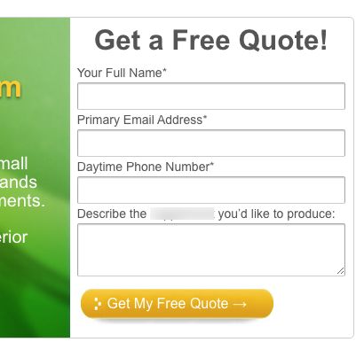 The original pictured above was a simple white background that put the majority of the emphasis on the button.
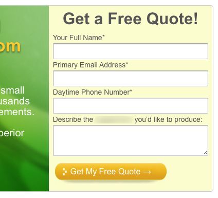 The second version was changed to a slight shade of yellow to bring a little more contrast to the form and button.
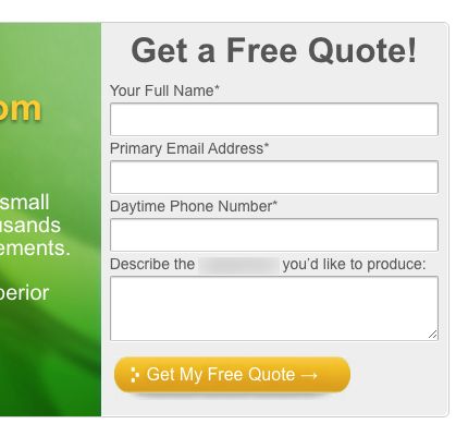
The third version used a shade of grey to help contrast the form.
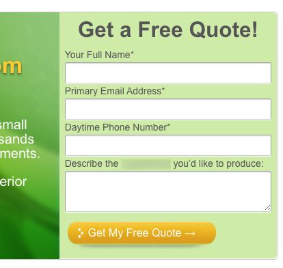 The last variation used a shade of green to help contrast and continue the flow from the main header image which contained the benefits and call to action.
But how did these color changes improve conversions and impact the actual form submissions?
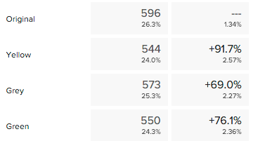
Quite shocking the results but it looks as if changing the colors can help improve conversions. In this case, the “yellow” version is showing an increase in form submissions by 91.7%. The “green” variation helped improve conversions 76.1% and the “grey” version helped improve conversions 69%.
We still have a little bit of time left on this test to determine a statistical winner but if the results hold out it looks as if the color “yellow” in this particular case came close to doubling the form submissions.
If we look back at why yellow may be the winner it could be because it grabs attention, it’s a fun color, and it conveys an emotional response of optimism.
What colors are you using in your marketing? Are you testing them on a regular basis to see how your website visitors respond to different colors and how they can help improve conversions?
If you have something to say about the use of colors, be sure to leave us a comment.
Don’t forget to like, share and subscribe.
If you want help running more tests faster and get in better touch with your visitors to improve conversions don’t hesitate to reach out for your no-obligation conversion accelerations session.