


If you have special offers for your product or service, by a general rule of thumb, it would be a good idea to highlight those during your order process. Today we look at one particular offer where we tested different versions to push more visitors to the premium membership and a special offer they were promoting.
If you have been around optimization for any given time you know that typically discounts or special offers often help increase conversions at least in most cases and when leveraged correctly. Here is a special case study that we conducted on a campaign that tested some different elements to push people to the main goal and that was premium membership.
Through our data and previous tests, we were led to this new design of the page, which is much cleaner and easier to navigate than the previous page. We gathered that the visitors responded well to special promotions. In an effort to increase signups for premium, which was the main goal for this company, here is what we did.
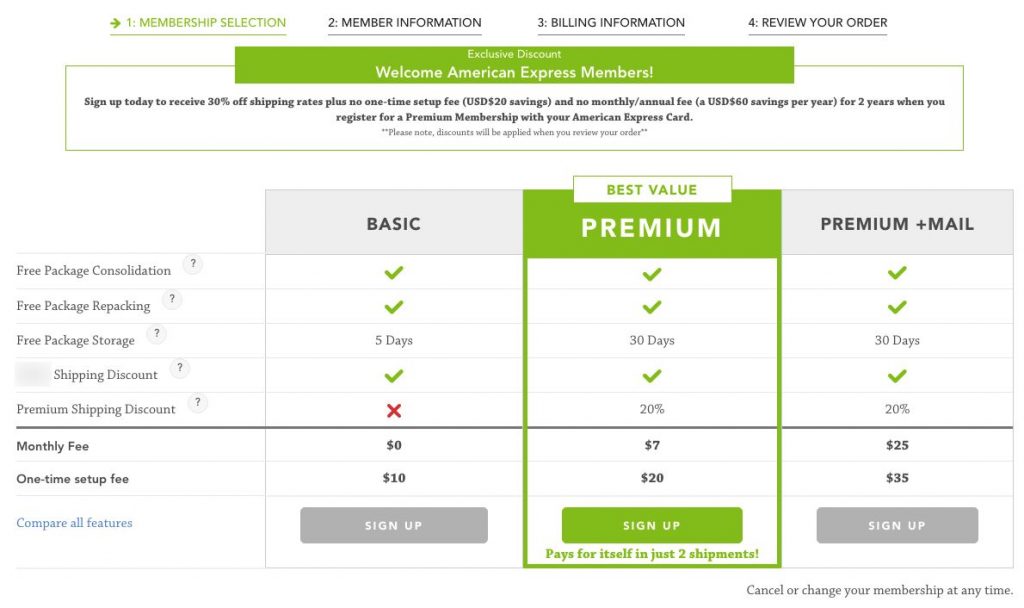 As you can see the original is pretty clean. It highlights the main benefits and tries to push people to signup for the premium membership. It also highlights a special discount at the top of the page.
This page, as mentioned was a big improvement already with a rather good conversion rate. But there is always room for improvement.
The first variation we tested…
 We changed things up a bit. Normally we wouldn’t test multiple variables like this but in this case, it was warranted and we will then go back and test again on a smaller scale. The goal was to get a bigger bump in actual checkout conversions.
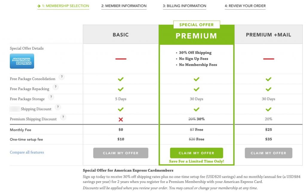
We tested removing the top special offer box and moving it below the selection grid. We changed the button text to “Claim My Offer” and highlighted that premium had a special offer through American Express in the grid.
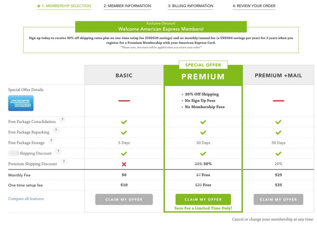 The second variation we tested added the special offer box back on top but included the new design. We wanted to see how much impact this had on the conversions placed at the top.
The results?
Well, it is important to note that this was tested on a smaller traffic channel and this test has been running for 15 days and has received just over 1000 unique visitors. We haven’t reached significance quite yet but the numbers have been staying pretty steady throughout the duration of the test. We still have a bit more time to determine a winner.
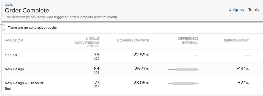
We are measuring several variables, with the main one being order complete as the goal. So far, the results are showing a 14.1% improvement on the new layout and messaging and a 2.1% improvement for the special offer at the top of the page.
This shows us that they respond well to the special offer, but placing the big box at the top, although it shows a bit of improvement, doesn’t have as much impact.
Thought this was interesting to share and if the numbers hold out, it will be a nice win for this particular company.
Have something to add? Leave a comment.
Be sure to like, share, and subscribe.