


Friction – anything that makes the user experience or buying process more challenging or painful for shoppers. Friction is bad for conversions. Friction costs you money.
And while you can never completely eliminate friction from your site, you can take steps to identify the biggest culprits and make changes to mitigate their effects.
Friction can be anything from a slow loading time to a confusing product description. Friction occurs most often…
- When an element takes up too much time, like a checkout process with 17 steps
- Or when an element is difficult or confusing, like a page layout crammed with features.
Points of friction aren’t always easy to spot. Sometimes the problem is obvious. But other times, what’s preventing your customers from converting or making them abandon your site is more subtle and less identifiable.
It’s good to start with the most obvious issues, though, as they’re likely costing you the most in terms of your ecommerce conversion rates and sales.
So which parts of a website cause the most friction and turn buyers away? And what can you do about it?
Let’s take a look.
Poor Web Design
Nothing causes friction right out of the gate, especially for new visitors, like poor web design.
There are many factors that can make a website’s design poor. But a few of the most common issues that lead to poor user experience are a site that’s cluttered, unorganized, or difficult to navigate.
To fix these problems…
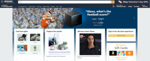
- Use a grid – A grid system gives your site effective and consistent alignment, making it appear clean and organized. Amazon.com is a great example of a website with an effectual grid layout:
- Show contrast between elements – Especially with your page’s background color and text color, you should use colors that contrast and don’t clash. (Also, use a font that’s large enough.) Otherwise, the text will fade into the background, impairing readability.
- Make navigation clear and eye-catching, preferably at the top of the page – You should limit the number of navigational elements to the essentials and use concise menu names. (Making visitors scroll horizontally is a big no-no.) Or, if you feel like you need additional items, create categories with drop-down options.
Overall, if you want to reduce friction with your site’s design, keep it simple and straightforward. Too many features, sections, and links, along with too much text can overwhelm visitors, causing them to leave your website.
Too Many Hoops To Jump Through
You mostly see this being an issue with registration pages and forms. But you see it happen with checkout processes as well.
Registration Pages
Requiring visitors to register or create an account is asking for their time and energy. And if you are going to ask this of them, you need to convey a recognizable purpose and the value of doing so.
Alternatively, you could provide an option to continue as a guest instead of registering.
Forms
When it comes to forms, you should ask for only relevant information. Visitors shouldn’t have to share their life stories to buy a sweatshirt.
Additionally, you need to make sure your forms are easy to fill out on all devices, especially smartphones. When applicable, use open predictive search fields, drop-down lists, or collapsible menus. These come in handy when asking visitors for things like their country of residence or preferred language. You should also make your ‘submit’ buttons large enough and bright enough to stand out.
Checkout
Your checkout process also needs to be as simple as possible, without any irrelevant steps (you might even want to allow visitors to track their progress.
![]()
But in addition to that, you should offer multiple payment options and be transparent about your return and exchange policies.
To identify points of friction, either look at specific areas of your website, especially where your most important ecommerce conversions should be happening, or start at the top of your sales funnel and work your way down.
What do you think of these tips for reducing friction? What friction points do you have on your website that you could change to increase ecommerce sales? Use our contact page to get in touch and share your thoughts!