


If you have a business that requires a pricing table, such as a web app business, then your pricing page is one of the most important pages on your site. Your pricing page needs to clearly convey the value users will receive upon signing up. Otherwise, there’s no way they’ll be convinced to give you their money.
Your pricing table options need to appeal to your customers and meet enough of their needs, even at the most basic plan level, so that it’s worth the investment.
Below, you’ll discover several pricing table strategies you can use to convert more of your leads into paying customers.
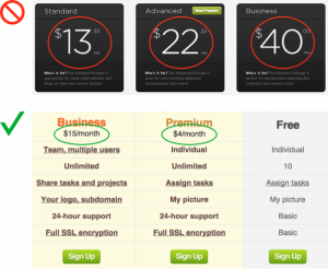
Highlight The Benefits, Not The Costs
When visitors arrive at your pricing page, they know there is going to some talk of money and that they might even end up spending some. What you don’t want to do, though, is highlight this fact by emphasizing the prices of your plans.
Instead, you want to highlight the features and benefits of your plans. This way, you aren’t selling people on the price; you’re selling them on the value they can expect, which is far more persuasive.
“To soften the pricing even more, avoid adding cents to your prices,” suggests Anthony of UX Movement. “Adding in cents adds more numbers to the price and makes it feel like they’re going to spend a lot of money.”
Place Plan Option In Descending Price Order
Since we read from left to right, it’s useful to list your high-end plan first so visitors won’t ignore this option without at least giving it a chance. This way, visitors will be able to consider your more expensive option from a less biased stance.
According to Ben Labay, a UX researcher for ConversionXL, “People read about the expensive plans more quickly and for a longer amount of time when they were placed on the left side of the table, listed first or second.”
Conversely, when you list your low-end plan first, that price becomes the anchor, which visitors use as a frame of reference to judge the value of what they’re getting. And so, visitors then often stop considering the options around the mid-way point, as pricing now weighs in as a more significant factor influencing their decision.
Highlight A Suggested Pricing Plan
The ConversionXL Institute conducted a study to assess the effects of highlighting a particular pricing plan by changing the background color.
Here are the results of the study, as reported by Ben Labay:
- “People basically viewed in an ‘r’ shape, reading features and prices on top, no matter what order the plans were in or what was highlighted.
- When ordered cheap-to-expensive, participants focused more quickly, and longer on the highlighted plan.
- Participants chose the PRO plan more often in the expensive first plan order, and when it was highlighted.”
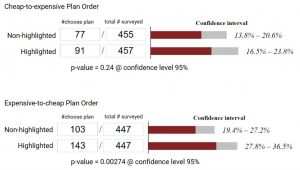
In conclusion, highlighting is an effective means of drawing attention to a particular plan, especially if you still order your plan options in ascending order (cheap-to-expensive).
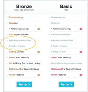
Strike-through Features That Aren’t Available
Not every feature will be available for every plan. And while highlighting what users do get with each plan is obviously important, showing them what they don’t get is also useful as a way to persuade visitors to choose one of your upgraded options.
So “for plans you don’t offer a feature on, use strike-through text to show users what they’re missing,” says Anthony of UX Movement. Doing so also clearly illustrates what the major differences are between your various plan options.
What do you think about these tips for pricing tables? Do have any other advice that you can share?