


Your conversion rates are never safe. There’s always a potential conversion killer on the loose. And you have to continuously split-test and stay on top of developments to keep your conversions safe and thriving.
So, when it comes to design, what are some of the biggest conversion killers you need to watch out for?
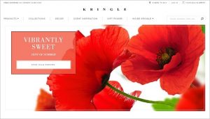
A Visually Confusing Site Design
For the most part, your visitors aren’t going to read the content on your site or at least not in-depth. Instead, they are going to scan, usually in a Z- or F-shaped pattern. And they are going to search for words and phrases that pique their interest and give them a reason to pause.
As a result, your visitors need visual queues and a clean design to help guide them to your website’s most important parts, including your call-to-action. Otherwise, your conversion rates will suffer.
Focus Visitors’ Attention Through Encapsulation
Encapsulation is a technique often used in photography that you can also apply to web design. Anytime you want to focus your visitors’ attention on a particular aspect of your site (your CTA, for example), try creating a natural frame around it.
Doing so “provides an effect to the eye similar to that of tunnel vision when your peripheral vision is narrowed to a point,” says Helen Stark. You can also implement the encapsulation technique by adding a contrasting color. This helps your site’s important elements to stand out from the background.
Make Your Dialogue Boxes Stand Out
To get visitors to take action, a lot of businesses incorporate dialogue boxes into their site’s design. However, if the content that lies beneath the dialogue box is too noticeable, your visitors won’t be able to focus on the content that’s actually in the dialogue box—like your CTA.
Sean Ellis suggests, “Whenever a dialog box pops up on [the] screen, try adding a dark semi-transparent layer over surrounding areas to help hone the focus of your visitors.”
 Sean Ellis: “In this old but incredibly instructive case study, Bryan Eisenberg showed how Lands’ End was able to improve [the] conversion rate by reducing visual noise as products were added to the shopping cart.
The original design had a lot of visual clutter surrounding the pop-up, making it difficult to focus the attention of visitors. The redesigned checkout page focuses the eye by graying out the area behind the pop-up.
This heat map for the redesigned page shows dramatic results:
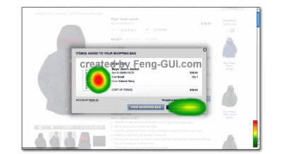
By dimming out the background and upping the contrast of the ‘Continue Shopping’ button – and effectively reducing visual confusion—Lands’ End improved cart performance dramatically.”
Use A Content Hierarchy That Makes Sense
The order in which you present information on your site—and yes, that includes visuals—should flow logically. And generally speaking, keeping it simple is the best approach.
The hierarchy of your site’s information is especially important when it comes to your offer. And the three most important components of your offer’s details are…
- The description with a clear list of benefits or characteristics
- Relevant images (with an opportunity to click to see larger versions)
- Up-to-date pricing options.
You should lay these components out in an order that makes sense for both your offer and your visitors’ expectations. For example, Helen Stark says, “People who [buy] a TV set or air conditioner are less likely to think a lot about its look. They are more obsessed with its features and technical characteristics. And vice versa: when people buy clothes they wish to see how they look from various angles.”
Is your site guilty of any of these conversion killers? What are you doing to safeguard your conversions?