With optimization, sometimes the small tests just aren’t enough to get you the bigger improvements you are looking for. Sometimes it takes a new approach to push you over the edge for growth so then you can refine the process from there.
That process sometimes calls for a re-design of your landing pages. Today we are going to take a look at one particular case study where a landing page re-design resulted in a MASSIVE win for the company.
When looking at a landing page for conversion effectiveness we follow a simple set of rules. Does the page state exactly what you do and how it works? Is there a clear concise next step? What are the benefits of your product/service? Does your message highlight results or social proof from others?
Of course, there are some other nuances but that is the general rules we follow. Couple that with data and you can usually find some areas for improvement.
In this particular case, all signs pointed to doing a full re-design instead of just testing some individual elements.
 In this example, we are talking about a specific landing page for a company called MyUS.com. They provide an international shipping discount/consolidation service.
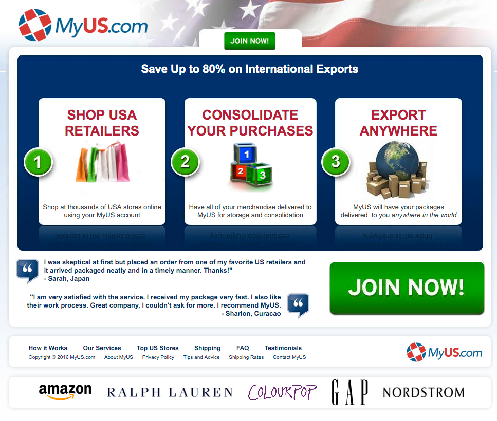
Pictured above is the original landing page we were looking to improve. As you can see many of our questions were answered on the page, however the flow of the page to the desired action wasn’t as clear as it could be.
This page also wasn’t a representation of the rest of the site pages. The design was different.
In an effort to start “fresh” and see if we could dramatically improve the results from this particular page, we decided to re-design it. Now we could have leveraged this page by testing things like larger headlines and tweaking the layout, but for this, we all agreed a re-design was the best approach.
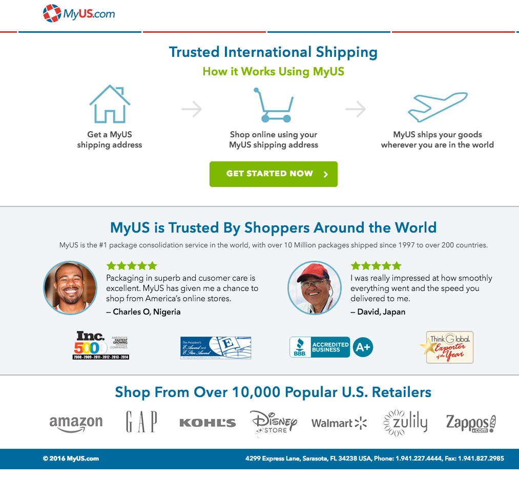
 The new design, pictured above, as you can see is a completely different look. The biggest problem they solve is providing trusted international shipping for shoppers buying from US retailers. We emphasized that in the headline and backed it up with a simple flow chart of how their service works.
We supported this with quite a bit of social proof. A mix of customer testimonials, credibility icons, and even some logos of some popular stores you can shop on using the service.
The results of this “big” change?

Well… all I have to say is we don’t always hit home runs like this but when we do they are pretty big ones.
This test ran for about 15 days in total, the increases didn’t really come close to losing during the duration of the test.
We saw a 71% increase in visits to the signup page, an 1892% increase in overall purchases, a 2788.9% increase in their “basic” membership signup, and a 99.2% increase in their “premium” signups.
Every goal we measured saw a massive improvement with 3 of them showing over 98% statistical significance.
The moral of the story on this little experiment is that you have to keep evolving and changing things up that help you convey your message in a better way that the audience responds to best. In some cases, it may take a completely different angle or in this case a re-design to make it happen.
The importance of continued optimization is that you are constantly trying to beat your previous high score. Markets change and as a result, your efforts need to change with it.
We aren’t done with the improvement though, even after this big win. We are now going to go back and do some incremental testing to see how the visitors respond to each of the individual elements on the page to further refine things.
Have something to add? Leave me a comment.
Be sure to like, share and subscribe.


