


In a recent interview, I was asked a question around web-forms and how much information is too much to ask for, so I thought I would shed some light on some recent case study results and some additional insight.
Obviously web-forms are common. We use them for just about everything online from capturing leads, surveying and purchasing and products. They are a part of just about every step in a digital marketing plan.
Now each industry is different so it is important that you test your own forms to see what works better for you.
Some campaigns may be able to just get by with asking for email only, while others may need to get more information such as name, phone, address, etc.
In a recent test, we did on our own marketing we had a long-form on a landing page asking for a bunch of information such as website, phone and asking some qualifying questions to those looking for our help in order to qualify them.
Our results from the Adwords campaign were decent but then we hit the bullseye.
Instead of asking for all the information in a single form we tested it as a survey style, asking the same questions but now asking them one at a time. The results were that we had almost 1100% increase in those who engaged. Pretty shocking results.
The reason is that it is less intimidating to make micro-commitments and seems like less work when visitors are presented with one question at a time instead of 10. Too many questions seem like too much work. Ryan Levesque talks about this in great detail in his bestselling book, Ask.
As Brad Costanzo revealed while we chatted for an episode of his podcast. He doesn’t feel comfortable filling out a long-form when he is simply looking for more information.
With that let’s take a look at a more specific example of how form fields can impact your results.
This particular company had a contact form to speak to their sales department about their software.
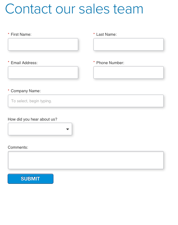
The original as pictured above asks for quite a bit of information.
We have a rule of thumb when looking at web forms that we ask for the minimum amount of information needed in order to still make it effective.
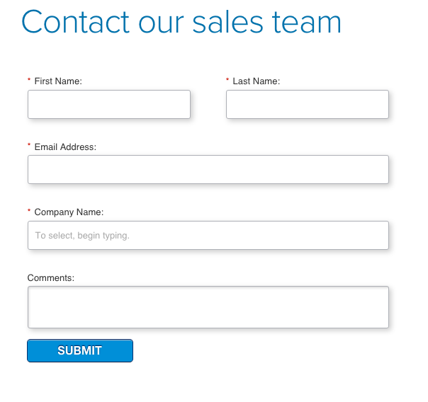 The test variation removed several fields from the form that weren’t exactly necessary for this step in their process.
We removed the phone number field and the “how did you hear about us” dropdown.
Remember any friction you have in your process can lead to reduced conversion rates.
So what were the results of this little test?
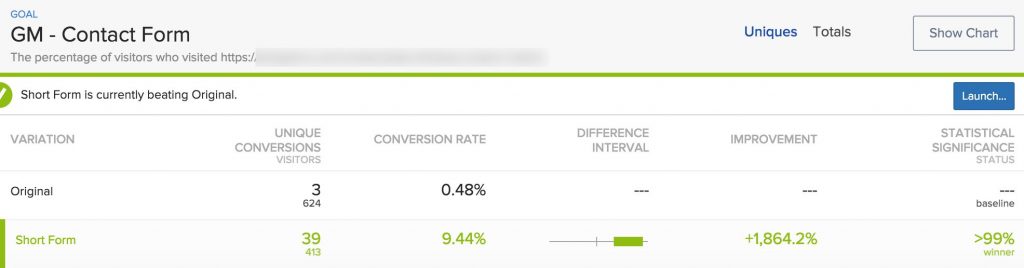
After almost 1100 unique visitors this test reached 99% significance showing an increase of 1864%.
Talk about shocking results.
It just goes to show you that even the smallest changes can yield massive increases. So I ask you again. What are you testing? Are you asking for too much information on your forms?
This doesn’t have to be used for just contact forms, this applies to even your checkout forms as well.
Have something to add? Leave us a comment.
Be sure to like, share and subscribe.