


A call-to-action is used to compel people to take a desired action, turning your website’s visitors into leads. And whereas the function of a CTA is easy enough to understand, putting your CTA’s function into practice and effectively persuading your visitors to take action requires a lot more effort.
There are a number of CTA best-practices that you can implement, however, to optimize your call-to-action and increase its ability to incite conversions. And those best-practices involve the following factors:
- Copy
- Design
- And page positioning
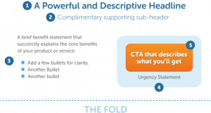
How To Create Compelling Copy For Your Call-To-Action
Rule 1: Use action-oriented language and convey a sense of urgency.
When it comes to your CTA’s copy, channel your inner Hemingway and empower visitors with punchy, concise verbiage, like “Discover” or “Learn more,” as opposed to softer phrases, like “Be smarter.”
You should also strive to add a dose of urgency to your copy, which you can achieve by incorporating time-sensitive words, such as “Now” or “Today.”
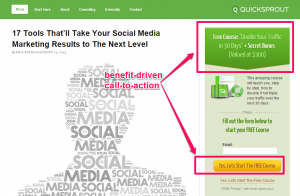
Rule 2: Make your CTA benefit-driven.
Neil Patel: “If people aren’t sure about the value that your CTA button will deliver, they’re not going to click it.
Having tested different copy on my CTA buttons, I’ve decided to stick with offering benefits. At QuickSprout, I promised to help my readers ‘double their traffic in 30 days.’ Then, on the CTA button, I ask them to click to watch the free course.”
Rule 3: Ensure your CTA copy matches your landing page copy.
You need to be consistent when referring to any item you promote, whether it’s a how-to guide, eBook, white paper, or free trial. And the name you use on the landing page—and anywhere else—should align with what you call the item in the call-to-action copy.
“For example, if you mention that people can download a crash course on Facebook advertising on the CTA, you shouldn’t call it an ebook on the landing page. It may seem like small potatoes, but those details matter,” says Ginny Soskey of HubSpot.
Effective Design Suggestions For Your CTA
Button Color
According to Megan Marrs of WordStream, “Green and orange buttons are reported to perform best.” However, the button color you choose should ultimately depend on the color scheme of your site. If your site’s background color is either green or orange, you obviously don’t want to set a button of the same color against it, as that would camouflage your CTA.
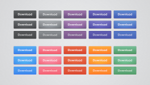
Button Shape
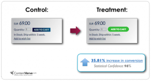
The two most popular button shapes are rounded and square edges, and the shape that works best for you will largely depend on testing. And don’t overlook this factor; button shape can and does impact conversion rates, as evinced by the example below, which illustrates the results of a ContentVerve button shape test.
Text Size
You want your text to be large enough to read at a glance but not so large that it comes across as obnoxious or intimidating. “Many users do experience subconscious distaste for threateningly large lettering,” says Marrs. So you want to aim for the Goldilocks sweet spot with the size of your button text.
Where To Place Your Call-To-Action
Your inclination may be to say, “Put it above the fold, duh!” And while above-the-fold often does prove the best location, it’s no longer a hard and fast rule. Scrolling has become second nature to most people. And sometimes, having your CTA show up before you give your visitors an opportunity to become engaged and feel a sense of trust can actually lead to a disconnect.
Therefore, you need to split-test your CTA’s above-the-fold versus below-the-fold placement.
When your CTA is below the fold, use directional cues—either visual or copy-based—and don’t create a false bottom. Additionally, if you have a particularly long page, use multiple CTAs at specific points to section out the text.
What do you think about these call-to-action tips? Do you have any other advice that you can share?