We know after too many tests to count that it is important to give your visitors a clear path to where you want them to go on your site. In an effort to increase engagement for one particular SaaS campaign and their home page we are testing some redesign elements on their home page to increase website engagement and ultimately generate more leads.
Today we are going to look at one of the elements we added and how it helped increase website engagement.
Can A Single Button Increase Website Engagement 400%?
First, you must understand that SaaS gets quite a bit of traffic to their site. During this test of only a few days over 16,000 unique visits hit the pages of the experiment.
So what did we change to increase website engagement and what were the results?
Well, one of the biggest elements that seemed to move the needle in terms of engagement and actually increased their demo signups as well as the addition of some strategically placed call to action buttons or in the case of the demo button, we moved it.
An important note is that as with most “home pages” they are generally busier than a single step landing page so cutting the clutter and shooting for an increase in website engagement is important.

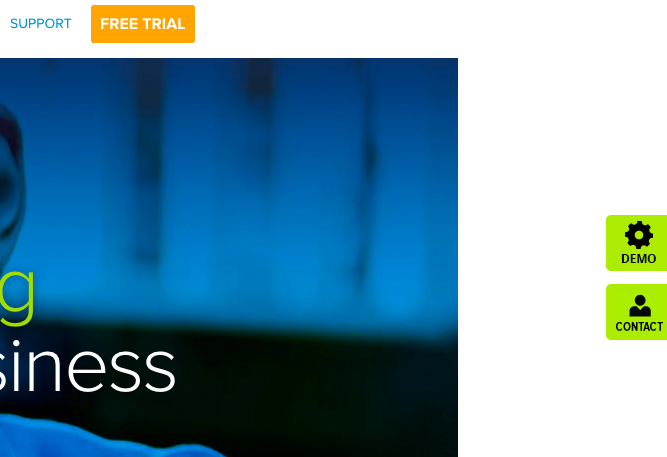
The “new” elements in question as you can see from the image were the sidebar buttons labeled as “Demo” and “Contact”.
These are floating buttons that follow you down the page as you scroll.
As you can see due to the color of the buttons (the bright green) they stand out quite well in relation to the rest of the page which is made up of shades of blue for the most part.
How much did these buttons increase website engagement?
First, let’s look at the demo button. This particular SaaS company generates the majority of their leads from doing live demos.

Measuring the click-through rate of the button we see an improvement of over 400%.
A pretty big lift.
You might be saying that click-throughs are great but how does this relate to actual demo signups?

From the demo button, we tracked the signup rate and so far we are seeing an almost 35% increase in demo signups.
Not a terrible start.
What about the “contact” button?

As you can see the click-through on the contact button is over 3200% increase. It is important to note that while this number looks impressive on the old home page there really wasn’t a comparable placement of the contact button so this number may be skewed.
All we know is that adding that contact button has definitely helped increase website engagement. Although we have concluded some winning elements we still have some work to do.
With the increase in engagement we are now running tests on the specific landing pages these visitors are going to and showing some nice improvements there as well.
Another element we are measuring is the change to the “Free Trial” button in the navigation bar that is pictured above and so far showing an improvement of over 55% with that button as well.
The important lesson to learn here is that as mentioned in the opening of this case study was that you need to cut the clutter and give your visitors a clear path to where you want them to go.
Make your calls to action contrast the rest of the page such as the bright green buttons mentioned here.
Test, test, test and just when you think you are done testing, test some more. You may just increase website engagement and ultimately generate more leads and sales.
We do have plans to expand on these tests to turn the majority of the focus on the trial and demo throughout the page to remove some additional friction points we have found through these experiments.
If you enjoyed this case study be sure to like, comment, share and subscribe so you never out on these valuable insights.
If you want help looking for ways to increase website engagement on your own site be sure to reach out for your no-obligation personalized site evaluation.


